

The Format Tab in PowerPoint is one of the most powerful tools for customizing your slides and making them visually appealing. Whether you’re working with text boxes, shapes, images, or charts, the Format Tab gives you complete control over their look and feel. In this beginner’s guide, we’ll walk you through the most essential features of the Format Tab and how to use them to level up your presentation skills.
If you’ve ever wondered why some presentations look effortlessly professional, it’s often because the creator has mastered subtle formatting tweaks. The Format Tab is your secret weapon for achieving that polished, brand-consistent style without spending hours designing from scratch. At SlideMasterz, we often emphasize that understanding this single tab can completely transform how your slides are perceived.

format
What is the Format Tab?
The Format Tab appears on the ribbon when you select a design element like a shape, picture, text box, or chart. Depending on the selected object, the tab may be labeled as Shape Format, Picture Format, or Chart Format. Each version offers specific tools relevant to that object type. For example, if you click on a picture, you’ll see options for corrections, artistic effects, and transparency. But if you select a chart, the Format Tab will instead offer chart-specific styles, shape fills for data series, and alignment tools. This contextual approach means you’ll only see the options that are relevant—reducing clutter and making it easier to focus on the task at hand.
Key Features of the Format Tab
1. Shape Styles & Quick Styles
The Format Tab provides pre-made visual styles that can instantly change the color, border, and effects of shapes and text boxes. Hover over different styles to preview changes before applying them. If you’re short on time, Quick Styles are a lifesaver. They ensure design consistency across your slides without the need to manually set colors and effects each time. Pair this with your brand color palette for professional branding in every presentation.
2. Fill, Outline, and Effects
You can customize the appearance of your object using: – Shape Fill: Apply solid colors, gradients, pictures, or textures – Shape Outline: Change the border color, thickness, and dash style – Shape Effects: Add shadows, glows, soft edges, and 3D effects
These options help make your design elements more attractive and aligned with your branding. A pro trick here is to use transparency in your shape fills to create layered designs. This allows you to overlay shapes without overwhelming your content, giving slides a clean, modern look. If you’re designing corporate presentations, stick to subtle effects for a professional finish, while educational or creative decks can benefit from bolder outlines and gradient fills.
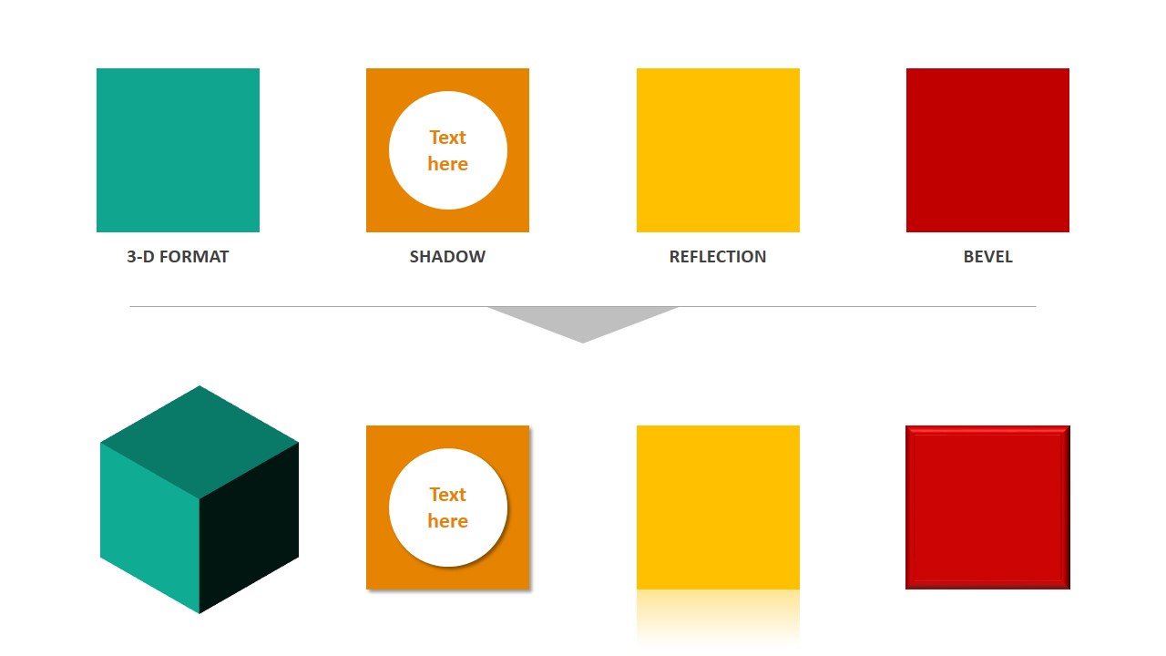
powerpoint effects
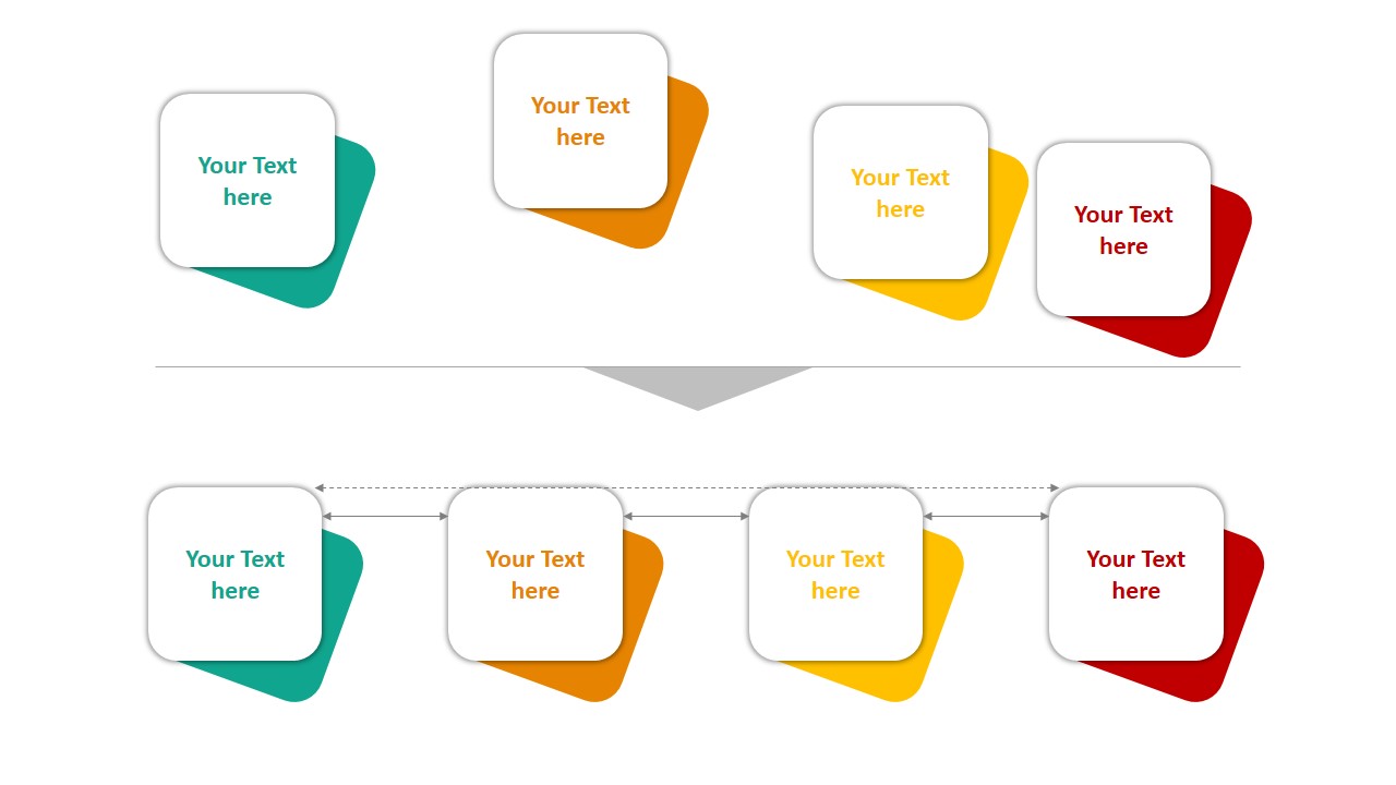
3. Arrange Tools
Use Arrange features to: – Bring objects forward or send them backward – Align objects relative to each other or to the slide – Group or ungroup elements – Rotate objects precisely
These tools are especially useful when working with layered designs or complex layouts. When creating infographics, precise arrangement is critical. Use the Align to Slide option to ensure elements are perfectly centered, and the Distribute Horizontally/Vertically commands to keep spacing uniform. This is one of the fastest ways to make your layouts look balanced and intentional.
4. Size and Positioning
The Format Tab allows you to input exact dimensions and positions for selected objects, helping you maintain consistency across multiple slides. his is particularly useful when you’re preparing template-based presentations or reports. By setting exact sizes for shapes and images, you avoid inconsistent layouts that can distract your audience.
Practical Tips for Beginners
- Tip 1: When designing infographics, use Format > Align > Distribute to space out icons or text evenly.
- Tip 2: Use gradient fills to make backgrounds or shapes more dynamic.
- Tip 3: Group related objects (like icons and text labels) to keep your layout organized and easier to move.
Another overlooked trick is Merge Shapes (found under the Format Tab when working with shapes). It allows you to combine, intersect, or subtract shapes to create entirely custom graphics—no external design software required. This makes it possible to create unique icons, stylized charts, and even logo-like visuals directly inside PowerPoint.
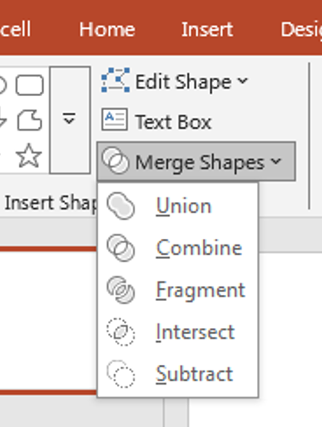
merge tool
Link to Other PowerPoint Essentials
Want to go deeper? Check out some of our other beginner-friendly guides:
– A Beginner’s Guide to PowerPoint’s Insert Menu
– How to Use PowerPoint for Virtual Presentations and Webinars
– Creating Custom Animations in PowerPoint: A Step-by-Step Guide
These resources work hand-in-hand with your understanding of the Format Tab. By combining formatting skills with other PowerPoint features, you’ll be able to produce slide decks that are not only visually impressive but also structured for maximum impact.
Download Free PowerPoint Templates
Give your presentations a head start by using our professionally designed free templates: PowerPoint Templates Free Downloads
Final Thoughts
Mastering the Format Tab in PowerPoint doesn’t require expert-level skills—it just takes a bit of exploration and creativity. As you become familiar with its features, you’ll find that even the smallest tweaks can make a big impact on the visual appeal of your slides. The key takeaway is this—great formatting is about balance. Too many effects can make slides look amateurish, while too little can leave them feeling flat. Experiment with the Format Tab tools to find your style, and remember: every adjustment should serve your message, not overshadow it. For more in-depth tutorials, visit SlideMasterz and explore our growing library of PowerPoint tips, tricks, and free templates.
Stay tuned for more beginner-friendly guides right here at SlideMasterz!


