

Typography plays a crucial role in presentation design. The right font choice doesn’t just affect aesthetics—it also impacts readability, tone, and audience engagement. In PowerPoint, where visual communication is key, choosing the right fonts can significantly elevate your message. A well-chosen typeface can also subconsciously influence how your audience perceives your professionalism and credibility. Even if your content is strong, inconsistent or poorly selected fonts can make your presentation appear rushed or unpolished, which might reduce audience trust.
In this blog, we’ll explore how to use typography effectively in PowerPoint, and how thoughtful font choices can enhance your overall presentation impact.
Why Typography Matters in PowerPoint
- Enhances readability: The right font helps your audience quickly absorb information
- Sets the tone: Fonts convey mood—formal, creative, playful, or authoritative
- Strengthens branding: Consistent fonts across slides create a polished, cohesive feel
- Grabs attention: Bold typography can highlight key messages and guide focus
Effective typography also plays a role in accessibility. Choosing high-contrast font colors, avoiding overly condensed letter spacing, and selecting fonts with clear character shapes ensures that all audience members—including those with visual impairments—can follow along easily.
Understanding Font Categories
- Serif Fonts
Fonts like Times New Roman and Georgia have small strokes at the ends of letters.
- Great for formal or traditional presentations
- Best used in print or header text
- Sans-Serif Fonts
Fonts like Arial, Calibri, and Helvetica are clean and modern.
- Ideal for digital screens and presentations
- Excellent for body text due to clarity
- Display or Decorative Fonts
These are stylized fonts meant for headlines or creative use.
- Use sparingly for visual impact
- Avoid for long passages of text
Remember that cultural context can influence how certain fonts are perceived. For example, a script-style font may feel elegant in one region but be seen as overly ornate in another. Always consider your audience’s background when making font choices.
Tips for Choosing Fonts in PowerPoint
 ✔️ Limit Your Font Choices
Stick to 2–3 fonts throughout your presentation:
- One for headings
- One for body text
- Optional accent font for emphasis
✔️ Prioritize Legibility
Avoid fonts that are too thin, ornate, or overly stylized. Make sure your text is easy to read from the back of a room—or on a small screen.
✔️ Use Font Pairings Strategically
Pair fonts that contrast but complement each other. For example:
- Header: Montserrat Bold
- Body: Open Sans Regular
✔️ Stick to Safe Fonts (or Embed Custom Ones)
Use widely supported fonts if sharing the file. If you’re using a custom brand font, make sure it’s embedded:
- Go to File > Options > Save > Embed fonts in the file
Test your slides on different devices and display screens to ensure the fonts render correctly. What looks sharp on your laptop might not appear the same on a projector or in a virtual meeting.
Font Size & Hierarchy
Size helps guide the viewer’s eye. General size recommendations:
- Titles: 32–44 pt
- Subtitles: 24–32 pt
- Body Text: 18–24 pt
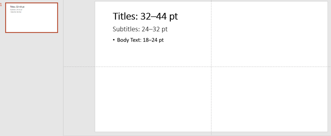
font sizes
Use size, weight (bold), and color to create a visual hierarchy and make your slides easier to scan.
Hierarchy also benefits from consistent spacing. Proper line spacing (around 1.15–1.5) can improve readability and prevent slides from feeling cramped. White space is your friend—it helps important content stand out.
Common Typography Mistakes to Avoid
- Using too many fonts on one slide
- Center-aligning all text (left alignment is easier to read)
- Stretching fonts to fit space
- Overusing bold or all caps
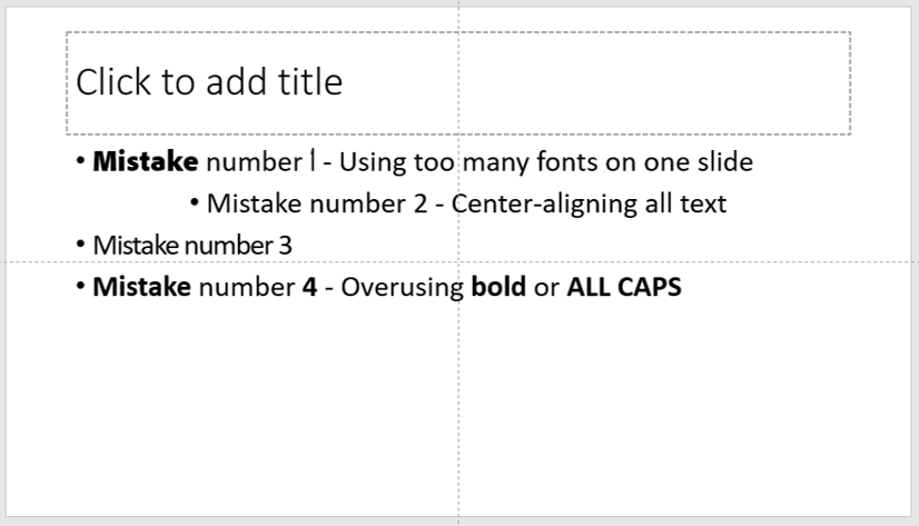
font mistakes
Another common error is ignoring contrast between text and background. Light gray text on a white background may look sleek but will be nearly unreadable from a distance. Always check visibility in actual presentation conditions.
Best Fonts for PowerPoint (Professional & Readable)
- Calibri – Clean and familiar
- Roboto – Modern and versatile
- Open Sans – Great for long text
- Lato – Balanced and readable
- Montserrat – Excellent for headers
- Poppins – Bold and contemporary
While these are excellent starting points, your brand guidelines should always take priority. If your organization already has a set of approved fonts, sticking to them ensures consistency across all communications.
Final Thoughts
Typography isn’t just about choosing a font—it’s about communicating effectively through text. The right fonts help build trust, highlight key messages, and ensure your presentation leaves a lasting impression. By giving typography the same attention you give to images, charts, and overall layout, you ensure that every visual element of your PowerPoint is working together to strengthen your story.
✍️ Next time you open PowerPoint, pay attention to your typography. The right font choice could make all the difference. Read more here


