

Infographics are powerful tools for visually presenting complex information in an easy-to-understand way. Whether you’re delivering a business report, marketing strategy, or educational content, well-designed infographics can enhance engagement and retention. The best part? You don’t need expensive software—PowerPoint has all the tools you need to create stunning infographics!
In this guide, we’ll walk you through the process of creating eye-catching infographics in PowerPoint step by step.
1. Plan Your Infographic
Before jumping into design, outline the key points you want to convey. Infographics should be concise, visually appealing, and informative.
free powerpoint templates
Steps to Plan Your Infographic:
✅ Identify the main message or data you want to showcase.
✅ Choose an infographic style (e.g., timeline, comparison, flowchart, process).
✅ Sketch a rough layout to determine the best visual flow.
For inspiration, you can explore ready-to-use infographic templates from our PowerPoint Templates Free Downloads page. These templates can help speed up your workflow and give your slides a professional edge without starting from scratch.
2. Set Up Your PowerPoint Slide
For better design flexibility, change your slide size to a vertical or custom size.
How to Adjust Slide Size:
- Go to Design > Slide Size > Custom Slide Size.
- Choose Portrait for infographic-style designs.
- Set dimensions (e.g., 1080 x 1920 pixels for a social media infographic).
Using a custom slide size ensures your infographic fits better when exported as an image, especially for platforms like Instagram, Pinterest, or LinkedIn.
3. Use Shapes and SmartArt for Structure
PowerPoint’s built-in Shapes and SmartArt tools allow you to create professional infographic layouts without needing graphic design experience.
free powerpoint templates
Best Practices:
🎨 Use rectangles, circles, and lines to organize sections neatly.
🎨 Utilize SmartArt graphics for lists, processes, and relationships.
🎨 Group elements together (Ctrl + G) for easy movement and alignment.
To learn more about SmartArt and shape formatting techniques, read our detailed blog here.
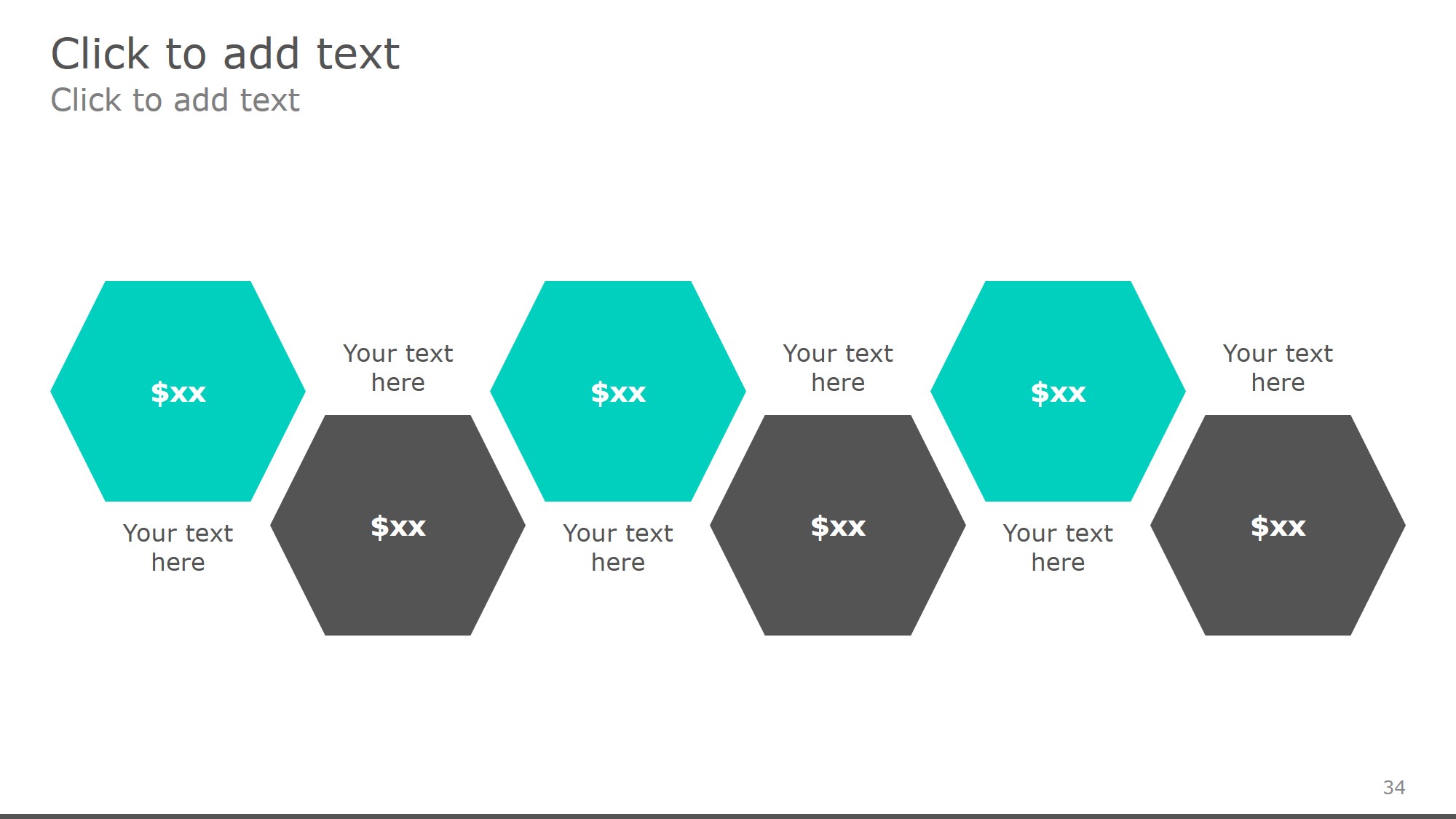
4. Add Icons and Images
Icons and visuals help illustrate points effectively and break up text-heavy designs.
Where to Find Icons in PowerPoint:
- Go to Insert > Icons for built-in Microsoft icons.
- Use royalty-free icon sites like Flaticon or The Noun Project.
- Use transparent PNG images for a professional touch.
Use consistent icon styles (outline or filled) to avoid visual confusion. Keep image file sizes optimized so they don’t slow down your presentation or increase export time.
5. Choose a Consistent Color Scheme
Color plays a crucial role in making infographics visually appealing. Stick to a cohesive color palette to maintain readability and professionalism.
Tips for Using Colors:
🎨 Use brand colors or select a palette from tools like Adobe Color.
🎨 Stick to 2-4 colors for simplicity.
🎨 Ensure high contrast between text and background.

color palette
Avoid neon or fluorescent colors as they may appear differently on various screens or projectors. Soft pastels and deep hues typically work better in business or academic presentations.
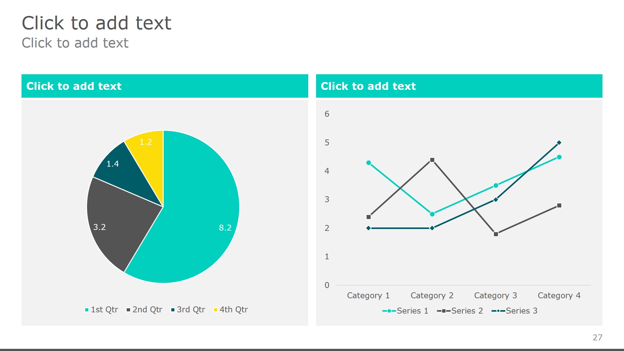
6. Use Data Visualization Tools
Transform raw data into engaging visuals using PowerPoint’s built-in chart and graph tools.
How to Add Data Visuals:
📊 Insert Charts – Go to Insert > Chart to create bar, pie, or line charts.
📊 Use Shapes for Custom Graphs – Manually create visuals like progress bars.
📊 Utilize PowerPoint Tables – Organize large datasets neatly.
Try combining icons with charts—for example, using a lightbulb icon next to a chart showing innovation stats—to create visual metaphors that make your data easier to remember.
7. Apply Animations & Transitions Wisely
Subtle animations can make infographics more dynamic without overwhelming the audience.
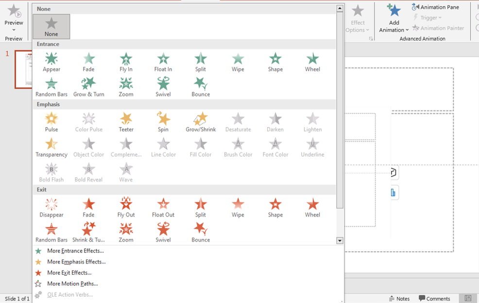
animations
Best Practices for Animation:
✨ Use fade-in effects to introduce elements smoothly.
✨ Keep transitions minimal for a polished look.
✨ Preview animations in Slideshow Mode before finalizing.
Avoid adding sound effects to animations unless absolutely necessary. They can distract rather than enhance the viewing experience in most professional settings.
8. Save and Share Your Infographic
Once your infographic is complete, export it as an image for easy sharing.
How to Save Your Infographic:
- Click File > Save As.
- Choose PNG or JPEG format for high-quality images.
- Select “Just This Slide” to export the infographic.
You can also upload your infographic to your company’s website, share it on LinkedIn, or include it in email newsletters to amplify your message and boost engagement.
Final Thoughts
Creating eye-catching infographics in PowerPoint is easier than you think! By planning your layout, using SmartArt, icons, and charts, and maintaining a clean design, you can transform complex data into compelling visuals.
🚀 Start designing today and take your presentations to the next level! Which infographic type do you use most? Let us know in the comments! 🎨
To read more please visit:


