

PowerPoint Diagrams are very helpful in creating attractive presentations. PowerPoint is a computer program that allows you to create powerpoint slide templates. You can combine text, graphics and multi-media content to create professional PowerPoint Diagrams. PowerPoint diagrams offer a structured way to present data, processes, or relationships in a visually engaging format. These visuals help simplify complex ideas, making them easier for audiences to grasp. When used effectively, they can elevate the professionalism of your slides and support better information retention for viewers. By using diagrams, you not only enhance the design but also guide your audience through the information flow in a logical and appealing manner.
You can add diagrams to enhance your ppt template design. So here we are about to show you how to create a Circular Diagram in few steps.
Circular diagrams are one of the most widely used formats in PowerPoint presentations. They are especially useful when you want to depict cyclic processes, workflows, or continuous systems. This shape symbolizes repetition and completeness, making it perfect for presenting recurring strategies or circular workflows. Let’s go step by step to see how easily this can be created-
1. Take a Circle from basic shapes. (See Image below)
Insert circle from Home → Drawing on top bar. Align it in center and middle of workspace or as per the requirements.
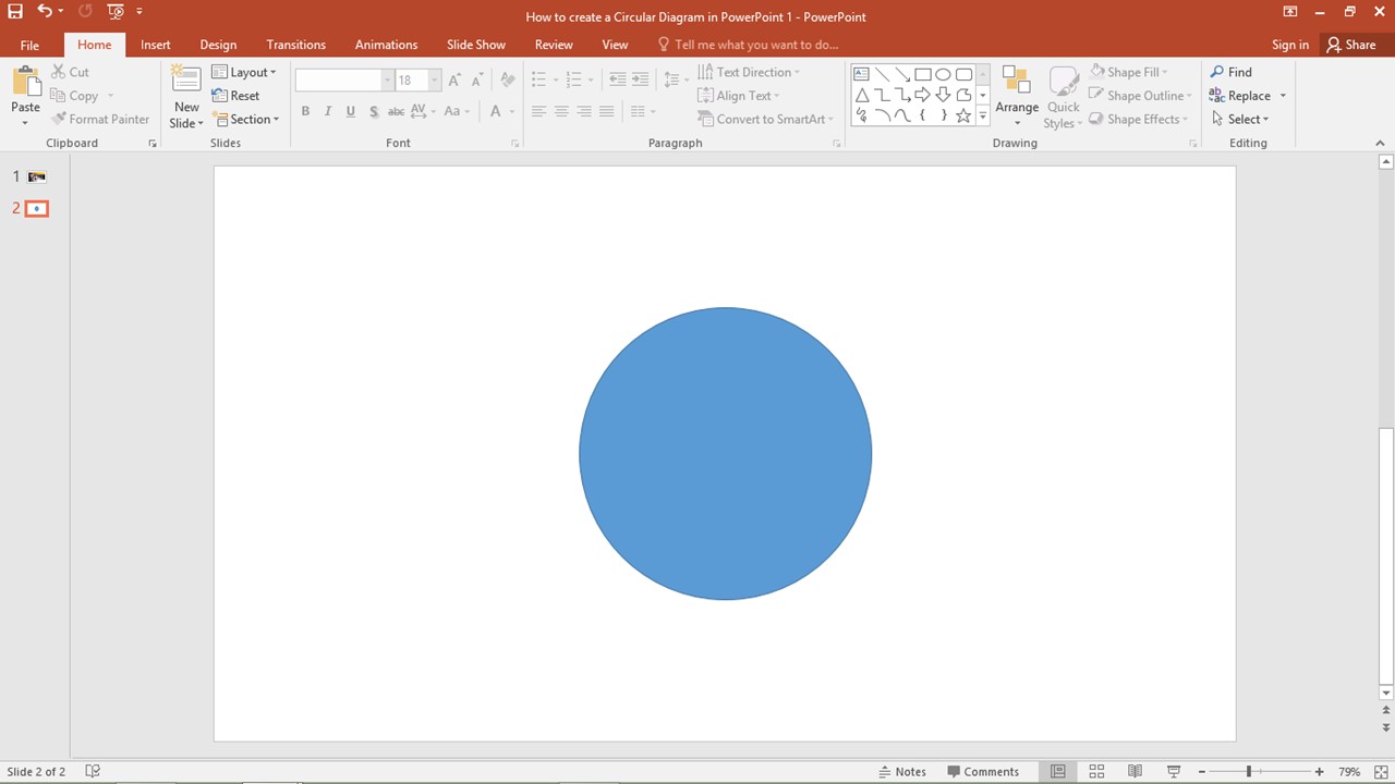
Choosing the correct size and placement of the circle is important to ensure balance on the slide. You can hold the “Shift” key while dragging the shape to maintain a perfect circle. Also, make sure the circle doesn’t overlap with the margins or edge of the slide if you’re planning to add multiple arrows or icons around it later.
2. Then add arrows as required by you. (See Image below)
After that, add arrows around circle depending upon number of points to be added. Make sure to align them properly around circle. You can also keep circle on one side and points on other depending upon the text.
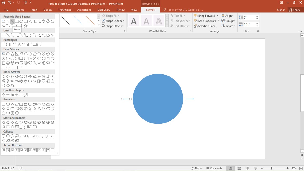
To maintain visual consistency, use the same type and size of arrows. You can use “Rotate” and “Align” options in the Format tab to evenly distribute the arrows around the circle. This layout not only looks clean but also improves the overall readability of the diagram. Remember, spacing is key — leave enough room between arrows for adding text or sub-elements.
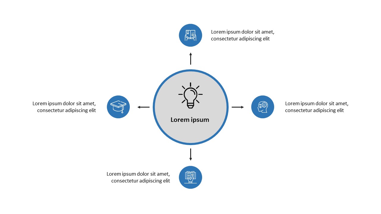
3. You can add four arrows to make a four point PowerPoint Diagrams. (See Image below)
For example, here we have added 4 arrows. Align them properly using alignment tool.
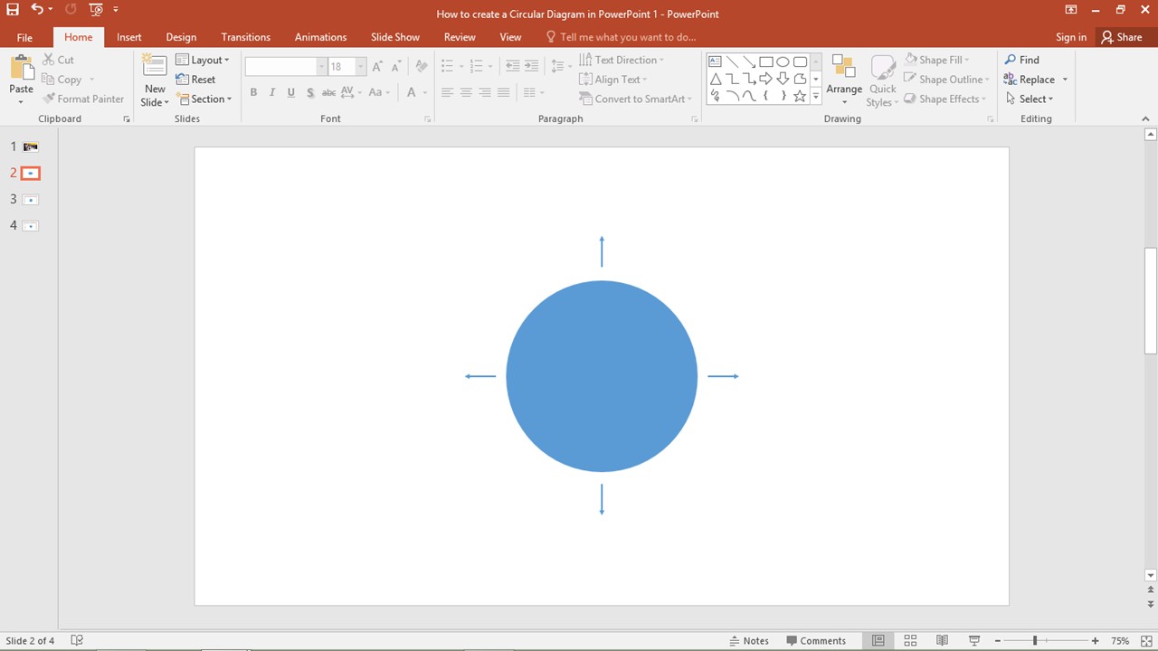
Four-point diagrams are ideal for showing processes that involve four key stages, departments, or decisions. They work well for business models, SWOT analysis, or project steps. Using alignment tools such as “Distribute Horizontally” or “Distribute Vertically” ensures symmetry, which gives a polished look to the entire slide.
4. Now add four circles after the four arrows (See Image below)
To add icons for each point, add 4 circles adjacent to each arrow. This will give more graphical appearance to the PowerPoint Diagrams.
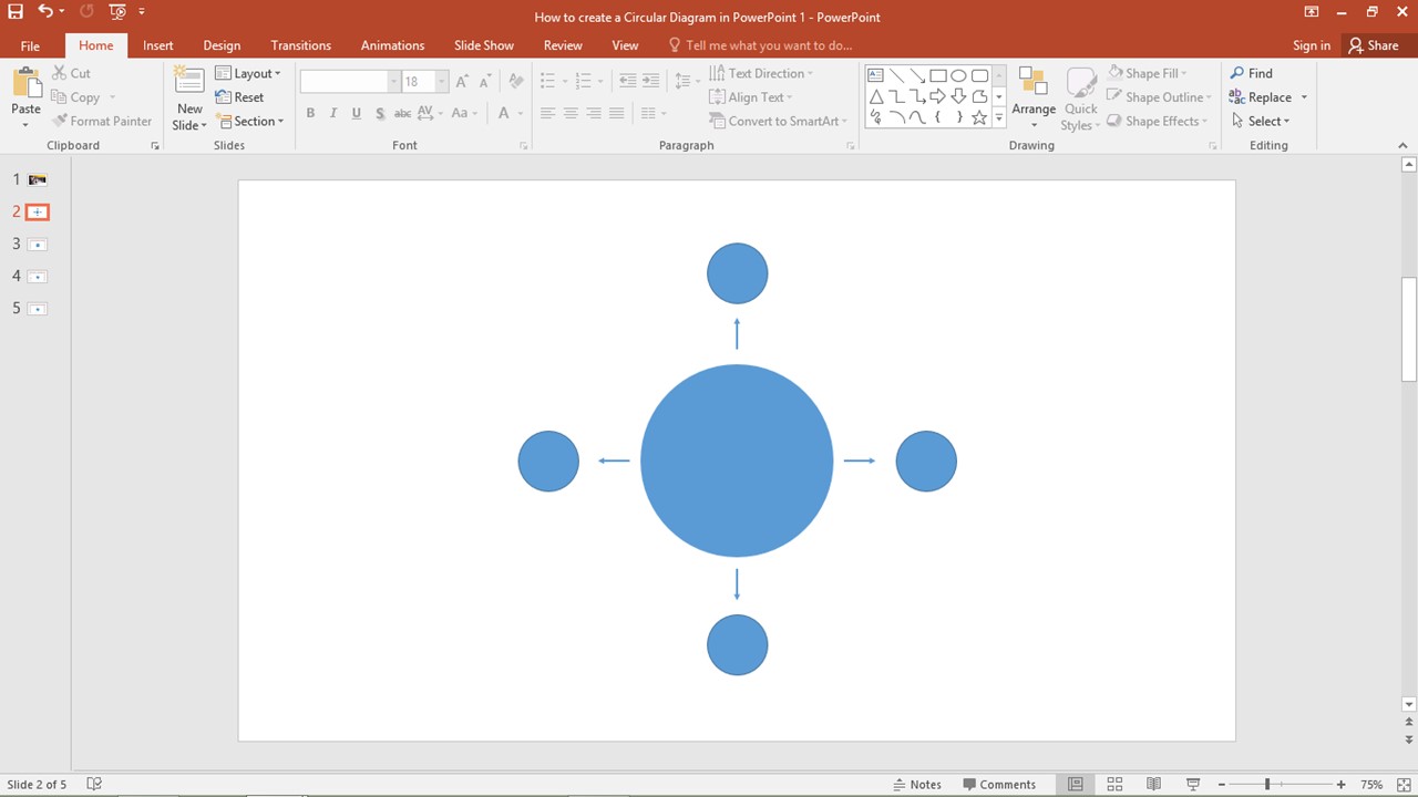
Adding small circular placeholders not only enhances the layout but also provides visual anchors for important points. These circles can later be filled with icons that represent each concept clearly — such as a gear icon for “Settings” or a calendar icon for “Schedule”. Make sure to use consistent icon styles (line, filled, or flat) throughout the diagram to maintain a cohesive design.
5. Add your desired color, icons and text as per your need in the PowerPoint Diagrams (See Image below)
Now add icons and text in the given space. You can color diagram according to your template or business colors. Try to add different shades to make it appealing. Animation can also be added to show step by step process. If icons are not to be added, outer circles can be removed and instead of icon, sub-heading can be placed in inner circle.
Always keep contrast in mind when applying colors — dark icons look better on light backgrounds and vice versa. If your diagram is part of a larger presentation, use the same color scheme throughout for consistency. Animations can be applied using the “Animations” tab. Use entrance animations like “Fade” or “Wipe” to introduce each step sequentially, which adds a storytelling effect and keeps viewers engaged. Avoid overdoing animations to maintain professionalism.
Thank you for going through this blog. If you have any suggestions do let us know. To learn more powerpoint tools, visit our “https://slidemasterz.com/5-basic-powerpoint-tools-know-how/” blog page. Explore more PowerPoint resources and free creative diagrams on our Free Templates Page. You’ll find professionally designed diagrams and layouts that are ready to use and fully customizable to fit any presentation style.


