

Every great presentation starts with a simple idea—maybe a scribble on paper, a wireframe on a whiteboard, or a loose concept in your head. The challenge is transforming that raw inspiration into a clean, impactful PowerPoint slide. The good news? With the right process, you can turn even the roughest sketch into a polished design that communicates your message clearly and powerfully.
In this blog, we’ll guide you through the step-by-step journey of transforming a rough idea into a finished slide that looks professional and delivers results. At SlideMasterz, we’ve helped hundreds of professionals, educators, and entrepreneurs turn rough ideas into stunning, presentation-ready designs. Whether you’re working on a business pitch, a webinar, or an academic presentation, these steps will help you save time while achieving a polished, on-brand look.
Step 1: Start with a Purpose
Before jumping into design, ask yourself:
- What message am I trying to convey?
- Who is my audience?
- What do I want them to feel or do?

Light bulb with drawing graph
This clarity will help guide your slide structure, visuals, and tone. A clear purpose not only shapes the design but also ensures your presentation stays focused. Many beginners get caught up adding unnecessary animations, colors, or extra slides, which can dilute the message. When you define your purpose early, every design choice becomes intentional, creating a slide that connects instantly with your viewers.
Step 2: Sketch It Out
Start with a rough layout. This doesn’t need to be fancy—pen and paper will do. Your sketch should outline:
- Headline or main message
- Supporting points
- Visual elements (icons, charts, images)
This helps organize your thoughts and visualize the flow before you touch PowerPoint. Don’t skip this step. Even professional designers often begin with a basic wireframe or hand-drawn sketch to capture the idea’s essence. By sketching first, you avoid design block and make better creative decisions. You can even use digital sketching apps like Microsoft Whiteboard or Miro for collaborative brainstorming before opening PowerPoint.
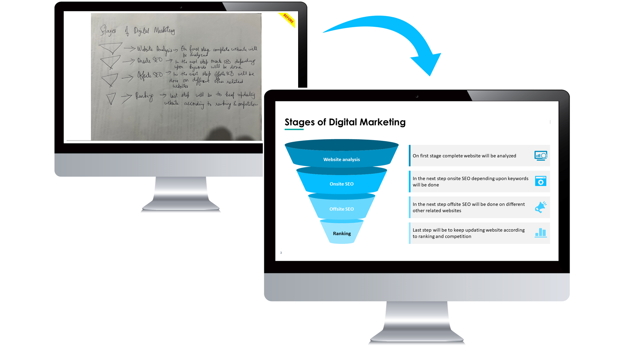
Image Recreation
Step 3: Build the Slide Structure
Now open PowerPoint and recreate the layout from your sketch using placeholders:

sample slide
- Use shapes and text boxes to block out content
- Stick to grayscale or muted colors at this stage to focus on layout
- Don’t worry about fonts or images yet
This is your wireframe slide—your digital blueprint.
Think of this stage as building a house’s framework before painting walls or adding décor. You’re deciding where the “rooms” (content areas) go, ensuring your audience’s eyes move logically across the slide. Using the PowerPoint Grid and Guides feature will help you align elements perfectly without guesswork.
Step 4: Add Visual Elements
Once the layout is set:
- Replace placeholders with relevant icons, charts, or images
- Use high-quality visuals that support your message
- Avoid generic stock photos—custom visuals work best

4 point diagram
Use SmartArt, Icons, or custom illustrations depending on the content. If you want your presentation to stand out, consider using custom-designed PowerPoint templates like those in our free download library. Visuals should not just “fill space” but act as storytelling tools—helping the audience remember key points long after the slide is gone.
Step 5: Apply Design and Branding
Now bring your slide to life:
- Apply your brand’s color palette and typography
- Use consistent spacing and alignment for visual balance
- Keep it clean: avoid clutter and unnecessary text
Use the Slide Master to apply design elements consistently across your deck. This is where a good template can save hours. If you regularly present for your company, having a branded Slide Master ensures every new presentation looks uniform and professional—critical for brand trust and recognition. Avoid mixing too many font types or inconsistent colors, as this can make slides feel amateurish.
Step 6: Review and Refine
Walk through your slide with fresh eyes:
- Is the key message clear?
- Can the audience grasp it in 5 seconds?
- Is the slide visually balanced?
Get feedback from a colleague if possible. Small tweaks can make a big impact. You can also test your slides with someone unfamiliar with your topic. If they understand the main idea without verbal explanation, you’ve nailed the design. PowerPoint’s “Presenter View” can help you rehearse and catch any last-minute errors before presenting.
Tips for a Smooth Design Process
- Use grids and guides in PowerPoint for precise alignment
- Keep it modular—create reusable layout components
- Save time with templates and custom shape libraries
- Use slide notes to capture ideas during the sketching phase
For faster workflow, bookmark tools and resources you frequently use—like icon libraries, color palette generators, and image sources. SlideMasterz offers ready-to-edit templates that combine design best practices with visual storytelling principles, saving you hours of trial and error.
Final Thoughts
The journey from sketch to slide is where creativity meets structure. By starting with a rough idea and refining it step-by-step, you can build slides that are both visually appealing and strategically effective.
📝 Next time you’re facing a blank slide, start with a sketch—and watch your ideas come to life. Remember, presentations are not just about aesthetics—they’re about communication. Every design decision should bring your audience closer to understanding and acting on your message.


