

Did you know the colors you choose for your PowerPoint slides can influence how your audience thinks and feels? Color isn’t just decoration—it’s a powerful psychological tool that can enhance communication, create emotional impact, and drive decisions.
In this blog, we’ll explore how to use color psychology to design better presentations—and we’ll share free PowerPoint templates that use professionally chosen palettes so you don’t have to guess.
Why Color Choice Matters in Presentations
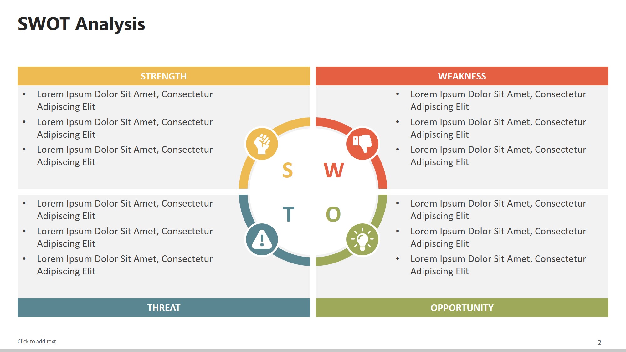
free powerpoint templates
Color can: –
🔥 Attract attention –
🧠 Improve memory retention –
💡 Emphasize key points –
😍 Create an emotional connection
That’s why top brands are meticulous about their palettes—and why you should be too.
What Different Colors Say to Your Audience
Here’s a quick breakdown of how different colors are often perceived:
- 🔵 Blue – Trust, calm, intelligence
- 🔴 Red – Urgency, passion, importance
- 🟡 Yellow – Optimism, attention, warmth
- 🟢 Green – Growth, balance, stability
- 🟣 Purple – Creativity, luxury, mystery
- ⚫ Black/Grey – Sophistication, modernity
Want to see these in action? Check out our blog: The Psychology Behind Slide Design
Tips for Choosing the Right Color Palette
- Match Your Message: Serious topics need calm, trustworthy tones (e.g., blue, grey); exciting pitches can use bold colors like red or orange.
- Stick to 2–3 Main Colors: Keep your slides clean and cohesive.
- Use Contrast for Readability: Dark text on a light background (or vice versa) improves legibility.
- Stay On Brand: If you’re representing a business, use brand-approved colors.
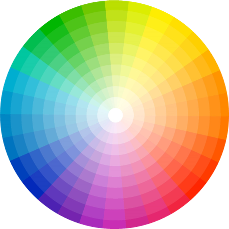
Recommended Color Tools
- 🎨 co – Generate color palettes instantly
- 📊 Adobe Color – Explore palette trends
- 💼 Use PowerPoint’s Eyedropper Tool to pick colors from your logo
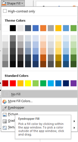
eye dropper
Done-for-You: Color-Optimized Templates
Want a shortcut? Our templates are designed with color psychology in mind—so you don’t have to think twice.
🔗 Browse our Free PowerPoint Templates to find palettes that match your topic, mood, and goals.
Related Blogs You’ll Love:
- Why Your PowerPoint Slides Look Outdated (And How to Fix Them Fast)
- Typography in PowerPoint: Choosing the Right Fonts for Impact
- How to Make Your PowerPoint Slides More Engaging
Final Thoughts
Don’t let poor color choices dull your message. The right palette can create clarity, focus, and connection—all without saying a word.
🎁 Ready to apply color psychology without the guesswork? Download our Free PowerPoint Templates crafted by expert designers.
Choosing the right color palette is more than just picking your favorites—it’s about aligning your visual design with the story you want to tell. For instance, a corporate annual report presentation would benefit from muted blues and greys that convey trust and stability, while a creative pitch for a marketing campaign might thrive on vibrant oranges and pinks that spark excitement.
The psychology behind color is deeply rooted in human perception. Studies show that people can make a subconscious judgment about a product or brand within 90 seconds of viewing it—and up to 90% of that judgment is based on color alone. This means your slides can either boost your credibility or weaken it instantly.
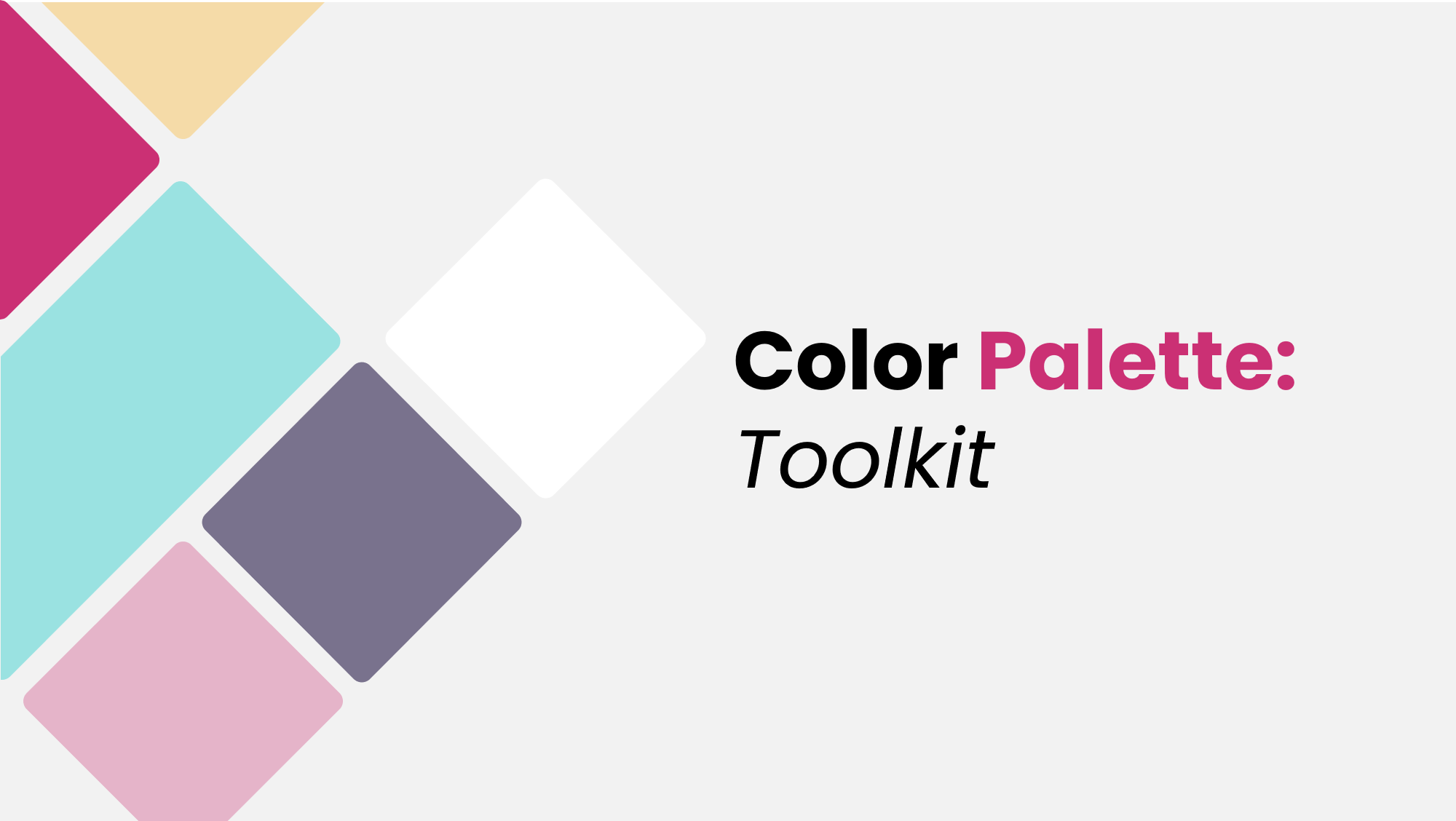
colors
When creating presentations in PowerPoint, always test your chosen colors under real presentation conditions. A color that looks great on your laptop might look dull or overly bright when projected on a large screen. This is where contrast ratios become critical—especially for text-heavy slides. For accessibility, aim for a contrast ratio of at least 4.5:1 between text and background to ensure readability for all viewers, including those with visual impairments.
If you’re unsure how to pair colors effectively, try using analogous color schemes for harmony or complementary color schemes for bold contrast. PowerPoint’s built-in Design Ideas feature can also suggest palettes based on your content, making it a quick option for those short on time.
At SlideMasterz, we integrate these principles into our templates so you can focus on your message rather than design headaches. Our templates come with ready-made palettes optimized for both on-screen viewing and print, ensuring your presentation looks equally stunning in any format.
Lastly, remember that consistency is key. Jumping between too many colors can distract and confuse your audience. Instead, anchor your slides with one primary color, one secondary accent, and one neutral tone. This will create a visual rhythm that guides viewers naturally through your content.
By applying color psychology strategically, you’ll not only make your slides more beautiful—you’ll make them more persuasive.
💡 Design smarter. Let color work for you—not against you.


