

A well-designed PowerPoint presentation can captivate your audience and enhance your message. However, many presenters unknowingly make common slide design mistakes that can weaken their impact. If you want your slides to be clear, engaging, and professional, avoid these five critical slide design mistakes that could be ruining your presentation.
1. Too Much Text on a Slide
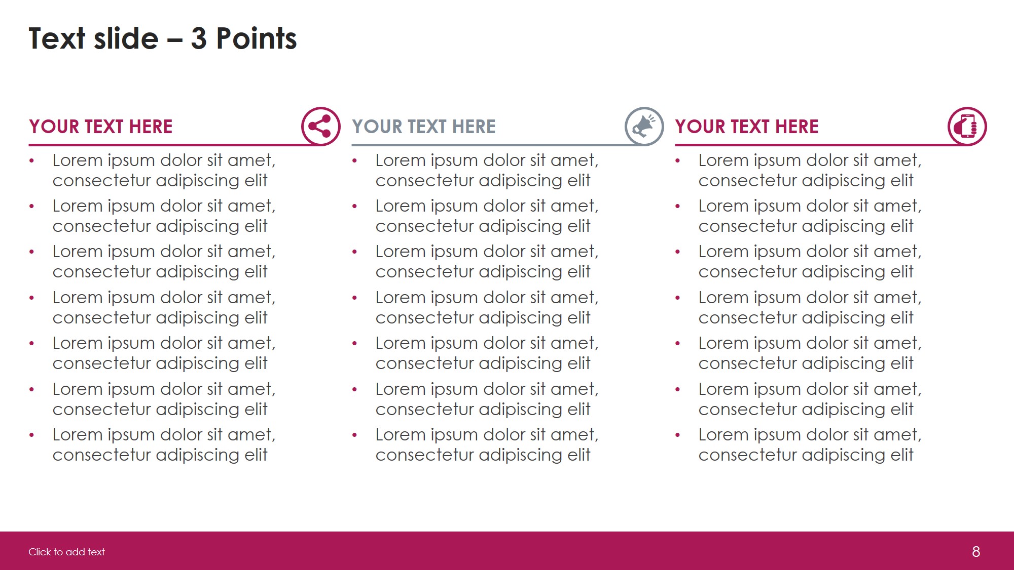
One of the biggest mistakes is overloading slides with text. Walls of text can overwhelm your audience and make your presentation dull. Remember, slides are meant to support your speech, not replace it.
How to Fix It:
- Keep slides concise—use bullet points instead of long paragraphs.
- Follow the 6×6 rule: No more than six bullet points per slide and six words per bullet.
- Use visuals like icons, charts, and images to convey information effectively.
Try using infographics or diagrams when you have more complex information to share. These not only reduce text load but also increase comprehension. Interactive elements like clickable buttons or navigable slides can also break long text into digestible sections. For pre-designed infographic templates, check out these free downloads from SlideMasterz.
2. Poor Font Choices and Sizes
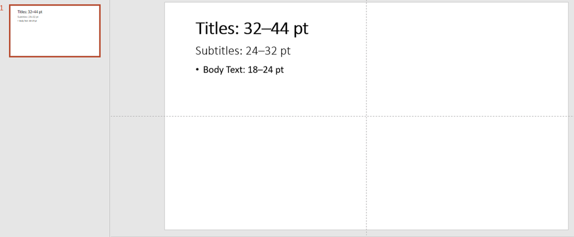
Choosing the wrong fonts can make your slides look unprofessional and difficult to read. Fonts that are too small, too decorative, or inconsistent create a visual mess.
How to Fix It:
- Use clear, professional fonts like Arial, Calibri, or Open Sans.
- Stick to a minimum font size of 24pt for body text and 30-36pt for headings.
- Be consistent—don’t use more than two different fonts throughout your slides.
font sizes
Avoid using all caps in body text—it can feel like shouting and is harder to read. Maintain uniform spacing and line height across slides for better readability. If you’re unsure about combinations, many modern PowerPoint templates (like those on SlideMasterz) come with well-paired font presets.
3. Clashing Colors and Low Contrast
Using bright, clashing colors or text that blends into the background makes slides hard to read. Poor contrast strains the eyes and reduces readability.
How to Fix It:
- Use a simple, high-contrast color scheme (e.g., dark text on a light background or vice versa).
- Stick to a consistent color palette that aligns with your brand or theme.
- Test your slides on different screens to ensure readability.
You can use tools like Adobe Color or PowerPoint’s built-in color themes to pick harmonious palettes. If you’re presenting to an audience with color vision deficiencies, avoid relying solely on color to convey meaning—use labels or icons alongside color-coded data.
4. Overusing Animations and Transitions
Animations and transitions can make a presentation dynamic, but overusing them can be distracting and unprofessional.
 How to Fix It:
 How to Fix It:
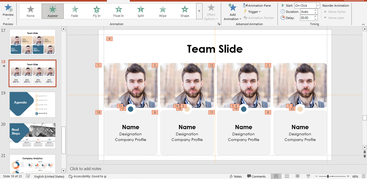
- Use animations sparingly—only when they help emphasize key points.
- Stick to simple transitions like “Fade” or “Appear” instead of flashy effects.
- Ensure animations are smooth and purposeful, not just for decoration.
A great practice is to preview your entire presentation in slideshow mode and time the transitions to match your speech. Avoid animation effects that mimic “fly-ins” or spins unless used very strategically. For templates that use animations wisely, explore the curated selection at SlideMasterz.
5. Inconsistent Slide Design
An inconsistent design makes your presentation look unpolished and confuses your audience. Randomly changing layouts, fonts, and colors disrupts the flow of your slides.
How to Fix It:
- Use PowerPoint slide masters to maintain consistency in fonts, colors, and layouts.
- Keep margins and alignments consistent throughout your slides.
- Stick to a cohesive theme that reflects your message and branding.
Set up a custom theme at the beginning of your design process and apply it across all slides. This avoids manual styling errors and helps maintain visual harmony. Also, remember to use consistent icon styles (outline or filled—not both). A mismatch here often disrupts design consistency subconsciously.
Final Thoughts
A well-designed presentation enhances your credibility and ensures your audience stays engaged. By avoiding these five slide design mistakes, you can create slides that are not only visually appealing but also effective in delivering your message.
For beginner-friendly slide design resources, visit our PowerPoint blogs section and explore templates designed with visual consistency in mind. By combining design rules with practical tools, you can upgrade your presentations without starting from scratch.
What’s the biggest slide design mistake you’ve seen? Share your thoughts in the comments! 🚀


