

One of the biggest giveaways of an amateur PowerPoint presentation is poor alignment — text boxes slightly off, icons not lining up, and uneven margins. These subtle inconsistencies can make even the best content look messy.
Luckily, PowerPoint offers powerful tools to help you fix that easily: Grids, Guides, and Rulers. Once you master these, you’ll be able to create slides that look clean, professional, and perfectly balanced — every single time.
In this guide, we’ll walk you through how to use grids and guides in PowerPoint, along with tips to achieve flawless alignment and consistent design.
🎯 Why Alignment Matters in Slide Design
Alignment might seem like a small detail, but it plays a huge role in visual clarity and audience perception.
Properly aligned slides:
- Look organized and polished
- Help the audience focus on content, not clutter
- Build brand consistency in every deck
- Make text and visuals easier to read and follow
If your slides “feel” off even when you can’t see why — grids and guides are the solution.
📏 Step 1: Turn On Grids, Guides, and Rulers
By default, PowerPoint hides these tools to keep the workspace clean. To activate them:
- Go to the View tab on the Ribbon.
- Under Show, tick the boxes for:
- Ruler
- Gridlines
- Guides
Once activated, you’ll see horizontal and vertical lines on your slide — these act as your layout blueprint.
💡 Pro Tip: You can right-click anywhere on your slide and choose Grid and Guides → Add Vertical/Horizontal Guide for more precision.

🧩 Step 2: Understanding How Each Tool Works
Each alignment tool in PowerPoint serves a unique purpose.
Rulers:
Help measure and place elements accurately in inches or centimeters. Perfect for creating equal spacing.
Gridlines:
Form a network of tiny squares (like graph paper) to align shapes, text boxes, or images.
Guides:
Customizable lines (vertical or horizontal) that you can drag to specific positions to line up content across multiple slides.
Together, they help you maintain visual balance and uniformity across the deck.
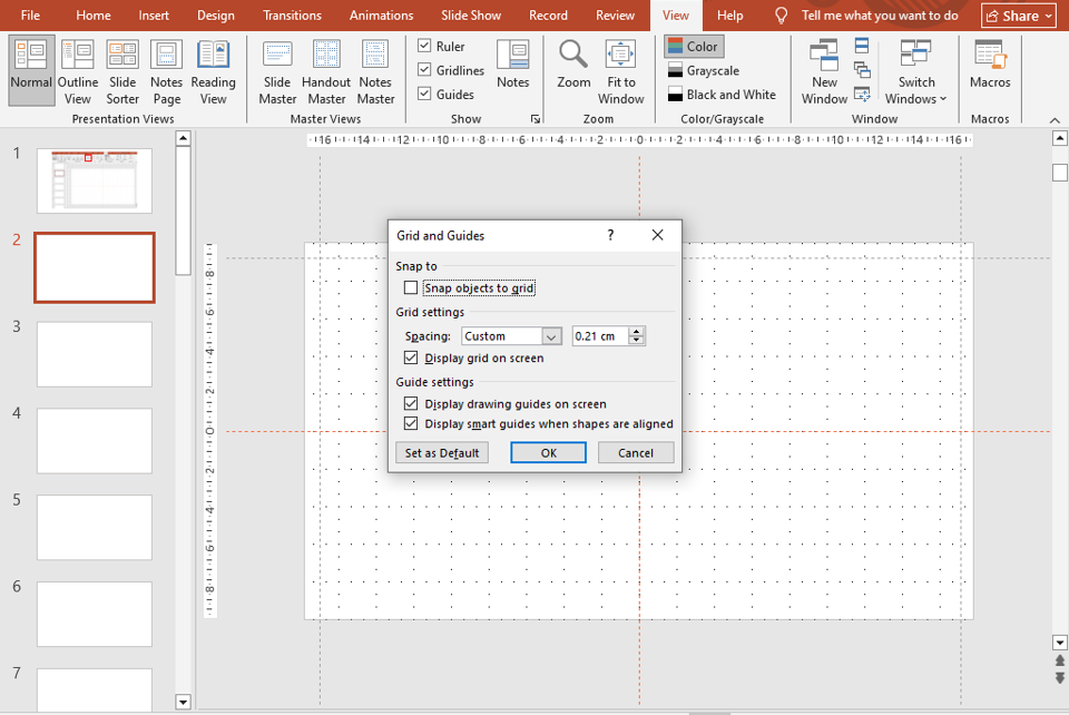
🔧 Step 3: Adjusting Grid Settings
You can customize the grid spacing for more control:
- Right-click on the slide → Grid and Guides → Grid Settings.
- Choose Spacing (e.g., 0.1 or 0.25 inches).
- Enable Snap objects to grid.
When “Snap to Grid” is turned on, every object you move automatically locks to the nearest grid point — ensuring perfect placement without manual alignment.
🎯 Pro Tip: Keep spacing around 0.2 inches for most layouts; smaller grids work best for detailed designs.
🧭 Step 4: Using Smart Guides
PowerPoint also includes Smart Guides — those pink dotted lines that appear automatically when you move or align shapes.
They help you quickly:
- Center objects on the slide
- Align shapes relative to each other
- Maintain equal spacing between elements
These real-time indicators make layout corrections effortless — especially when designing infographics or icon-based slides.
🪄 Step 5: Using Guides for Consistency Across Slides
Consistency is what separates average presentations from great ones.
To maintain alignment across all slides:
- Set up guides on one slide (like for title, content, and image positions).
- Right-click and choose Grid and Guides → Add Vertical/Horizontal Guide as needed.
- Once done, duplicate the slide or use Slide Master to replicate the guide structure throughout the presentation.
This ensures that every title, text box, and visual element aligns perfectly from start to finish.
For a deeper understanding of master-level control, check out our blog — Using PowerPoint’s Slide Master for Consistent and Professional Designs.
🧠 Step 6: Combine Guides with Slide Master for Brand Consistency
If you create company or client decks often, you’ll benefit from applying grids and guides in the Slide Master view.
This way, every new slide inherits the same alignment — perfect for logos, footers, headers, and recurring elements.
💡 Pro Tip: Create one “Base Layout” slide that includes brand-aligned guides for text, icons, and images.
🎨 Step 7: Enhance Design with Perfectly Aligned Templates
When alignment meets design excellence, you get truly standout slides. If you want to skip the setup time, try pre-built templates that already use grid-based design.
Explore SlideMasterz Premium PowerPoint Templates — each template is crafted with pixel-perfect alignment, balanced typography, and visual harmony.
Or, if you’re learning and experimenting, start with our free PowerPoint templates to practice layout precision before going premium.
Both collections help you understand how professional slides maintain clean structure and balance — even with complex visuals.
🔗 Related Blogs to Improve Your PowerPoint Design Skills
- Mastering PowerPoint Shapes: A Beginner’s Guide
- The Power of Shape Formatting: Shadows, Gradients, and Effects
These guides will help you refine both technical precision and creative design balance.
✅ Final Thoughts
PowerPoint’s grids, guides, and rulers may seem simple, but they’re the backbone of a professional-looking presentation. They ensure your content looks balanced, your visuals align seamlessly, and your audience focuses on the message — not the layout flaws.
Once you start using them regularly, you’ll notice how effortless good design can become. And when combined with premium templates from SlideMasterz, you’ll be creating polished, pixel-perfect presentations that truly impress.


