
Images and icons play a crucial role in making PowerPoint presentations more engaging, visually appealing, and easy to understand. They help break up text, illustrate key points, and keep the audience focused. However, using them effectively requires more than just dragging and dropping. In this ultimate guide, we’ll explore the best practices for incorporating images and icons into your PowerPoint slides like a pro.
1. Choosing the Right Images
Not all images are created equal. Selecting high-quality, relevant images enhances your presentation and reinforces your message.

Best Practices:
✅ Use high-resolution images to avoid pixelation.
✅ Choose relevant and contextual images that support your content.
✅ Avoid cluttered or overly busy images that distract from your message.
✅ Stick to a consistent style for a professional look.
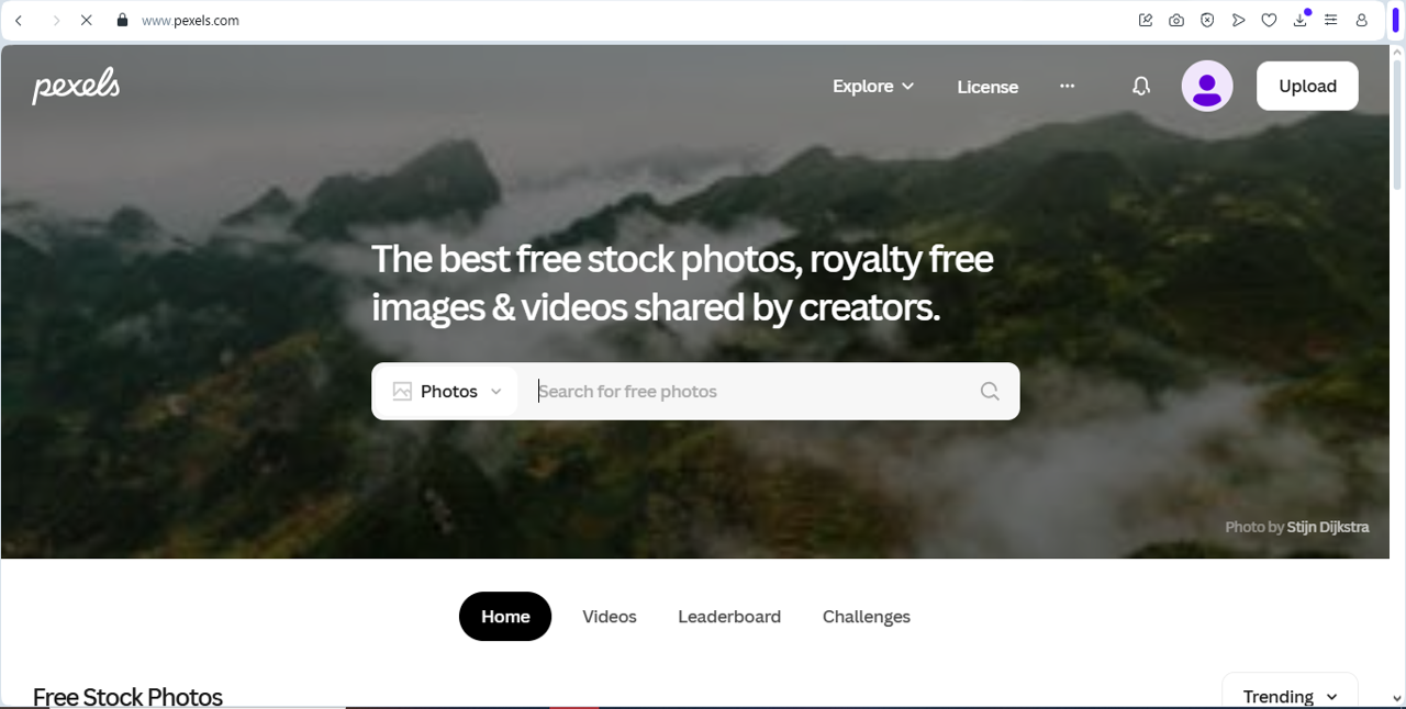
Where to Find High-Quality Images:
- Royalty-free sites: Unsplash, Pexels, Pixabay
- Microsoft Stock Images: Built-in PowerPoint image library
- Your own photographs: Personal and company photos add authenticity
For ready-to-use presentation slides that already include thoughtfully selected visuals, explore free downloadable PowerPoint templates on SlideMasterz. These templates save time and ensure a polished, image-friendly layout.
2. Optimizing Images for PowerPoint
Large images can slow down your presentation and make file sizes unnecessarily big. Optimizing your images ensures smooth performance.
How to Optimize Images:
📌 Compress Images: Go to File > Compress Pictures to reduce file size.
📌 Crop Unnecessary Parts: Use the Crop tool to focus on key elements.
📌 Adjust Brightness & Contrast: Improve visibility with PowerPoint’s built-in editing tools.
📌 Remove Backgrounds: Use the Remove Background tool for a cleaner look.
If you’re using templates with pre-added image placeholders (like those on SlideMasterz), many of these optimization steps become easier, as the templates are pre-formatted for efficient image usage and file performance.
3. Using Icons to Enhance Visual Appeal
Icons are a great way to simplify information, create hierarchy, and make slides more visually appealing.

Why Use Icons?
✔ They replace long text descriptions with simple visuals.
✔ They create consistent and clean designs.
✔ They are easy to resize and recolor.

Visual Enhancement
Where to Find Free Icons:
- PowerPoint Icon Library (Go to Insert > Icons)
- Flaticon (www.flaticon.com)
- The Noun Project (www.thenounproject.com)
Use icons strategically to support the theme of your presentation. For example, a finance-themed template may include currency icons, while an education-themed one might use books and graduation caps. Check out topic-specific PowerPoint templates that include curated icons on our blog for inspiration and examples.
4. How to Use Images and Icons Effectively
Adding images and icons is just the first step. Placing them strategically ensures maximum impact.
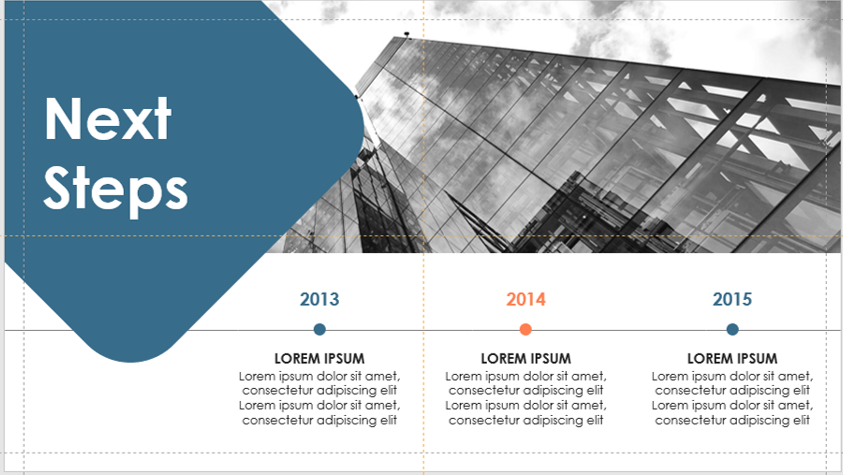
timeline
Tips for Effective Placement:
🎯 Align images and icons properly using PowerPoint’s alignment tools.
🎯 Keep spacing consistent to maintain a clean design.
🎯 Use icons to support, not replace, text.
🎯 Apply a cohesive color scheme by changing icon colors to match your theme.
Make use of PowerPoint’s built-in Design Ideas tool to automatically generate layouts that place images and icons in a visually appealing way. This tool can save time and prevent common alignment issues, especially when you’re working with multiple visuals on a single slide.
5. Common Mistakes to Avoid
🚫 Using too many images/icons, leading to visual clutter.
🚫 Stretching or distorting images, making them look unprofessional.
🚫 Ignoring accessibility, failing to add alt text for visually impaired viewers.
🚫 Mixing inconsistent styles, leading to a disjointed design.

To maintain brand consistency, consider creating a custom icon and image library that aligns with your brand’s colors, tone, and messaging. This small step can significantly elevate the professionalism of your slides.
Final Thoughts
Mastering the use of images and icons in PowerPoint can take your presentations to the next level. By choosing the right visuals, optimizing them, and placing them strategically, you can create slides that are both visually stunning and easy to understand.
🚀 Start applying these tips today and transform your PowerPoint slides into powerful storytelling tools!
Which tip do you find most useful? Let us know in the comments! 🎤
To read more please visit:


