Creating an effective PowerPoint presentation is more than just adding content to slides. The design choices you make—colors, fonts, and layout—have a direct impact on how your audience perceives and retains information. Understanding the science behind slide design can help you craft presentations that are visually appealing, persuasive, and easy to understand.
In this blog, we’ll explore how colors, fonts, and layout influence audience engagement and provide tips to optimize your PowerPoint slides for maximum impact.
The Psychology of Colors in Slide Design
Colors play a crucial role in evoking emotions and shaping perceptions. The right color scheme can make your presentation more engaging and memorable, while the wrong one can create confusion or disinterest.
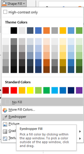
eye dropper
How Colors Influence Audience Perception:
- Red → Creates a sense of urgency, excitement, or importance
- Blue → Evokes trust, calmness, and professionalism
- Green → Symbolizes growth, balance, and harmony
- Yellow → Grabs attention and conveys positivity
- Black & White → Represents simplicity and sophistication
Best Practices for Using Colors in PowerPoint:
✅ Stick to 2-3 primary colors to maintain consistency.
✅ Use high-contrast combinations (e.g., dark text on a light background) for readability.
✅ Align colors with your brand identity or the emotional tone of your message.
✅ Utilize color psychology to emphasize key points or call-to-action elements.
Example: If you’re presenting financial reports, a blue and gray theme can create a professional and trustworthy impression.
Choosing the Right Fonts for Clarity & Impact
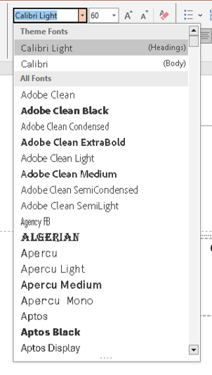 Fonts do more than display text—they affect readability, tone, and audience engagement. A poor font choice can make your slides look unprofessional or difficult to read.
Types of Fonts and Their Impact:
- Sans-serif fonts (e.g., Arial, Helvetica, Calibri) → Modern, clean, and easy to read. Best for digital presentations.
- Serif fonts (e.g., Times New Roman, Georgia) → Traditional, formal, and professional. Suitable for printed documents but less effective on slides.
- Display fonts (e.g., Script, Decorative fonts) → Eye-catching but can be distracting if overused. Best for headings only.
Best Practices for Using Fonts in PowerPoint:
✅ Stick to two fonts max—one for headings and one for body text.
✅ Use at least 24-28 pt font size for body text to ensure readability.
✅ Keep bold and italic use minimal to avoid visual clutter.
✅ Avoid all-caps except for short headings or emphasis.
Example: A sans-serif font like Calibri or Montserrat ensures readability on any screen size.
The Science Behind Effective Layouts
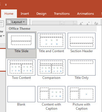
layouts
A well-structured layout helps guide the audience’s eyes, making it easier to absorb and retain information. Poorly arranged slides can lead to confusion and disengagement.
Principles of Effective Slide Layouts:
- Rule of Thirds: Divide your slide into a 3×3 grid and place key elements along the intersections to enhance visual balance.
- Hierarchy: Use larger fonts, bold colors, or positioning to emphasize key points.
- Whitespace: Give your content breathing room to avoid a cluttered look.
- Alignment: Keep text and visuals aligned to maintain a polished appearance.
Best Practices for Slide Layout:
✅ Use bullet points sparingly—keep each slide focused on one idea.
✅ Follow the 6×6 rule—no more than six words per line and six lines per slide.
✅ Place important elements (titles, key points, images) in strategic locations.
✅ Use consistent margins, spacing, and alignments to maintain professionalism.
Example: A title at the top, an image on one side, and supporting text on the other creates a visually balanced layout.
The Power of Visuals and Infographics
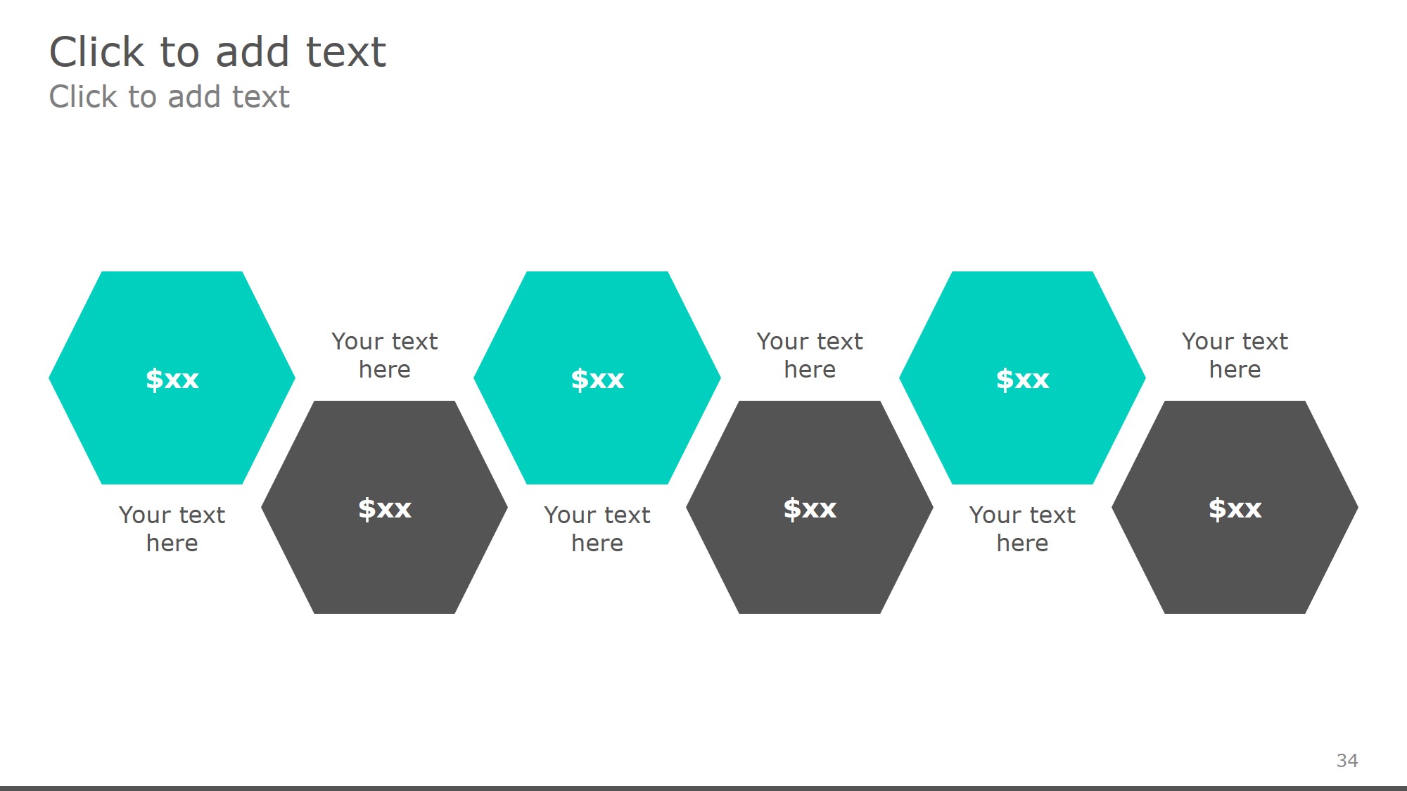
free powerpoint templates
Adding images, icons, and infographics enhances engagement and makes complex data easier to understand.
Why Visuals Matter:
🔹 People remember 65% of visual information compared to just 10% of spoken words.
🔹 Charts and graphs make data more digestible.
🔹 Icons and illustrations break monotony and add interest.
Best Practices for Using Visuals:
✅ Use high-quality, relevant images that support your message.
✅ Avoid overloading slides with too many visuals—keep it simple.
✅ Use icons and diagrams to replace large chunks of text.
✅ Optimize image placement to complement, not overpower, your content.
Example: Instead of listing statistics in bullet points, use a simple bar chart to illustrate trends effectively.
How to Test and Improve Your Slide Design
Even with great design principles, testing and refining your slides ensures they resonate with your audience.

Visual Enhancement
Ways to Evaluate Slide Effectiveness:
🔹 Conduct A/B Testing—Try two different versions of a slide and see which gets better engagement.
🔹 Ask for Feedback—Present to a colleague and get constructive criticism.
🔹 Use PowerPoint’s Slide Sorter View to check for consistency and flow.
Final Checklist for Optimized Slides:
✅ Are colors enhancing readability and emotion?
✅ Is the font choice clear and professional?
✅ Does the layout guide the viewer’s attention effectively?
✅ Are visuals adding value rather than clutter?
If the answer is YES, you’re on your way to a visually compelling and impactful PowerPoint presentation!
Final Thoughts
Designing an effective PowerPoint slide is both an art and a science. By using strategic colors, fonts, and layouts, you can create presentations that are engaging, persuasive, and memorable. The key is to keep it simple, structured, and visually appealing.
🚀 Now it’s your turn! Which design tip will you implement first? Let us know in the comments!
To read more please visit:

