

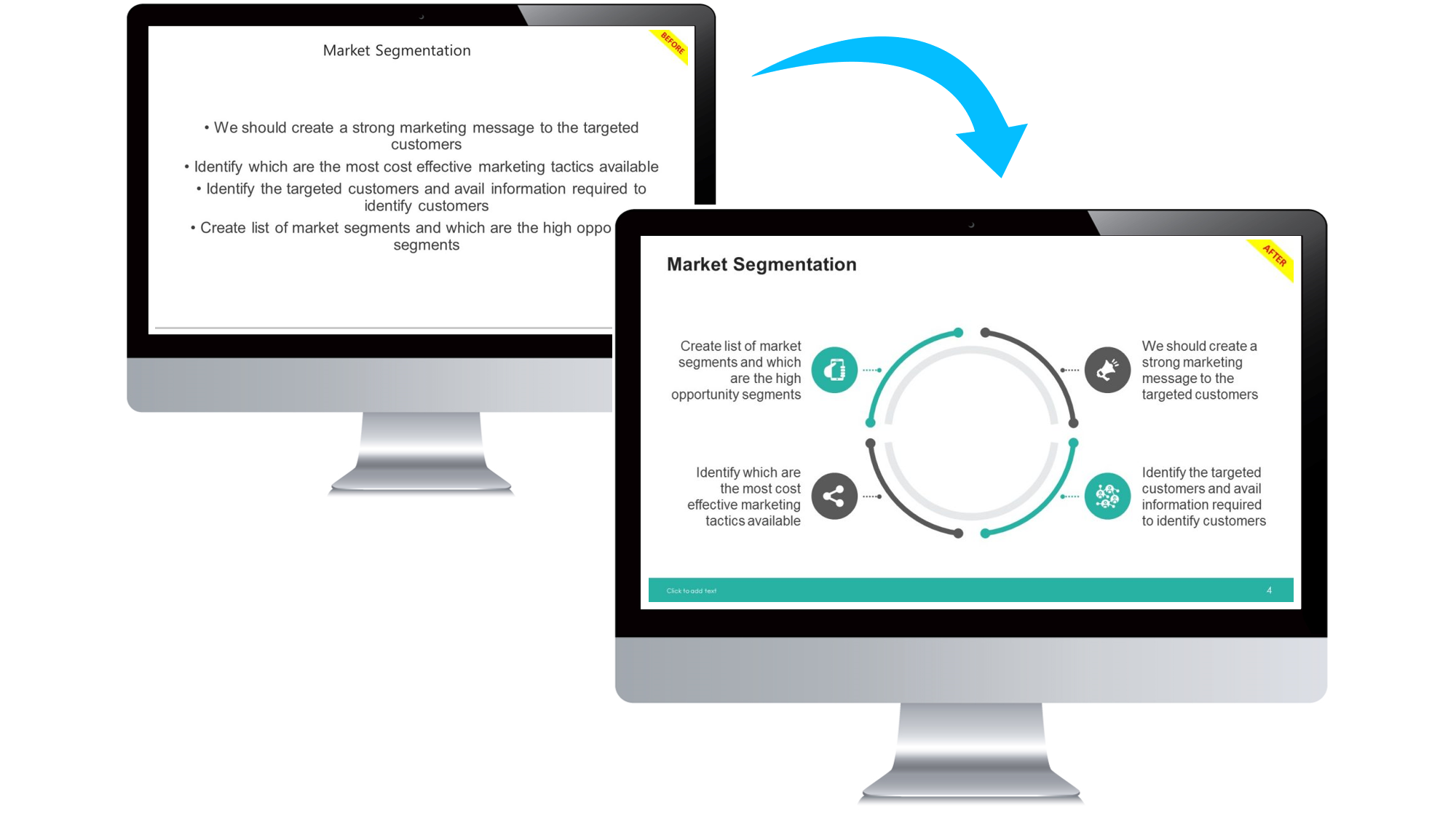
A picture is worth a thousand words—but only if it’s used correctly. In PowerPoint presentations, images and icons can make or break the message. Used well, they enhance clarity and emotion. Used poorly, they cause confusion or distraction.
In this blog, we’ll walk through how to use images and icons effectively in your slides—plus share free PowerPoint templates with built-in visual placeholders that simplify the process.
Why Visuals Matter More Than Ever
Studies show that visuals are processed 60,000x faster than text. Whether it’s a chart, photo, or icon, the right visual helps your audience:
- Understand your message faster
- Retain key information longer
- Feel more emotionally connected to your story
Want your visuals to drive impact? Don’t miss our blog: How to Make Your PowerPoint Slides More Engaging
How to Use Images Like a Pro
✅ Do:
- Use high-resolution photos (no pixelation)
- Choose images that directly support your point
- Apply consistent styles (e.g., color filters, borders)
- Use white space to avoid clutter

Light bulb with drawing graph
❌ Avoid:
- Generic stock photos that lack context
- Stretching or warping images
- Overlapping text and visuals

🔗 Browse our Free PowerPoint Templates designed with image placement in mind.
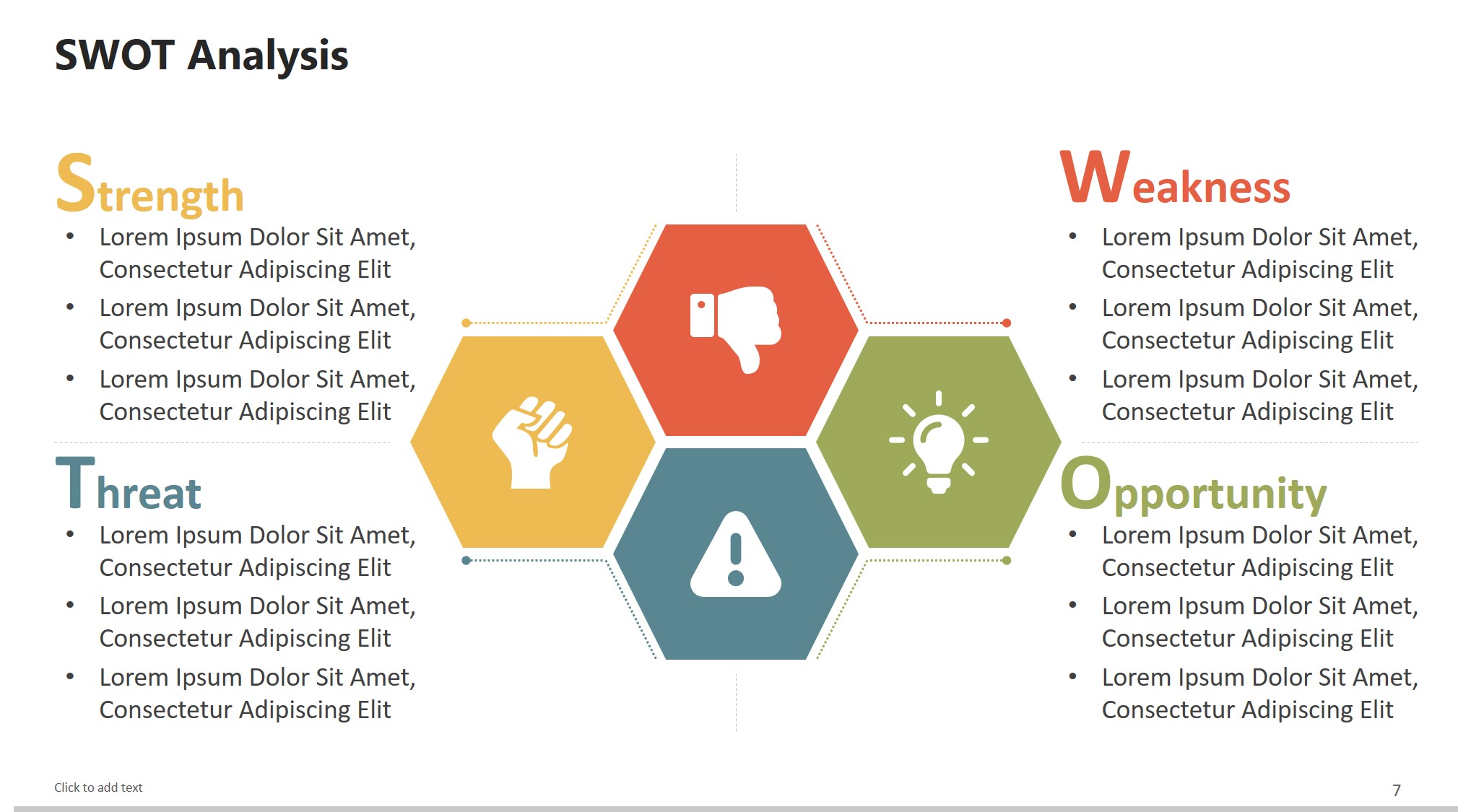
Icons: The Underrated Design Superpower
free powerpoint templates
Icons add clarity and visual interest without clutter. They work great for: – Breaking up bullet points – Representing features or benefits – Making data more digestible
Need inspiration? Check out 10 PowerPoint Tricks You Wish You Knew Earlier for more smart design shortcuts.
Where to Find High-Quality Visuals
Quick Tips for Consistency
- Stick to a single icon style (line, filled, flat)
- Align images and icons to the grid
- Keep your color scheme uniform across all visuals
Need more help? Read our full blog: The Psychology Behind Slide Design
Final Thoughts
Good visuals aren’t about decoration—they’re about communication. Done right, they simplify complex ideas, create emotional connections, and make your presentation more memorable.
When integrating visuals, always remember that less is more. Overloading slides with too many images can dilute the core message and overwhelm your audience. Instead, focus on selecting visuals that align perfectly with your narrative flow. For example, if you’re presenting market growth data, pairing a clean line chart with a subtle icon for “growth” can reinforce understanding without clutter.
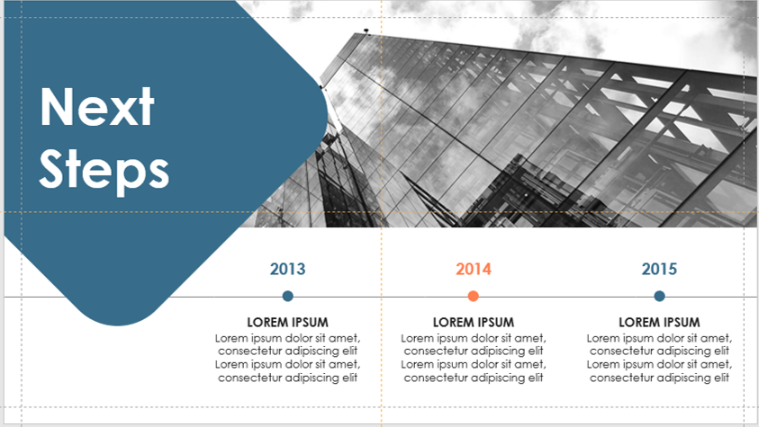
timeline
Also, consider accessibility—ensure that images have sufficient contrast for visibility and that any icons or infographics are clear when projected on larger screens. This is especially important in conference settings or webinars where display quality may vary.
If you often present in different environments, create a master folder of pre-approved visuals that match your brand identity. By using templates from SlideMasterz, you can ensure every presentation maintains a polished, professional, and brand-consistent look.
Finally, test your presentation visuals on multiple devices before the actual presentation. What looks crisp on your laptop might appear washed out or pixelated on a projector—small adjustments in brightness and contrast can make a big difference.
🎁 Download our Free PowerPoint Templates and let professionally crafted visuals do the hard work for you.
💡 Stop decorating—start communicating. Your visuals should speak louder than your text.


