

When creating a PowerPoint presentation, how your text is aligned can dramatically influence how your message is received. Misaligned or poorly formatted text can make even the most informative slide look unprofessional. Fortunately, PowerPoint offers several powerful tools and alignment options to help you achieve clean, organized layouts.
In this blog, we’ll cover the basics of text alignment in PowerPoint and show you how to use them effectively to make your presentations look polished and visually appealing. Proper text alignment is not just a matter of aesthetics—it’s also about maintaining viewer engagement and brand consistency. Whether you are preparing a corporate pitch, an academic lecture, or a visual-heavy report, correct alignment ensures that your slides look intentional and polished.
Why Text Alignment Matters
Text alignment is more than just an aesthetic choice. Proper alignment ensures that your slides:
- Look clean and professional
- Are easier to read
- Guide the viewer’s eye through your content logically
- Prevent distractions caused by inconsistent formatting
When alignment is off, it draws attention away from your message and makes your slides appear cluttered or amateurish. Inconsistent alignment can also impact accessibility for viewers who rely on screen readers or have visual processing difficulties. A well-structured alignment ensures your audience can follow your narrative seamlessly, especially during fast-paced presentations.
Types of Text Alignment in PowerPoint
PowerPoint offers four primary alignment options:
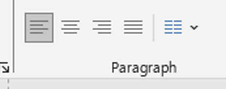
- Left Align – Text is aligned to the left edge. Best for most body text.
- Center Align – Centers the text. Great for slide titles or single-line emphasis.
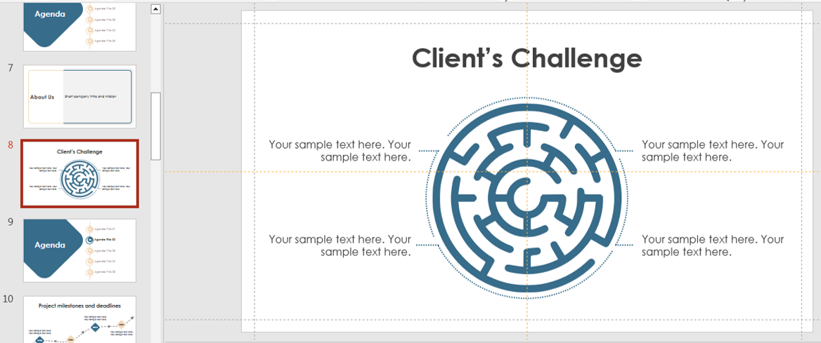
- Right Align – Aligns text to the right. Useful in charts or data-heavy slides.
- Justify – Aligns text to both left and right edges, adding spacing between words. Ideal for text-heavy slides but should be used carefully to avoid awkward spacing.
To access these, simply highlight your text and use the alignment options in the Home > Paragraph section of the ribbon. For professional results, match your alignment choice to your content type. For instance, marketing slides with quotes often use center alignment for emphasis, while training materials rely on left alignment for better readability. Experiment with combinations when working on infographics or timelines.
Using Text Boxes for Better Control
PowerPoint allows you to insert text boxes, which provide more control over positioning and alignment. To insert one:
- Go to Insert > Text Box.
- Click anywhere on the slide.
- Type your text.
- Use alignment tools in the ribbon or Format > Align to adjust its position.
With text boxes, you can also: – Rotate text – Wrap text around images – Resize and reposition with precision. One underrated trick is using transparent text boxes over images. This allows you to maintain alignment while ensuring the text stands out against the background.
Aligning Text Across Multiple Slides
Consistency is key in professional presentations. To align text uniformly across slides:
- Use the Slide Master feature (learn more here)

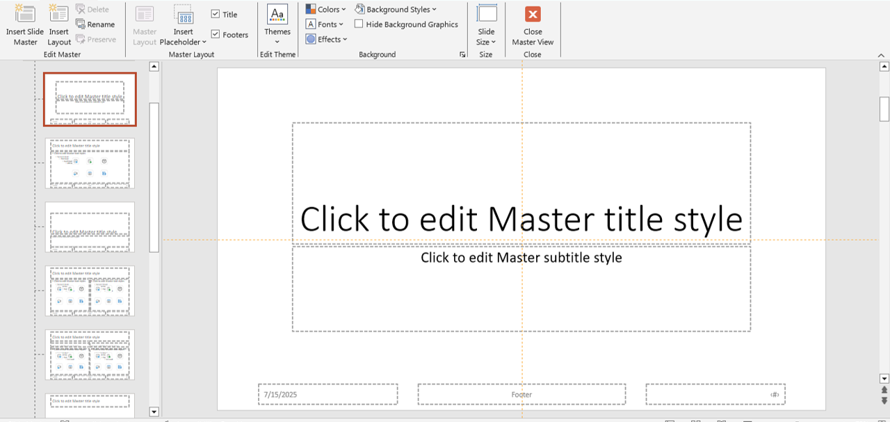
- Set predefined positions for titles and body text
- Use guides and grids for layout precision
You can also visit our detailed blog on How to Use PowerPoint’s Slide Master to maintain alignment and branding throughout your deck.
When working on large presentations with dozens of slides, batch formatting through the Slide Master saves hours of manual adjustments. This also ensures brand colors, typography, and alignment remain intact across all slides. For templates with pre-set alignment rules, explore our free download section.
Alignment Tools You Should Know
PowerPoint offers a set of tools under Shape Format > Align, which you can use not just for shapes but also for text boxes:
- Align Left/Center/Right
- Align Top/Middle/Bottom
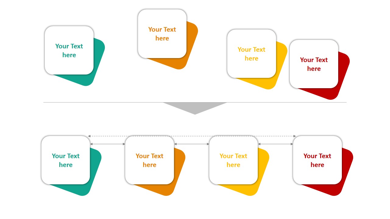
- Distribute Horizontally/Vertically
- Use Smart Guides for visual alignment hints
powerpoint alignment
Explore more hidden features in our blog on Hidden PowerPoint Features You Didn’t Know Exist.
Smart Guides are particularly helpful when collaborating on shared presentations, as they ensure all team members align elements the same way—even if they have different design habits. You can also lock certain text boxes to prevent accidental misalignment during edits.
Bonus Tip: Pair Text Alignment with Visual Balance
Good alignment is part of a bigger design principle: visual balance. Make sure your text doesn’t overpower other elements on your slide. Use white space effectively and align your text with icons, images, or charts for better harmony.
Want to spice up your slides? Download free professionally designed templates from our Free PowerPoint Templates Page to get a head start. Visual balance is not just about symmetry—it’s about making your slides look intentional. A title centered above an evenly spaced chart feels stable, while uneven alignment can make your audience feel visually unsettled. Pairing alignment with consistent margins also improves the overall design.
Final Thoughts
Mastering text alignment in PowerPoint isn’t just about lining things up—it’s about making your message clear and your slides appealing. Whether you’re designing from scratch or using templates, proper alignment boosts professionalism and viewer engagement.
By applying the principles discussed here and using pre-designed templates from SlideMasterz, you can significantly reduce the time spent adjusting layouts and focus more on delivering impactful content. Remember, in presentations, alignment is not a small detail—it’s the silent force that keeps your audience focused on your message.
Explore More:
– How to Choose the Right Colors for Your PowerPoint Presentation
– PowerPoint Typography: Choosing the Right Fonts for Impact
– PowerPoint Templates: Free Downloads
Stay tuned for more design tips and tricks!


