In today’s data-driven world, effective communication of information is crucial. PowerPoint is a powerful tool for presenting data visually, helping audiences understand complex information quickly and efficiently. However, not all charts and graphs are created equal. To truly master data visualization in PowerPoint, you need to select the right chart type, design it effectively, and ensure clarity in your presentation.
Let’s explore how to create clear, engaging, and impactful charts and graphs in PowerPoint.
1. Choosing the Right Chart Type
Different data sets require different visualization techniques. Selecting the right type of chart ensures that your audience can interpret the information correctly.
Common PowerPoint Chart Types & Their Uses:
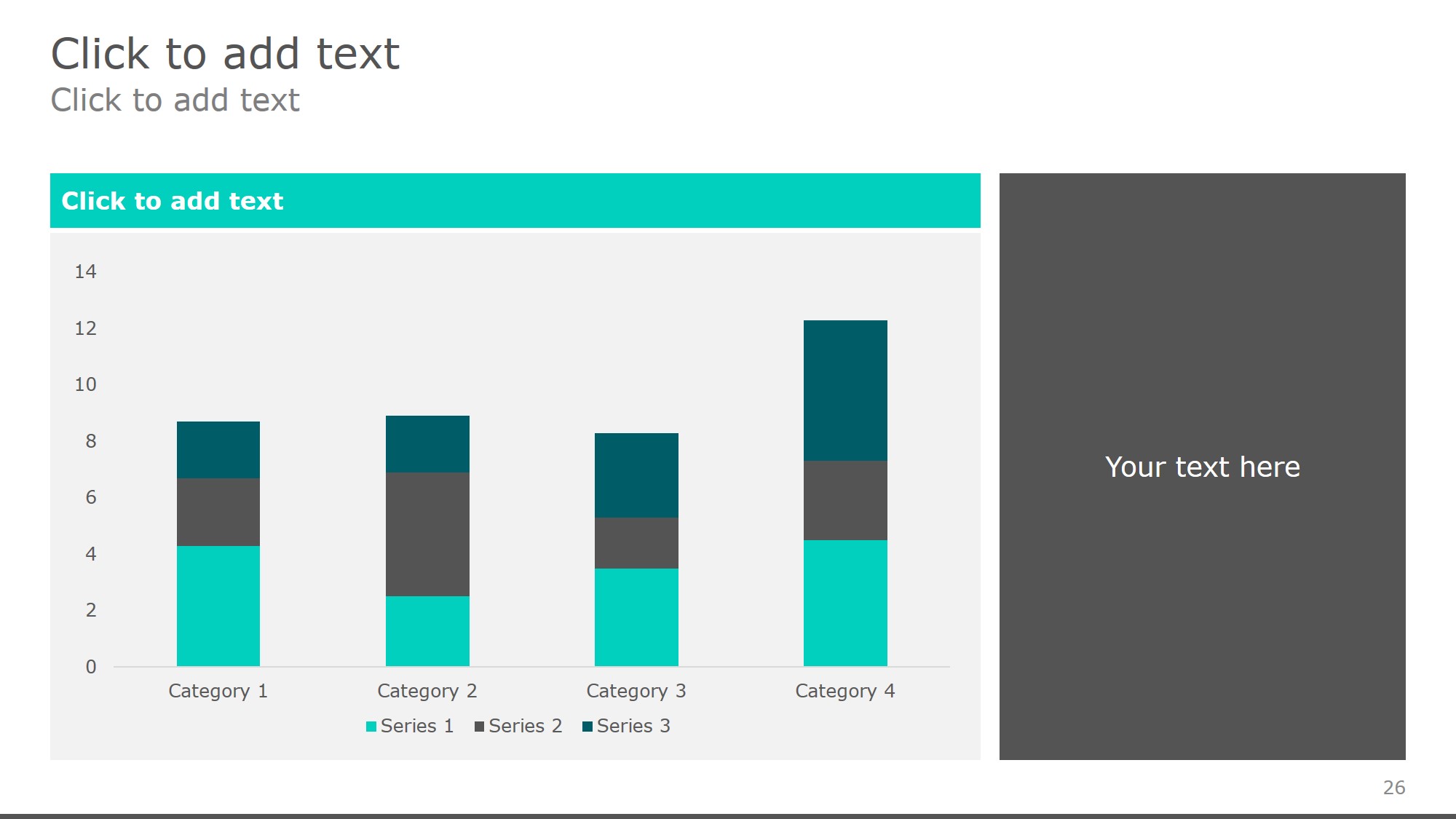
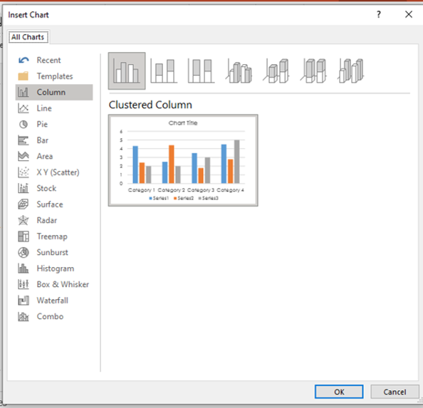
📊 Bar/Column Chart – Best for comparing different categories. 📈 Line Chart – Ideal for showing trends over time. 📉 Pie Chart – Used to display proportions or percentages. 📌 Scatter Plot – Great for showing relationships between variables. 📊 Area Chart – Helps show volume changes over time. 📊 Combo Chart – A mix of multiple chart types for complex data.
📌 Pro Tip: Avoid using 3D charts as they can distort data interpretation.
2. Designing Charts for Clarity
A well-designed chart should be simple, clean, and easy to read. Poorly formatted charts can confuse rather than clarify.
Best Practices for Chart Design:
✅ Use a clean layout with minimal distractions. ✅ Keep labels concise and avoid clutter. ✅ Use color strategically to highlight key data points. ✅ Maintain a consistent style across all slides. ✅ Avoid excessive gridlines – use only where necessary.
📌 Pro Tip: Use contrasting colors for better visibility but avoid overwhelming the viewer with too many shades.

free powerpoint templates
3. Customizing Charts in PowerPoint
PowerPoint offers built-in tools to modify and enhance your charts. Knowing how to customize elements can make a significant difference in readability and engagement.
How to Customize Your Chart:
🛠 Modify Axis Labels – Ensure they are clear and descriptive. 🎨 Change Colors & Styles – Use theme colors for consistency. 🔍 Adjust Data Labels – Display values directly on the chart where necessary. 📌 Resize Elements – Make sure everything is proportionate and legible. 📊 Add Trendlines – Helpful for highlighting patterns in data.
📌 Pro Tip: Stick to one or two font styles for a professional look.
4. Using SmartArt & Infographics for Data Storytelling
Charts and graphs aren’t the only ways to visualize data in PowerPoint. SmartArt and infographics can help present information in a more engaging and digestible format.
How to Enhance Data with Infographics:
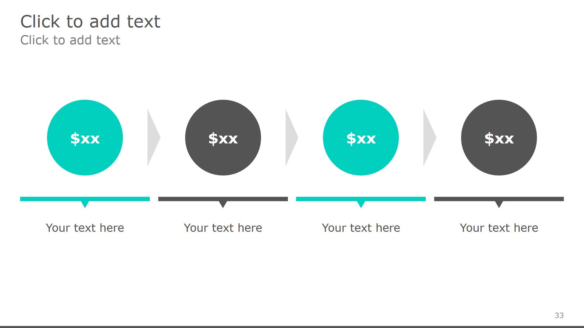
📍 Convert bullet points into SmartArt diagrams. 📍 Use icons and symbols to make key points stand out. 📍 Incorporate flowcharts for process-based data. 📍 Animate infographics for gradual information reveal.
📌 Pro Tip: Keep infographic designs simple—less is more when it comes to data visualization.

free powerpoint templates
5. Avoiding Common Mistakes in Data Visualization
Even well-intentioned visualizations can mislead or confuse if not designed properly.
Mistakes to Watch Out For:
🚫 Overloading the chart with excessive data. 🚫 Using too many colors that make it hard to focus. 🚫 Choosing the wrong chart type for the data. 🚫 Distorting scales – avoid exaggerating differences. 🚫 Ignoring accessibility – ensure colorblind-friendly design.
📌 Pro Tip: Always test your charts by showing them to a colleague before presenting.
6. Animating Charts for Engagement
Adding animations can help guide the audience’s focus, but overuse can be distracting. Use animations strategically to reveal data step by step.
Effective Ways to Animate Charts:
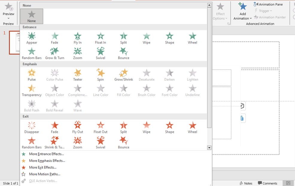
🎞 Fade in sections gradually to emphasize key points. 🎞 Use motion paths to show trends or flows. 🎞 Highlight specific data using emphasis effects. 🎞 Avoid excessive animations – keep it smooth and professional.
📌 Pro Tip: Use the Appear or Fade effect instead of flashy animations.

animations
7. Telling a Story with Your Data
Data alone isn’t enough—you need to guide your audience through a narrative that makes the numbers meaningful.
How to Craft a Data Story:
📖 Start with a question or problem the data addresses. 📖 Show key insights using visuals. 📖 Compare data points to highlight trends or anomalies. 📖 End with an action point or conclusion based on the data.
📌 Pro Tip: Make sure your final slide summarizes key takeaways clearly.
Final Thoughts
Mastering data visualization in PowerPoint isn’t just about creating charts—it’s about making information clear, engaging, and actionable. By selecting the right chart type, simplifying design, avoiding common mistakes, and crafting a compelling narrative, you can transform data into a powerful storytelling tool.
🚀 Now, try these techniques in your next PowerPoint presentation and bring your data to life!
Read more blogs here:


