

Choosing the right Color Palette for PowerPoint Presentation is crucial for capturing attention, conveying your message effectively, and ensuring your slides look professional. The right color scheme can enhance readability, evoke emotions, and create a lasting impression. In this guide, we’ll walk you through the key principles and best practices for selecting the perfect Color Palette for PowerPoint presentation.
Why Color Choice Matters
Colors play a vital role in communication, influencing how your audience perceives and processes information. Here’s why choosing the right Color Palette for PowerPoint is essential:
- Enhances Readability: A well-chosen contrast between text and background improves legibility.
- Evokes Emotions: Different colors trigger different psychological responses.
- Reinforces Branding: Consistent use of colors aligns with brand identity and professionalism.
- Improves Engagement: Visually appealing slides keep the audience focused and engaged.
colors
Color has the unique power to subconsciously influence how your message is interpreted. A warm-toned palette may create an inviting atmosphere, while cooler tones can make your presentation appear more formal. Consider your presentation setting—whether it’s a corporate boardroom or a classroom—and let your color choices support the tone and purpose of your content.
Key Factors to Consider When Choosing Color Palette for PowerPoint
1. Understand Color Psychology
Each color has a psychological impact on your audience. Here are some common associations:
- Blue – Trust, professionalism, calmness (ideal for corporate and technical presentations)
- Red – Passion, urgency, excitement (great for calls to action or emphasis)
- Green – Growth, stability, nature (useful for environmental and financial topics)
- Yellow – Energy, optimism, warmth (attention-grabbing, but should be used sparingly)
- Black/Grey – Sophistication, formality, neutrality (best for minimalist or modern designs)
color palette
PowerPoint users often overlook the emotional effect that colors have on attention span and retention. For example, using orange—a blend of red and yellow—can stimulate energy without the aggression of red. Use it sparingly to highlight key stats or action items.
You can explore more presentation formatting insights on our Formatting Text in PowerPoint blog.
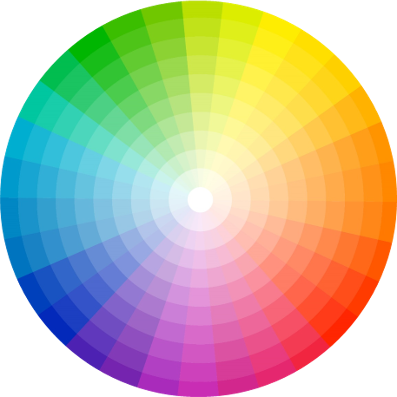
2. Use a Complementary or Analogous Color Scheme
- Complementary Colors: Colors that are opposite each other on the color wheel (e.g., blue and orange) create a striking contrast and are useful for highlighting key points.
- Analogous Colors: Colors that sit next to each other on the color wheel (e.g., blue and green) create a harmonious and professional look.
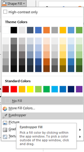
If you’re unsure about which color combinations to use, tools like Adobe Color or PowerPoint’s eyedropper feature can help you test real-time combinations. Remember, complementary colors are bold and should be balanced well with neutral tones.
3. Maintain High Contrast for Readability
A poor contrast between text and background can make your slides hard to read. Ensure your text stands out by:
- Using dark text on a light background (or vice versa)
- Avoiding overly bright or neon colors for backgrounds
- Testing your slides in different lighting conditions
tables
Try viewing your slides in grayscale before presenting—this is a quick hack to verify if your contrast is high enough. If the text still stands out in grayscale mode, your contrast is likely on point.
4. Keep It Simple: The 60-30-10 Rule
A well-balanced color scheme follows this principle:
- 60% Primary Color – Dominant color used for backgrounds
- 30% Secondary Color – Used for supporting elements (charts, shapes)
- 10% Accent Color – Used for highlights, call-to-action text, or key points
This rule also helps in guiding the viewer’s eye across the slide. The accent color should be used sparingly but strategically—for call-to-actions, icons, or headings you want the audience to remember. Don’t forget to maintain consistency in color use throughout the presentation.
5. Align Colors with Your Brand Identity
If you’re presenting on behalf of a company, ensure that your Color Palette for PowerPoint reflects your brand’s colors. Consistency in branding helps reinforce trust and recognition.
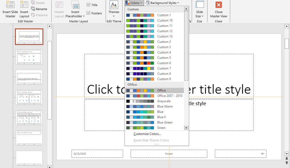
Use your brand’s hex codes directly in PowerPoint’s custom color options for precision. You can even save your customized theme under the “Design > Colors > Customize Colors” tab for future use.
Need help creating brand-consistent slide designs? Explore our Free PowerPoint Templates section to get started.
6. Use PowerPoint’s Built-in Color Themes
PowerPoint provides pre-designed color themes that ensure aesthetic consistency. To access them:
- Go to Design > Variants > Colors and choose a predefined theme.
- You can also create a custom color palette to match your brand.
eye dropper
These themes are especially helpful if you’re in a rush or unsure where to start. They also automatically adapt across new slides, ensuring you don’t miss a color inconsistency.
7. Test Your Colors on Different Screens
Colors may appear differently on various screens and projectors. Before your presentation, test your slides on multiple devices to ensure the colors remain visually appealing and readable. Ambient lighting can alter color perception. What looks vibrant on a monitor may appear dull on a projector. Always check in a live setting before the final presentation.
Final Thoughts
The right color choices can make a huge difference in how your PowerPoint presentation is received. By understanding color psychology, ensuring contrast, and maintaining a cohesive scheme, you can create slides that are both visually stunning and effective.
Color isn’t just decoration—it’s communication. Don’t just pick colors that “look nice.” Pick colors that say something about your message. Next time you design a presentation, remember: good color decisions aren’t just aesthetic—they’re strategic.
Next time you create a presentation, take a moment to carefully choose your colors—you’ll be surprised how much impact they can have!
What’s your go-to Color Palette for PowerPoint presentations? Share your thoughts in the comments! Or read more blog posts to sharpen your PowerPoint design skills. 🎨


