PowerPoint presentations are a powerful tool for communication, but outdated or cluttered slides can make even the most compelling message fall flat. If your old slides feel stale and uninspiring, it’s time for a transformation! With a few simple design and content tweaks, you can turn boring slides into brilliant, engaging visuals that captivate your audience.
Let’s dive into some expert strategies to revamp your old PowerPoint slides and give them a fresh, modern look!
Simplify Your Content
One of the biggest mistakes in old PowerPoint slides is text overload. Long paragraphs and cluttered bullet points make it difficult for audiences to focus and retain information.
How to Fix It:
✅ Break down long text into short, punchy bullet points.
✅ Use keywords and phrases instead of full sentences.
✅ Follow the 6×6 rule: No more than 6 words per line, 6 lines per slide.
✅ Consider using speaker notes instead of cramming all the details onto your slides.
📌 Before: A slide filled with paragraphs of text.
📌 After: A concise slide with key points supported by visuals.
Upgrade Your Fonts for Better Readability
Old presentations often use outdated or difficult-to-read fonts like Times New Roman or Comic Sans. Modern, clean fonts enhance readability and give your slides a polished, professional look.
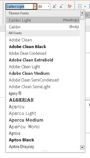 How to Fix It:
✅ Switch to modern sans-serif fonts like Calibri, Montserrat, or Open Sans. ✅ Use a minimum font size of 24pt for body text to ensure readability. ✅ Stick to two fonts max (one for headings, one for body text) to maintain consistency. ✅ Avoid using all caps, which can feel like shouting.
📌 Before: Small, cluttered text in an outdated font.
📌 After: Large, legible text with a clean font pairing.
Refresh Your Color Scheme
Color has a psychological impact on your audience. Outdated color schemes can make your slides look dull or hard to read.
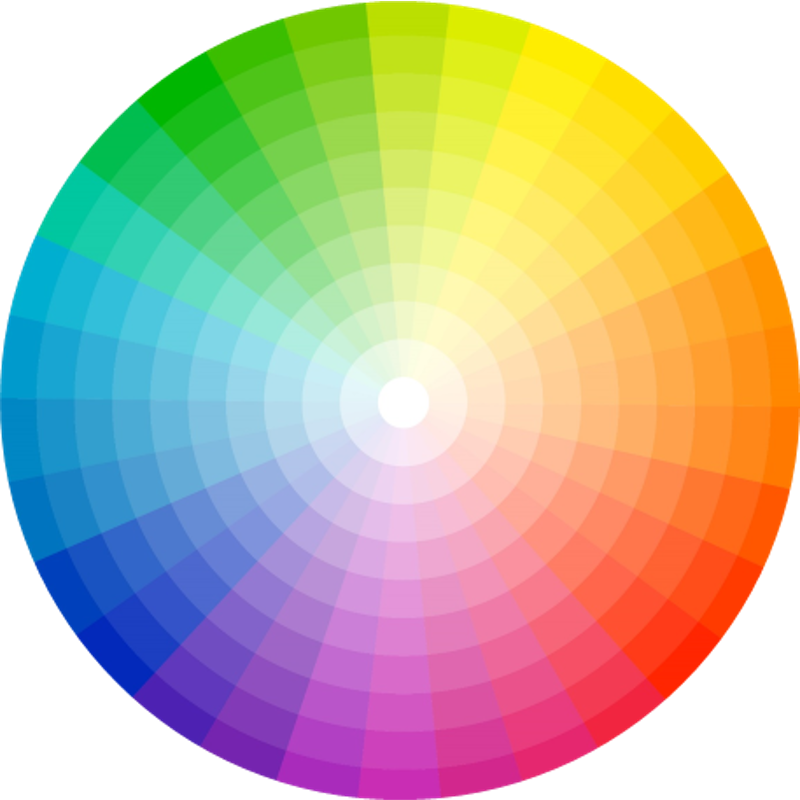
color palette
How to Fix It:
✅ Use high-contrast colors for text and background to enhance readability. ✅ Stick to brand colors or modern, visually appealing palettes. ✅ Avoid overly bright or clashing colors that strain the eyes. ✅ Utilize PowerPoint’s built-in color themes for a cohesive look.
📌 Before: A slide with a dull or overly bright color scheme.
📌 After: A modern, well-balanced color palette that enhances the presentation’s tone.
Replace Outdated Clipart with Modern Icons and Images
Nothing screams “outdated” more than old-school clipart. Today’s presentations use high-quality images and icons to communicate visually.

4 point diagram
How to Fix It:
✅ Replace clipart with high-resolution stock images (from PowerPoint’s stock library or free sites like Unsplash).
✅ Use simple icons (Insert > Icons) to illustrate concepts cleanly.
✅ Ensure images are relevant and enhance your message rather than distract.
📌 Before: A slide with pixelated clipart.
📌 After: A professional slide with sharp, meaningful visuals.
Use Consistent and Modern Slide Layouts
A messy, inconsistent layout makes it difficult for your audience to follow along. Clean, structured slides improve flow and engagement.
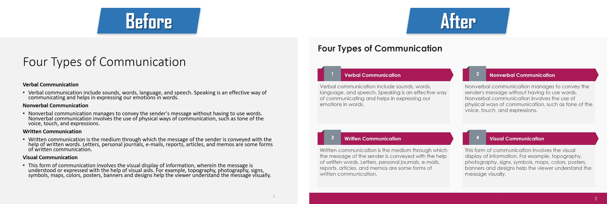
powerpoint presentation
How to Fix It:
✅ Use PowerPoint’s built-in slide templates for consistency.
✅ Align elements properly to avoid a cluttered look.
✅ Stick to a single layout style throughout your presentation.
✅ Add white space to avoid overwhelming your audience with too much content.
📌 Before: A slide with misaligned text and visuals.
📌 After: A well-structured slide with balanced spacing and clear alignment.
Add Subtle Animations and Transitions
Animations can make a presentation more engaging, but excessive effects can be distracting and unprofessional.
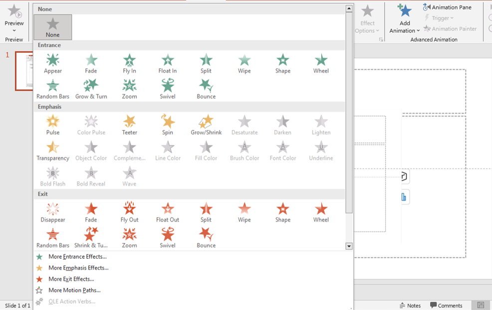
animations
How to Fix It:
✅ Use subtle animations (like Fade or Appear) to highlight key points.
✅ Apply consistent transitions between slides (like Morph or Push).
✅ Avoid flashy effects like Bounce or Spin, which can look unprofessional.
✅ Keep animations purposeful, not just decorative.
📌 Before: A slide overloaded with distracting animations.
📌 After: A smooth, engaging slide with subtle movement for emphasis.
Incorporate Infographics for Better Data Visualization
Instead of overwhelming your audience with tables full of numbers, use infographics to present data in a visually appealing way.
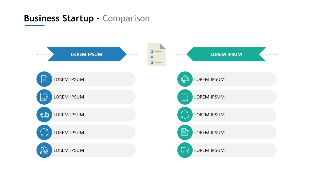 How to Fix It:
✅ Convert data into bar charts, pie charts, or infographics.
✅ Highlight key takeaways rather than displaying raw numbers.
✅ Keep charts simple and easy to interpret.
✅ Use icons to visually support statistics.
📌 Before: A slide filled with a dense, text-heavy table.
📌 After: A clean, visually engaging slide with a simple infographic.
Ensure Mobile-Friendliness
With more people viewing presentations on mobile devices, slides need to be readable on smaller screens.
How to Fix It:
✅ Use larger text and visuals to ensure readability on any device.
✅ Avoid overcrowding slides—stick to one idea per slide.
✅ Test your slides on different screen sizes before presenting.
📌 Before: A slide packed with tiny text and small visuals.
📌 After: A simple, clean slide that’s easy to read on mobile.
Final Thoughts
Revamping old PowerPoint slides doesn’t have to be overwhelming. By making a few strategic updates—cleaning up text, modernizing fonts, refreshing colors, using high-quality visuals, and optimizing layouts—you can transform outdated slides into stunning, impactful presentations.
🚀 Ready to give your PowerPoint slides a fresh new look? Start revamping today!
To read more please visit :


