
Icons are a powerful visual tool that can enhance your presentation, reinforce your message, and make your content easier to understand. But instead of relying solely on pre-made icons, why not design your own? PowerPoint’s shape tools make it surprisingly easy to create a custom icon set that matches your branding and presentation style.
In this blog, we’ll walk you through how to design unique icons using PowerPoint shapes—no graphic design experience required.
Why Create Your Own Icons in PowerPoint?
- Customization: Tailor icons to fit your content and branding
- Consistency: Ensure all visuals align with your design theme
- Creativity: Add a personal touch that generic icons can’t match
- Accessibility: No need for external design software
 Creating your own icons also allows you to maintain a unified tone across your entire presentation—perfect for corporate decks, academic slides, or portfolio showcases. Unlike downloading icons from various sources (which may vary in style), your PowerPoint-created icons can be built using the same lines, colors, and dimensions throughout. It’s especially useful if you’re reusing the presentation for different clients or industries and want to quickly swap icon styles while keeping the overall design intact.
Step-by-Step: Designing Custom Icons with Shapes
- Set Up Your Design Space
Start with a blank slide:
- Change the background to white or transparent for easy exporting
- Zoom in to give yourself more design space
You can also set up guides (View > Guides) to help align shapes evenly as you begin building your icon grid. For icon sets with multiple icons on one slide, use a consistent padding around each icon to maintain visual balance.
- Choose a Simple Concept
Think about the message or function of the icon (e.g., phone, chart, person, idea). Simplicity is key—stick to basic, recognizable forms. It’s helpful to sketch out a few rough ideas or look at similar icons for inspiration. Focus on the most essential shapes—users should be able to understand the icon’s meaning at a glance, even when it’s small. Start with universally recognized symbols and then slowly evolve your custom variation.
- Use PowerPoint Shapes as Building Blocks
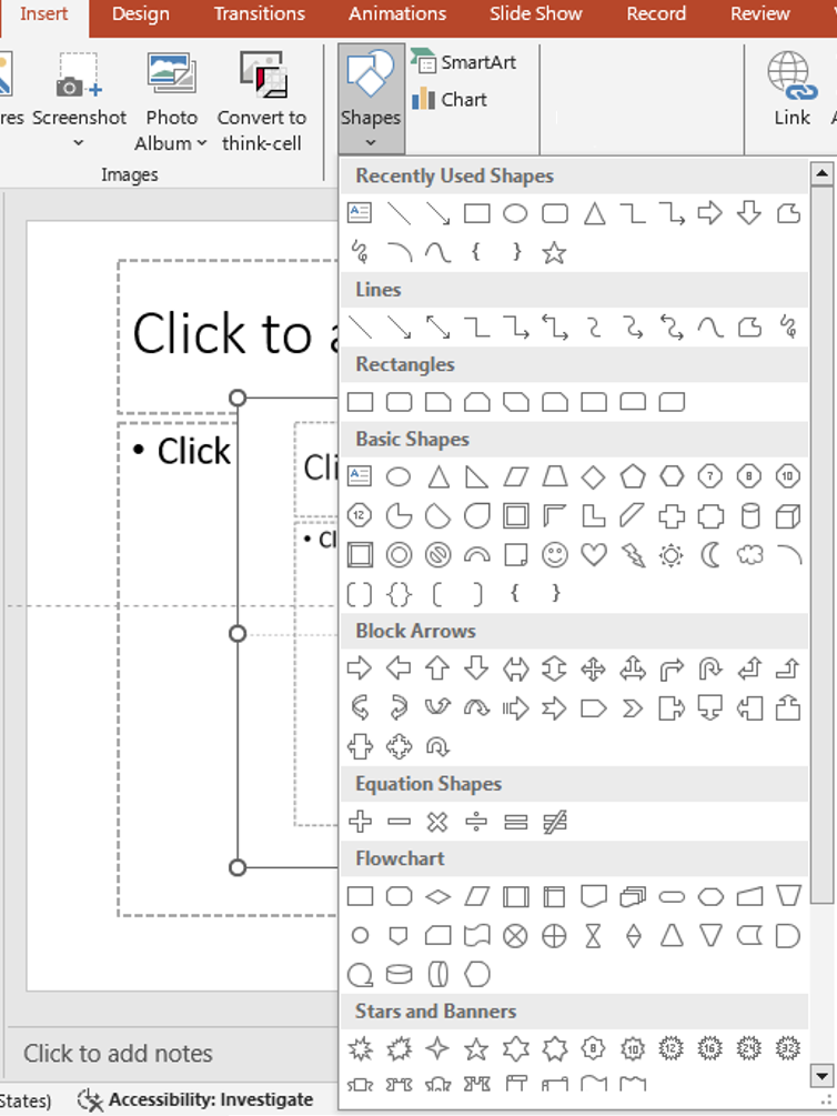
insert shapes
Head to Insert > Shapes and choose from:
- Circles, squares, and triangles
- Lines and arrows
- Flowchart and callout shapes
Use Merge Shapes under the Shape Format tab to combine, subtract, or intersect shapes for more complex designs. Merging shapes unlocks advanced customization—you can make a lightbulb by subtracting a circle from a triangle or create an envelope icon by combining rectangles and triangles. This method not only saves time but also reduces the need to import or trace external graphics. Try grouping several base shapes together before merging to visualize how they will appear as a single unit.
- Align and Size Consistently
- Use the Align tools to center elements
- Keep a consistent size for all icons
- Create a visual grid to maintain uniform spacing and layout
Use the Selection Pane (Home > Select > Selection Pane) to manage each shape and layer precisely. Locking background elements prevents accidental movement while adjusting overlays. For icon sets, create a reusable layout frame with labeled spacing guides to speed up your workflow.
- Add Color and Style
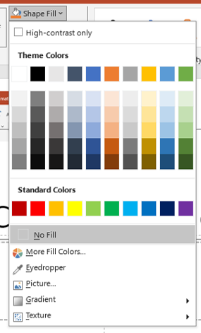 Apply your brand colors or a monochromatic scheme:
- Use Shape Fill and Outline options
- Keep styles minimal for a clean, professional look
Try using subtle gradients or soft shadows to give depth without cluttering the icon. If your presentation has a dark background, use white or light-colored icons with semi-transparent overlays to ensure high contrast and visibility. Stick to 1-2 colors per icon unless you’re intentionally designing multicolored sets for infographics.
- Group and Export
Once your icon is complete:
- Select all elements and Group them
- Right-click > Save as Picture to export the icon as PNG or SVG
Exporting as SVG (Scalable Vector Graphics) ensures your icons stay crisp even when resized—ideal for reusing them on websites, reports, or infographics. Make sure the slide background is transparent before exporting for a cleaner look.
Tips for Icon Design in PowerPoint
- Use simple geometry to maintain clarity at small sizes
- Limit icons to 1-2 colors for a cohesive style
- Test your icons on slides to ensure readability
- Duplicate and modify shapes to build variations quickly
When creating multiple icons, name each one clearly (e.g., “Icon_Email”, “Icon_Chart”) for easy organization, especially when exporting or importing into other decks. Keep a “Master Slide” where all icons are stored—this becomes your personal library you can copy from anytime.
Ideas for Custom Icons You Can Make
- Social media icons (custom logos or simplified symbols)
- Business tools (documents, graphs, briefcases)
- Communication (chat bubbles, phones, email)
- Educational (books, pencils, graduation caps)
You can also create icons for data visualizations—like bar graphs, pie charts, or dashboards—and use them as clickable buttons in interactive slides. These types of icons are perfect for business reports, client updates, or training decks.
Final Thoughts
Designing custom icon sets with PowerPoint shapes is a great way to enhance your presentations without relying on external graphics. It gives you control over style, color, and consistency—plus, it’s easy to update and reuse. By mastering this technique, you unlock an advanced level of visual customization inside PowerPoint—without ever leaving the app. Whether you’re a startup founder, freelancer, or educator, building your own icon system gives your slides a polished and professional touch.


