

Infographics are one of the most effective ways to communicate complex information quickly and clearly. The good news? You don’t need expensive software to make them. PowerPoint, with its built-in shape tools, is a powerful platform for designing engaging, data-driven visuals.
In this blog, we’ll walk you through how to create stunning infographics using nothing but PowerPoint shapes.
Why Use PowerPoint for Infographics?
PowerPoint offers:
free powerpoint templates
- An intuitive drag-and-drop interface
- Customizable shapes and smart formatting
- Easy alignment and grouping tools
- Built-in icons, charts, and design templates
These features make it easy for beginners and pros alike to craft polished visuals. Moreover, using PowerPoint for infographics is especially useful in business presentations, educational materials, and digital marketing efforts. Instead of relying on complicated software like Adobe Illustrator, PowerPoint gives you immediate access to editing tools, saving both time and effort. Whether you’re a student creating a class project or a professional preparing a report, PowerPoint infographics offer a balance of simplicity and sophistication.
Step-by-Step: Creating Infographics with Shapes
Plan Your Content
Before you design, decide:
- What is the core message?
- Who is the audience?
- What data or insights need to be highlighted?
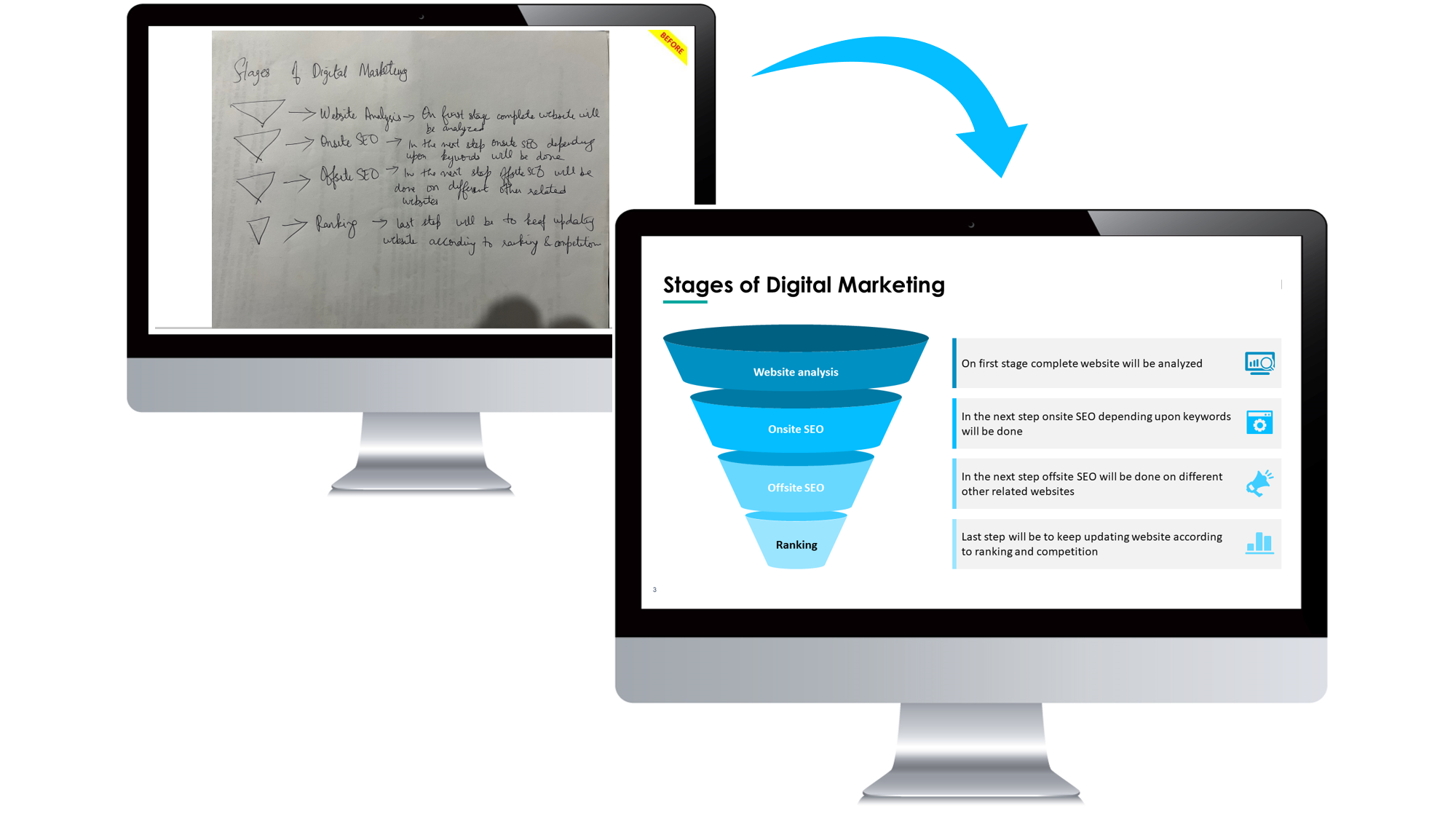
Image Recreation
Sketch your layout on paper or mentally plan it before jumping into PowerPoint. Planning ensures that your infographic doesn’t just look good but also delivers value. A well-planned infographic can increase viewer retention, engagement, and even sharing if you’re posting it online. Consider structuring the layout from top to bottom or left to right, depending on how your audience typically processes information.
Choose the Right Slide Size
Go to Design > Slide Size > Custom Slide Size and set dimensions based on where you plan to use the infographic (e.g., portrait for print, widescreen for screens). If you’re creating content for platforms like Pinterest or Instagram, choosing a vertical or square layout may work better. For blog embedding, a widescreen format (16:9) is often ideal. You can later export your slide as a high-resolution PNG or PDF.
Use Shapes as Building Blocks
PowerPoint offers dozens of shapes: rectangles, circles, arrows, banners, callouts, and more.
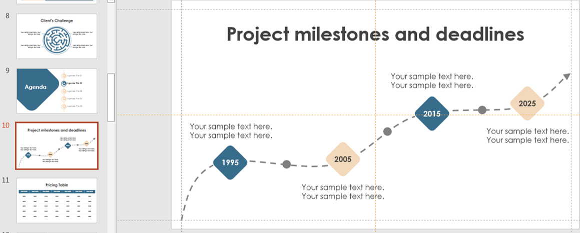
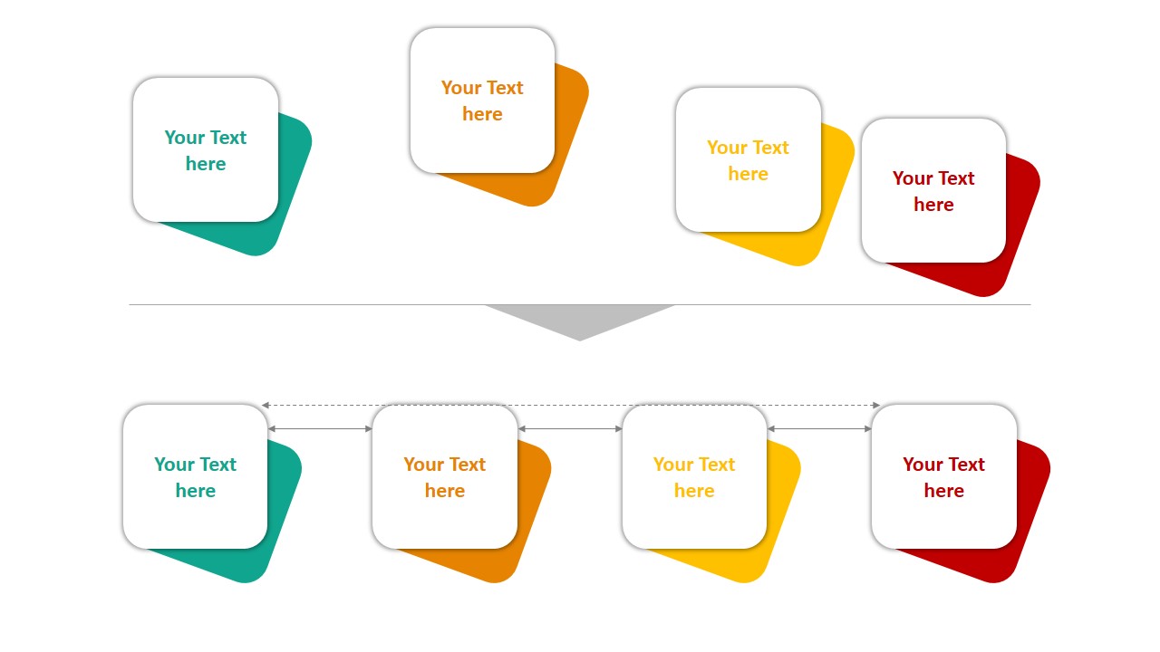
timeline
Use them to build:
- Process diagrams with arrows and steps
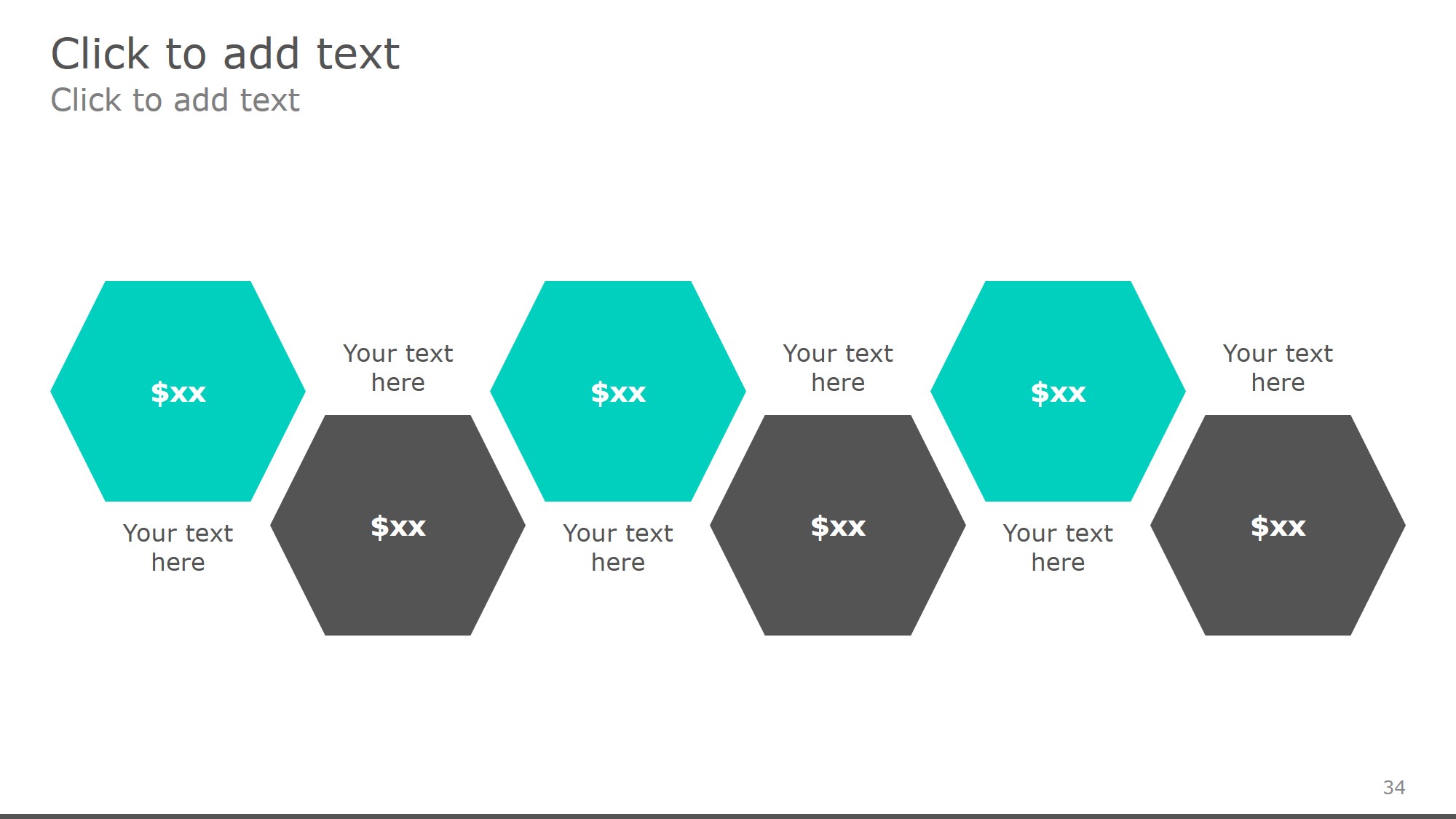
- Stat blocks with circles or hexagons
- Comparison charts using side-by-side shapes
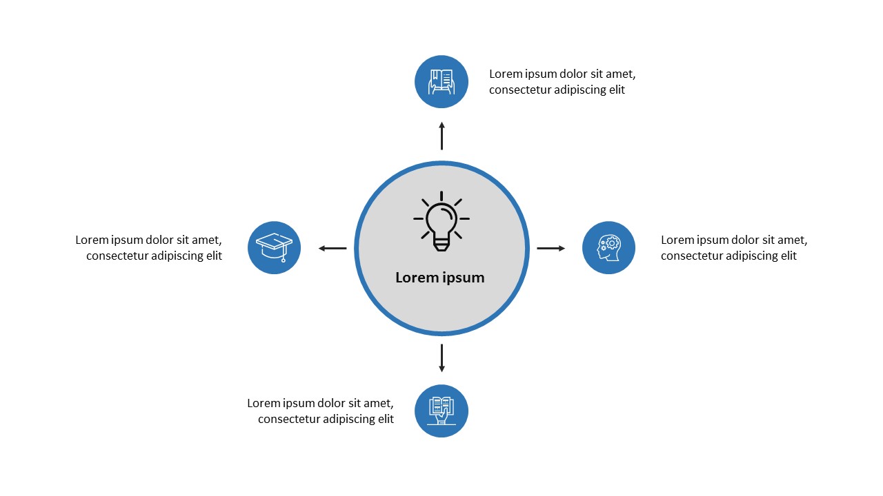
Each element should have a clear purpose and support the overall message. You can also layer multiple shapes to create custom icons, progress meters, or decision trees. For example, placing smaller circles within a larger one can mimic a pie chart effect. Think beyond the basic use—combine multiple shapes creatively to build visual metaphors or story flows.
Add Text and Icons
You can insert text directly into shapes. Use bold fonts, hierarchy, and color to make important info stand out.
To insert icons:
- Go to Insert > Icons
- Search for relevant symbols
- Place them inside or near shapes to reinforce meaning
PowerPoint Diagrams
Make sure your text is concise and legible. Avoid long paragraphs—use bullet points or bolded stats for quick reading. Icons should support the message, not distract. If needed, use third-party icon packs (ensuring they are royalty-free or properly credited).
Apply Color and Style
Stick to a consistent color palette (3-5 colors max). Use shades of the same hue for visual unity.
Enhance design with:
- Shape Fill: Solid, gradient, or transparent backgrounds
- Shape Outline: Light or bold lines for contrast
- Effects: Subtle shadows or glow for depth
Align and Distribute Elements
powerpoint alignment
Use Align and Distribute tools from the Shape Format tab to:
- Keep shapes evenly spaced
- Maintain symmetry
- Create visual balance
Group related elements together to keep them organized. Alignment ensures your infographic looks professional. Uneven spacing or misaligned objects can quickly reduce trust in your design, no matter how great the content is. Always preview your layout in Slide Show mode to see how it will appear to viewers.
Use Data Visuals
Shapes can represent data! For example:
- Use stacked rectangles for population comparisons
- Use filled circles to show percentages (like donut charts)
- Use grouped shapes to illustrate categories
You can also insert charts and use shapes to annotate or highlight key data points. You can even use shapes to create visually impactful dashboards. For example, by combining a circle with a needle shape, you can mimic a speedometer chart. When used smartly, these visuals reduce cognitive load and increase data retention.
Tips for a Strong Infographic
- ✅ Keep text brief and to the point
- ✅ Use white space to avoid clutter
- ✅ Focus on one message per section
- ✅ Use visuals over words whenever possible
Also, remember to test your infographic. Share it with a friend or colleague to ensure the message is clear and the layout is engaging. If it takes more than 10 seconds to understand, you may need to simplify it.
Final Thoughts
PowerPoint shapes are more than decorative elements—they’re powerful tools for visual storytelling. With a bit of planning and creativity, you can transform your presentations into eye-catching infographics that make an impact.
📊 Start creating with shapes today and let your data speak visually!


