

When you think of PowerPoint, chances are your mind jumps to slides filled with bullet points. While bullets can be useful, overusing them makes presentations look monotonous and uninspired. If you’re aiming to create more engaging and visually dynamic slides, it’s time to go beyond bullet points.
Audiences today are exposed to countless presentations—whether in meetings, classrooms, or conferences—and most follow the same pattern of text-heavy bullet points. This repetitive approach makes it harder for your slides to stand out and for your message to leave a lasting impression. By intentionally replacing or reducing bullet points, you can differentiate your presentation style, making it more interactive, visually attractive, and easier for viewers to connect with.
In this blog, we’ll explore creative alternatives for presenting lists that will keep your audience interested and improve information retention.
Why Move Away from Bullet Points?
- They create visual clutter
- Viewers tend to skim or ignore them
- They reduce storytelling potential
- They encourage reading rather than listening
Bullet points also tend to limit creativity because they encourage a linear, predictable flow. When your audience can guess the next slide’s format, they’re less likely to stay curious. In educational or training sessions, bullet-heavy slides can even cause “information overload,” where people disengage due to too much static text. Using variety in your list design keeps the mind alert, supports different learning styles, and strengthens emotional engagement.
By replacing bullet points with more visually engaging formats, you can make your content clearer and more memorable.
Creative Alternatives to Bullet Lists
- Icons with Short Text
Instead of listing features or services in bullet points, represent each item with an icon and a short label underneath. This approach is visually appealing and immediately communicates the idea.
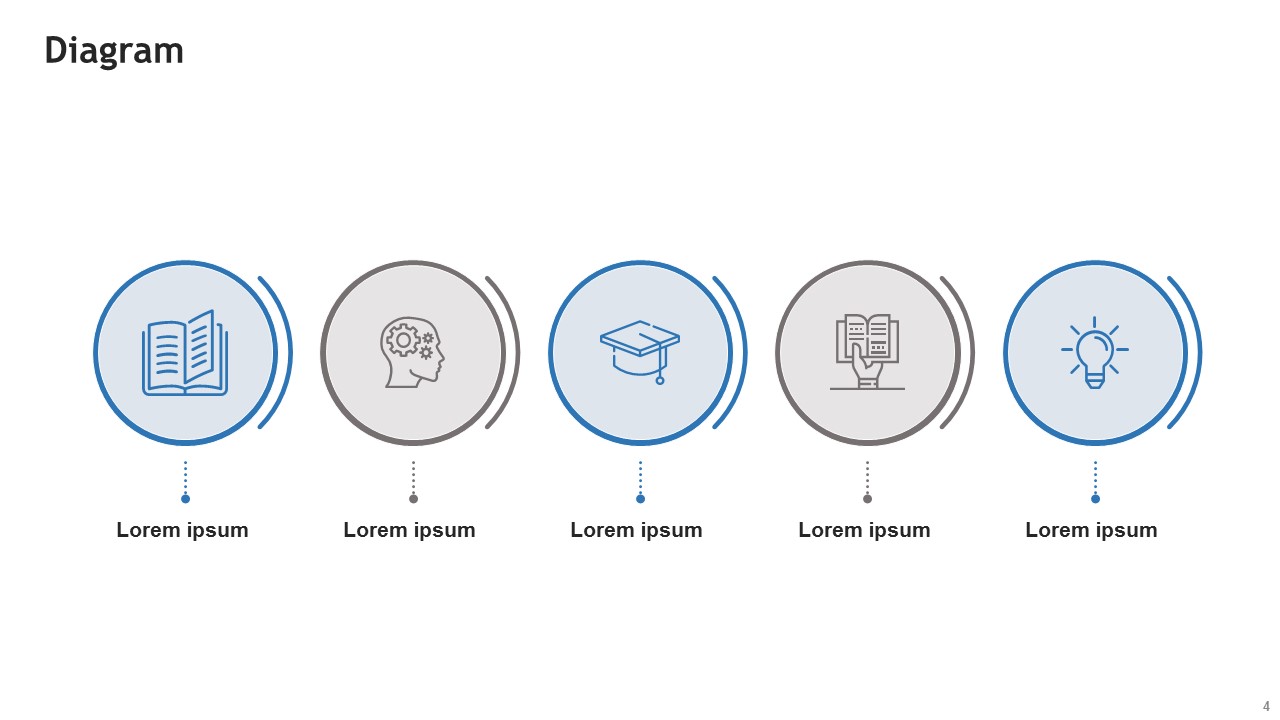
powerpoint diagram
Icons also serve as quick visual anchors—your audience can associate each symbol with a concept without having to read every word. For example, a “shield” icon might instantly communicate security, while a “lightbulb” represents ideas or innovation. This method works especially well when you need to display information in multiple languages, as the imagery bridges communication gaps.
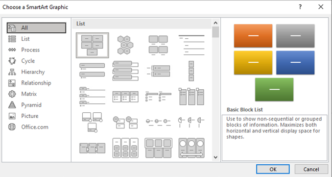
- SmartArt Graphics
PowerPoint’s SmartArt offers diagram-based layouts that visually organize information. Use options like:
- Process (for sequences)
- Cycle (for loops)
- Hierarchy (for organizational structures)
SmartArt can be easily customized with brand colors, gradients, and effects, ensuring your design stays on-brand while being functional. You can also animate SmartArt elements to reveal information step-by-step, preventing viewers from reading ahead and keeping their attention synchronized with your speech.
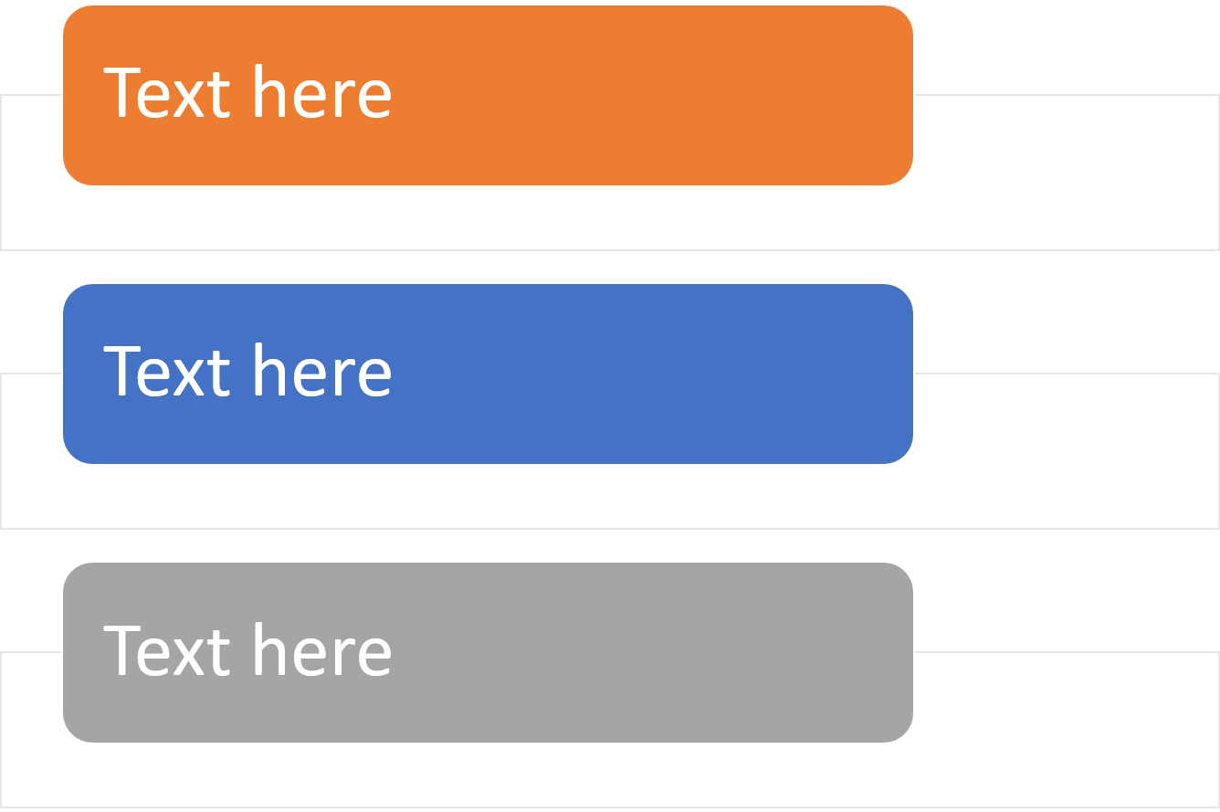
- Grids and Cards
Create a grid or card-style layout where each point gets its own space. This method is perfect for comparisons or grouped information and helps organize content neatly. Card layouts mimic the structure of popular social media feeds and modern web design, making them instantly familiar to most audiences. You can use different background colors or patterns for each card to separate ideas visually, and even embed small visuals or photos for better context.
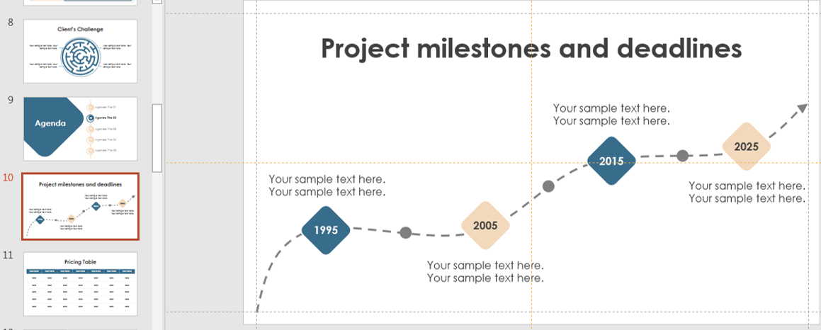
- Timelines
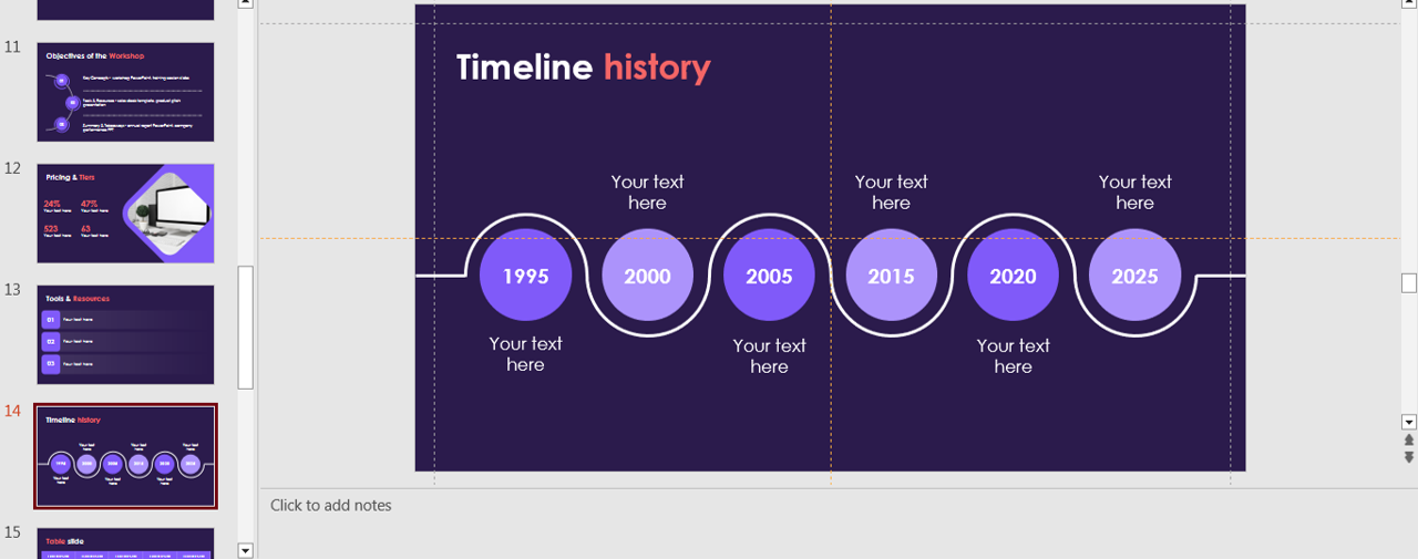
timeline
For chronological lists or historical data, timelines are much more engaging than bullets. PowerPoint’s built-in timeline templates make this easy. A well-designed timeline can also highlight cause-and-effect relationships or show progress toward a goal. Adding icons, milestone markers, or even small photos along the timeline can make it more dynamic and memorable. Timelines are especially powerful for project updates, product development history, or event schedules.
- Infographics
Infographics combine visuals, icons, and concise text to present information attractively. Use shapes, charts, and custom graphics to replace static lists. You don’t need advanced design tools to create infographics—PowerPoint shapes, charts, and SmartArt can be combined to make highly engaging designs. Infographics work particularly well for summarizing research findings, breaking down complex processes, or comparing multiple data points in a way that’s easy for the eye to scan.
- Clickable Tabs or Menus
Turn each list item into a clickable button or tab that reveals more information. This works well for interactive or non-linear presentations. This approach is ideal for self-paced learning or sales pitches where you may want to tailor content on the spot. By linking each tab to a different slide, you allow your presentation to flow more like a website—letting the audience choose the order in which they consume information.
- Tables with Style
Stylized tables with icons, alternating colors, and minimal text can turn dry lists into sleek, professional layouts. To keep your tables visually appealing, limit text to short phrases and use strong color contrast for readability. Icons or checkmarks within the table cells can make comparisons clearer, while subtle shading can help guide the eye row by row.
- Comparison Charts
If your list is comparing features, options, or ideas, convert it into a comparison chart. Use checkmarks, color coding, or rating systems to simplify. Comparison charts are particularly effective in decision-making presentations, as they allow viewers to process pros and cons at a glance. Consider adding visual elements like star ratings or progress bars to show qualitative differences more intuitively.
Tips for Better List Presentation
- Use minimal text: Aim for keywords, not full sentences
- Visual hierarchy matters: Use size, color, and placement to guide attention
- Consistency: Stick to a style throughout your deck to keep it cohesive
- Animation: Reveal one item at a time to maintain focus
timeline
Also, remember that whitespace is your friend—crowding too much onto a slide can undo the benefits of any design. Balancing visuals with breathing room helps prevent mental fatigue and makes your slides look cleaner.
When to Still Use Bullet Points
Bullet points aren’t evil—they have their place, especially for:
- Quick summaries
- Speaker notes
- Dense information that must remain in list form
Just be mindful of how frequently and where you use them. When using bullet points, try limiting them to three to five per slide. Also, consider enhancing them with small icons, bold keywords, or subtle animations to keep them visually appealing.
Final Thoughts
Breaking away from bullet points unlocks the visual potential of your PowerPoint slides. Whether you’re presenting data, ideas, or narratives, using creative alternatives makes your content more impactful and memorable. Over time, practicing these alternative design approaches will make them second nature, allowing you to craft presentations that not only inform but also inspire. This shift away from default bullet points toward more visually dynamic slides can be the factor that sets your presentation apart in a crowded room.
🌟 Next time you’re building a slide, challenge yourself to skip the bullets and try one of these techniques instead. Your audience will thank you!


