

When it comes to presentation design, your background sets the tone for everything. A well-chosen background can make your slides look professional, visually appealing, and easy to follow. On the other hand, poor background choices can make slides distracting, messy, or hard to read.
In PowerPoint, backgrounds aren’t just decorative—they guide the audience’s focus and influence how your message is perceived. In this guide, we’ll explore how to choose and customize PowerPoint backgrounds effectively, along with step-by-step instructions and practical design tips.
Why PowerPoint Backgrounds Matter
A background is the foundation of your slide design. It provides:
- Visual consistency across your presentation.
- Focus control, helping text and visuals stand out.
- Mood and tone setting, making content feel professional, creative, or formal.
Choosing the right background ensures that your audience focuses on your message, not just the design.
Types of Backgrounds in PowerPoint
PowerPoint offers several types of backgrounds. Here’s a breakdown:
- Solid Color Backgrounds
Simple and effective. Solid colors are great for minimalist presentations.
- Use light colors for bright, professional looks.
- Use dark colors when showcasing visuals like photos or videos.
- Gradient Backgrounds
Gradients add depth without overwhelming your content. They work well for modern and creative presentations.
- Picture Backgrounds
You can set any image as a slide background. This works well for visual storytelling but requires careful selection to avoid clutter.
- Texture or Pattern Backgrounds
Patterns can give slides a stylish touch, but overusing them can make slides distracting.
- Custom Designed Backgrounds
Professionally designed templates often come with custom backgrounds that are both visually appealing and content-friendly.
👉 Explore ready-made designs in our Premium PowerPoint Templates collection.
How to Choose the Right PowerPoint Background
When choosing a background, ask yourself:
- Is it readable? – Text should be clear against the background.
- Is it professional? – Backgrounds should match the presentation’s tone (e.g., business, education, creative).
- Does it support the content? – A background should enhance, not overpower, your slides.
- Is it consistent? – Stick to one theme throughout the deck.
Pro Tip: Always use backgrounds that complement your brand’s color palette for consistency.
Step-by-Step: How to Customize Backgrounds in PowerPoint
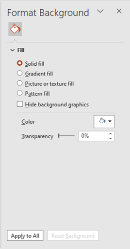
- Apply a Background
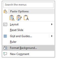
- Right-click on the slide → Format Background.
- Choose Solid Fill, Gradient Fill, Picture or Texture Fill, or Pattern Fill.
- Insert a Picture Background
- Go to Format Background → Picture or Texture Fill.
- Upload your image (ensure it’s high resolution).
- Use the Transparency slider to make text more readable.
- Use Gradient Backgrounds
- Select Gradient Fill under Format Background.
- Choose color stops, gradient direction, and transparency.
- Apply to All Slides
If you want consistency, click Apply to All to use the background across the presentation.
Tips for Effective Backgrounds
Here are some design best practices to make backgrounds work for you:
- Keep it simple – Busy backgrounds distract from your message.
- Use contrast – Ensure text color stands out from the background.
- Avoid low-quality images – Pixelated images reduce professionalism.
- Consider accessibility – Use high-contrast colors for better readability.
- Match with fonts and icons – A background should complement, not clash, with other design elements.
Common Mistakes to Avoid
- Using images with too much detail (makes text hard to read).
- Adding different backgrounds to every slide (breaks consistency).
- Using loud colors that strain the eyes.
- Forgetting to test in Slide Show mode—what looks good in edit mode may not work in presentation mode.
Practical Examples of Background Usage
- Corporate Presentations – Use clean, solid backgrounds with brand colors.
- Educational Slides – Light backgrounds with subtle gradients improve readability.
- Creative Pitches – Picture backgrounds can tell a visual story if paired with overlays.
For ready-to-use designs, try our Free PowerPoint Templates collection. Each template includes professional backgrounds you can customize easily.
Related PowerPoint Guides
If you’re learning the basics of PowerPoint design, check out these helpful tutorials on our blog:
- How to Insert and Format Shapes in PowerPoint (Step-by-Step)
- Using PowerPoint Charts: Visualizing Data Effectively
- Adding Hyperlinks in PowerPoint: A Beginner’s Guide
Conclusion
PowerPoint backgrounds are more than a design choice—they’re a communication tool. By selecting the right background and customizing it effectively, you can make your presentations look polished, professional, and engaging.
Remember, the goal of a background is to support your content. Keep it simple, relevant, and consistent, and your audience will stay focused on your message instead of being distracted by design flaws.
If you want a shortcut to professional design, explore our Premium Templates for business, education, and creative needs.


