Numbers alone rarely inspire. But when you transform raw data into a chart that’s clear, engaging, and visually appealing, you make your audience understand and remember your message. That’s the power of using charts in PowerPoint.
Whether you’re preparing a business pitch, an academic lecture, or a project update, charts allow you to communicate insights faster and more effectively than text-heavy slides. In this guide, we’ll explore how to use PowerPoint charts to visualize data effectively.
Why Use Charts in PowerPoint?
Charts help you simplify complex information and tell a story with numbers. Some benefits include:
- Clarity: A chart makes it easier to digest data compared to spreadsheets or tables.
- Engagement: Visuals grab attention and keep your audience interested.
- Storytelling: The right chart highlights patterns, comparisons, or trends.
- Credibility: Well-designed charts make your presentation look more professional.
👉 Related: Learn the difference between tables and charts in PowerPoint and when to use each.
Types of Charts in PowerPoint
PowerPoint offers a variety of chart types, each designed for different purposes.
- Column and Bar Charts – Best for comparisons across categories.
- Line Charts – Perfect for showing trends over time.
- Pie and Doughnut Charts – Useful for showing proportions and percentages.
- Area Charts – Combine line and fill to highlight volume and growth.
- Scatter Charts – Show relationships between variables.
- Combo Charts – Mix two chart types (e.g., bar + line) for more context.
Choosing the right chart depends on the story you want your data to tell.
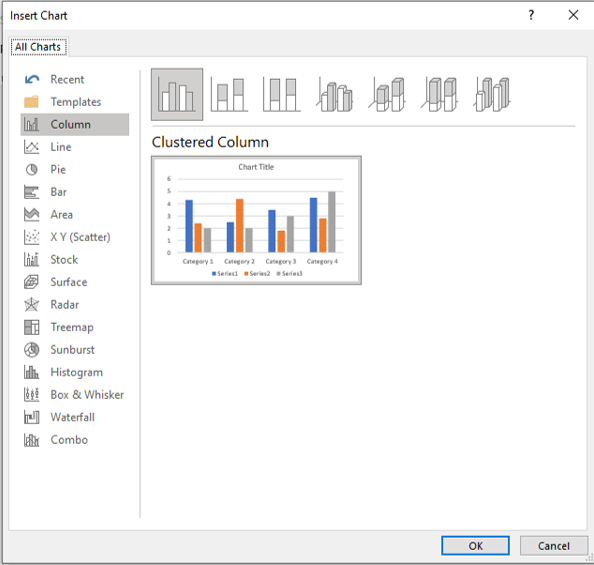
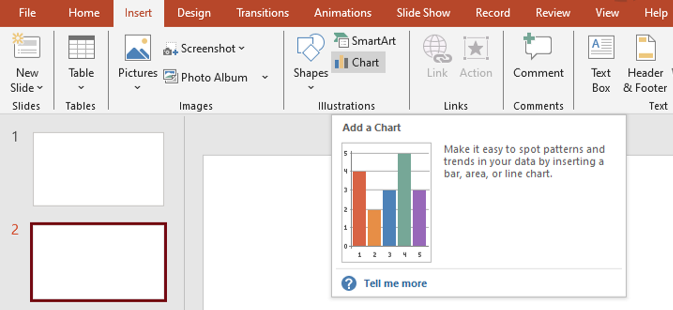
How to Insert a Chart in PowerPoint
Adding charts in PowerPoint is straightforward:
- Go to the Insert tab.
- Click Chart.
- Select the chart type that fits your data.
- Enter your data in the built-in Excel sheet.
- Customize colors, fonts, and styles to match your theme.
👉 Tip: Use your Slide Master (see Slide Master explained) to apply consistent chart formatting across your presentation.
Best Practices for Effective Charts
Here’s how to make your charts stand out:
- Keep It Simple
Avoid clutter. Remove unnecessary gridlines, 3D effects, or extra labels. Simplicity makes your message clear.
- Use Colors Strategically
- Highlight key data points with a bold color.
- Stick to your brand’s palette for professionalism.
- Avoid too many colors that distract from the data.
👉 Related: Learn how to choose the right colors for PowerPoint.
- Label Clearly
Your audience should never guess what data means. Use descriptive titles, data labels, and legends only when necessary.
- Tell a Story
Don’t just present numbers—explain what the chart reveals. For example: “Sales grew 40% in Q3 due to our new marketing strategy.”
- Use Animation Sparingly
Animate charts only when it enhances understanding. For example, showing bars grow across time. Avoid flashy effects that distract.
Common Mistakes to Avoid
- Using pie charts for too many categories.
- Choosing chart types that don’t fit the data.
- Overloading slides with multiple charts at once.
- Ignoring accessibility (ensure contrast and readable fonts).
Free Templates for Chart Design
Not sure how to style your charts? Our Free PowerPoint Templates include pre-formatted slides with charts and graphs that you can edit with your own data.
Premium Templates for Professional Presentations
If you want charts that impress clients or decision-makers, explore our Premium PowerPoint Templates. These templates feature:
- Ready-made, professionally designed chart layouts.
- Customizable color schemes and fonts.
- Editable vector graphics for data visualization.
Perfect for businesses, educators, and creatives who need impactful visuals without wasting hours designing from scratch.
Final Thoughts
Charts are more than just visuals—they’re storytelling tools. By choosing the right chart, simplifying design, and highlighting key insights, you can transform raw data into meaningful takeaways.
The next time you build a presentation, think carefully about your charts. Done well, they don’t just display data; they persuade, engage, and inspire your audience.
👉 Want to take your slides further? Read our guide on creating infographics in PowerPoint for more visual storytelling tips.