

When it comes to creating an effective and visually engaging PowerPoint presentation, text formatting plays a crucial role. Fonts, sizes, colors, and alignment can all influence how your message is received. In this blog, we’ll break down everything you need to know about formatting text in PowerPoint, helping you turn ordinary slides into polished visual content. At SlideMasterz, we emphasize that well-formatted text is one of the fastest ways to upgrade the quality of your slides. A great design alone won’t work if the text is hard to read or inconsistent. Proper formatting builds trust, improves comprehension, and enhances your professional image, whether you’re pitching an idea, presenting data, or delivering a keynote speech.
Why Text Formatting Matters
Text formatting impacts how your audience perceives your message. Poor font choices, inconsistent sizing, and jarring colors can distract or confuse viewers. On the other hand, consistent and professional text formatting enhances clarity and keeps your audience focused. Research in presentation design shows that clear and structured typography can increase audience retention by over 30%. In business environments, where every detail counts, presentation slides with clean text often create a stronger impression. For example, a consistent style guide ensures brand alignment, making your presentation instantly recognizable across departments, events, or campaigns.
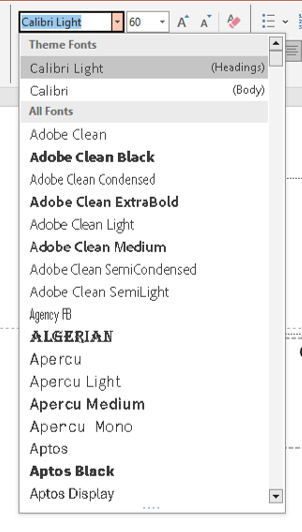
Choosing the Right Font Style
The font you choose sets the tone for your presentation. PowerPoint offers a wide range of fonts, but here are some best practices:
- Use Sans-serif fonts like Arial, Calibri, or Helvetica for clean, modern slides.
- Avoid overly decorative fonts unless you’re designing for a specific theme.
- Stick to 1–2 fonts throughout your presentation to maintain consistency.
 Want more design tips? Check out our blog on 5 Slide Design Mistakes That Are Ruining Your Presentation.
Fonts are not just a design choice; they can influence readability, mood, and audience perception. For example, serif fonts such as Times New Roman might convey a more formal tone, making them suitable for academic presentations, while sans-serif fonts offer a modern feel ideal for corporate or creative pitches. Pairing a strong heading font with a lighter body font can also help guide viewers through your content without overwhelming them.
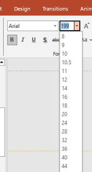
Adjusting Font Size Effectively
Font size is essential for readability. If your audience can’t read your content, your message is lost.
- Use 24pt or larger for body text.
- Use 32pt or larger for titles and headings.
- Test your presentation on a projector or screen to make sure all text is legible.
font size
Pro tip: Don’t try to fit too much text on one slide. Instead, break it into multiple slides or use bullet points wisely. Read our guide on Beyond Bullet Points: Creative Alternatives for Presenting Lists for inspiration. A simple test is to stand 8–10 feet away from your screen and see if you can still comfortably read the text. If you can’t, neither can your audience. Larger fonts also help your presentation breathe visually, reducing clutter. When you must use smaller text for detailed charts or footnotes, make sure to keep them minimal and provide verbal explanation instead of overloading slides.
Color and Contrast
Color can add emphasis, create hierarchy, and even evoke emotions. When formatting text, consider the following:
- Use high contrast between text and background (e.g., dark text on a light background).
- Use color sparingly to highlight key points.
- Stick to your brand colors for consistency in business presentations.

color palette
You can learn more about color use in our blog on How to Choose the Right Colors for Your PowerPoint Presentation. Choosing the right color palette also plays a role in accessibility. For example, ensure your text is legible for color-blind viewers by using accessible contrast ratios. Tools like Microsoft’s built-in accessibility checker can help identify issues before you present. Consistent color use also strengthens brand recall—your audience begins to associate your color scheme with your message over time.
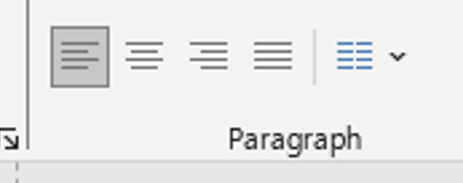
Text Alignment and Spacing
Alignment affects the visual flow of your slide. Left-aligned text is generally easiest to read, but center-aligned text can work well for titles.
- Keep alignment consistent across slides.
- Use line spacing (found under the Paragraph settings) to avoid cluttered text.
- Make use of bullet points, but limit to 3–5 per slide.
Incorrect alignment can make your slides appear unbalanced and amateurish. For example, mixing left, right, and center alignment within the same slide often confuses the viewer. Consistent spacing between lines and paragraphs also improves scanning speed, which is crucial in fast-paced presentations. Always preview your slides in full-screen mode to ensure spacing looks intentional, not accidental.
Using Slide Master for Consistent Formatting
Want your font and text style to remain consistent across all slides? Use PowerPoint’s Slide Master feature. It allows you to set fonts, sizes, and placeholders globally.
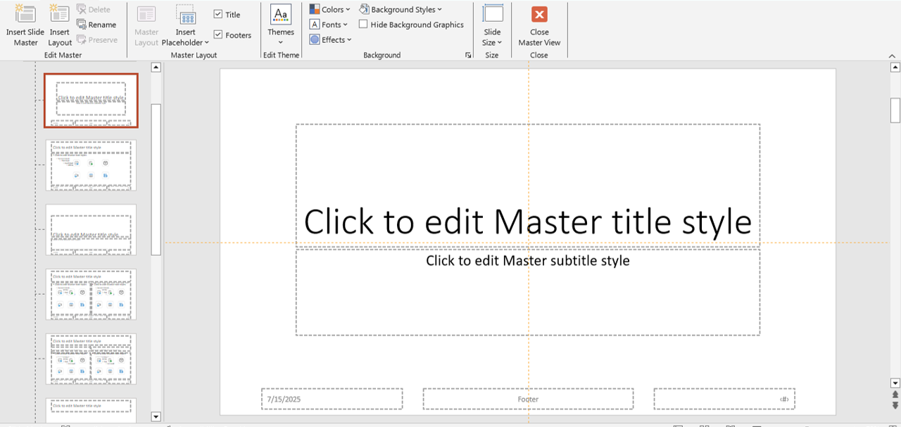
slidemaster
Learn how in our blog Using PowerPoint’s Slide Master for Consistent and Professional Designs.
Slide Master is especially useful for large projects, where multiple team members contribute slides. By locking down formatting, you ensure that no matter who adds content, the final presentation maintains a professional, on-brand look. This saves time in revisions and reduces inconsistencies during collaboration.
Bonus Tip: Typography Hierarchy
Establish a visual hierarchy using font size, weight (bold), and color. For example: – Slide title: 40pt, bold – Subheading: 32pt – Body: 24pt
This helps guide the viewer’s eye through the content. Hierarchy also works hand-in-hand with storytelling. For instance, you can emphasize the main takeaway in a large, bold font and place supporting details in smaller, lighter text. This structure subconsciously guides the audience’s attention toward your key points first, ensuring they remember the most important information.
Final Thoughts
Text formatting may seem simple, but it can make or break your presentation. By mastering fonts, sizes, alignment, and color, you’ll ensure your message is both clear and visually appealing. Whether you’re creating a sales pitch, classroom lecture, or event keynote, applying these text formatting principles will improve your professionalism and impact. Remember—your words are powerful, but how they appear on screen determines whether they inspire or get ignored. Keep learning, refining, and applying these techniques to stay ahead in presentation design.
If you’re ready to upgrade your presentation game, don’t miss our free PowerPoint templates designed with typography best practices in mind.


