

When it comes to creating a compelling presentation, the humble text box plays a bigger role than you might think. Whether you’re crafting a pitch, lecture, or business proposal, text boxes help you organize and present your message clearly and visually. For beginners, learning how to use text boxes effectively can dramatically improve slide readability and audience engagement. Proper text box placement ensures that your message flows naturally and avoids the “wall of text” effect that often bores viewers.
In this beginner-friendly guide, we’ll walk you through everything you need to know about PowerPoint text boxes—from inserting and formatting to advanced positioning tricks and design ideas. And if you want to take your designs to the next level, don’t forget to explore our free PowerPoint templates to see how professionals do it.
What Is a Text Box in PowerPoint?
A text box in PowerPoint is a container that holds your text. Unlike placeholders, which are pre-positioned within a layout, text boxes can be added and moved freely, giving you complete control over content placement. This flexibility is especially useful when you’re customizing slides beyond the default template. For example, marketing professionals often place text boxes strategically to balance text with high-quality visuals, ensuring brand alignment without cluttering the slide.
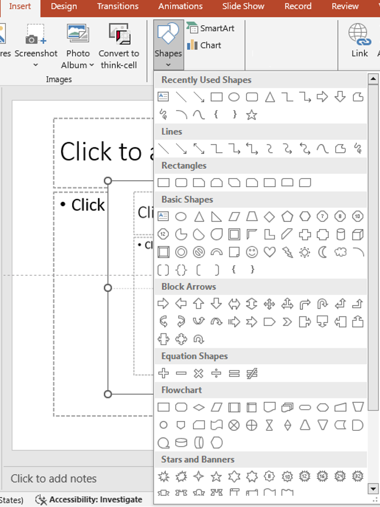
insert shapes
How to Insert a Text Box
- Go to the Insert Tab: Click on the Insert tab in the top ribbon.
- Click Text Box: Select Text Box from the menu.
- Draw the Box: Click and drag your mouse anywhere on the slide to draw the text box.
- Start Typing: Once you release the mouse, you can begin typing inside the box.
Tip: Use keyboard shortcut Alt + N + X to insert a text box quickly.
While inserting is simple, placement matters. Try to align your text box with existing content blocks or visual cues in the slide background. This creates a structured flow for your audience’s eyes, leading them through the slide logically.
Formatting Text Boxes
To make your slides visually appealing, text formatting is essential:
- Font Styles: Change fonts, size, color, bold, or italics.
- Text Alignment: Align text left, center, right, or justify.
- Padding: Adjust the internal margin inside the text box (Format > Shape Options > Text Box).
- Borders and Fill: Add background color, border styles, or shadow effects from the “Format Shape” panel.
Check out our blog on Typography in PowerPoint to choose the right fonts that match your tone. Consistency in formatting across all text boxes builds visual harmony. This is particularly important when preparing corporate or client-facing presentations, where uniformity reinforces professionalism and brand trust.
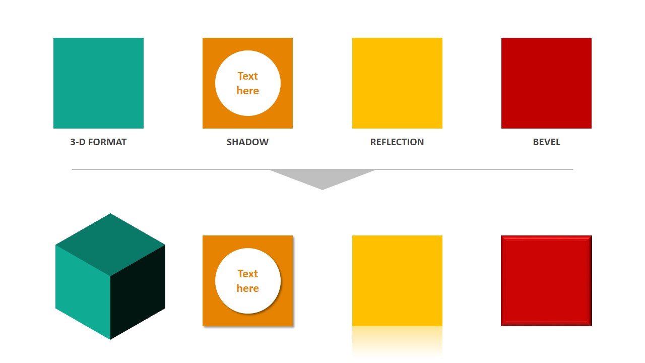
powerpoint effects
Positioning and Aligning Text Boxes
Positioning can make or break the balance of your slide layout.
- Use Guides and Grids: Enable them from the View tab to align perfectly.
- Align Objects: Use the Align button (under Shape Format) to line up multiple text boxes.
- Group Text Boxes: Select multiple text boxes > Right-click > Group. This helps maintain structure when resizing or moving elements.
For layout mastery, don’t miss our blog on Building Layouts with Shapes. Misaligned text boxes can make a professional presentation look rushed. Taking the extra time to align and distribute them evenly ensures that your design remains clean and visually balanced.
Advanced Text Box Tips
Here are a few lesser-known tricks to work smarter:
- Text Autofit: Prevent text overflow by enabling autofit in the Format Shape pane.
- Text Direction: Use vertical or rotated text for creative designs.
- Linking Text Boxes: Connect overflow text from one box to another by using multiple linked text boxes (available in PowerPoint 365).
- Use Slide Master for Consistency: Set predefined text boxes in your layout using PowerPoint’s Slide Master. Advanced users can also experiment with transparency effects on text boxes to create layered designs, which can make titles pop without overwhelming background visuals.
Design Ideas: Beyond Basic Text
- Use shapes as containers with text instead of rectangles.
- Pair text with icons for visual storytelling.
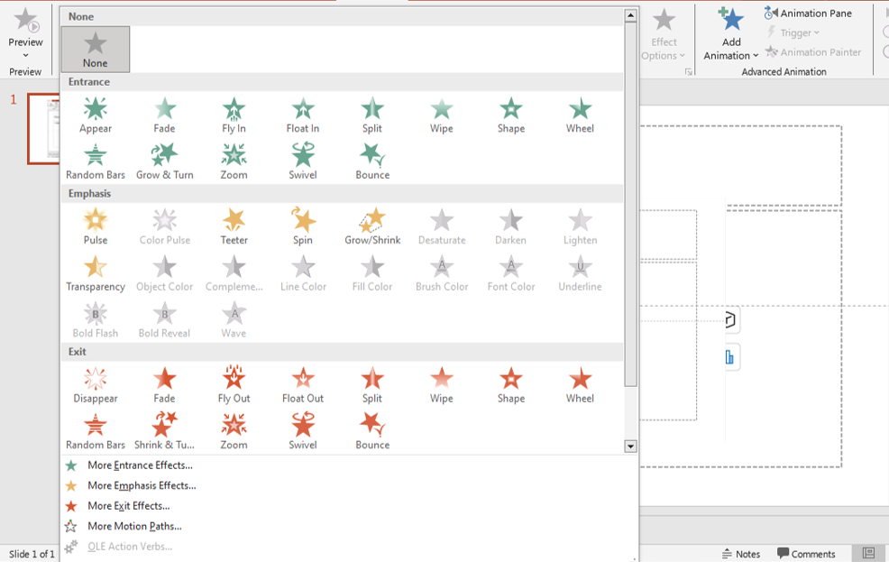
- Apply animation to text boxes for emphasis. Just remember to use it sparingly—see our guide on PowerPoint animation do’s and don’ts!
Try integrating text boxes with infographics for data-heavy presentations. This keeps slides engaging while still delivering key information effectively.
Common Mistakes to Avoid
- Overcrowding: Don’t squeeze too much text into one box.
- Tiny Font Sizes: Keep readability in mind—nothing below 18pt for main content.
- Inconsistent Styles: Stick to a single font family and align consistently.
timeline
Another common oversight is failing to check text visibility against slide backgrounds. Always test your presentation in slideshow mode to ensure that text remains readable under different lighting conditions.
Final Thoughts
Mastering text boxes may seem simple, but the design and placement decisions you make here are fundamental to clear, effective communication. Start with these tips and practice them in your next presentation.
Want to jump-start your next slide deck? Browse our Free PowerPoint Templates to find professionally designed presentations where all of this is already done for you.
If you consistently apply these text box best practices, you’ll soon find that your slides not only look better but also communicate more clearly—helping you win over audiences in business pitches, academic talks, or online webinars.
Explore More:
– 5 Slide Design Mistakes That Are Ruining Your Presentation
– How to Create a Branded PowerPoint Template for Your Business


