

Even the best ideas can fall flat if your slides are poorly designed. Whether you’re presenting to clients, colleagues, or a large audience, your visuals matter more than you think. Design mistakes can make your message confusing—or worse, make you look unprepared.
In this blog, we’ll highlight 7 common slide design mistakes and how to avoid them. We’ll also show you how to fix them fast with our free professional PowerPoint templates.
At SlideMasterz, we’ve reviewed thousands of presentations, and most design errors boil down to the same few problems. The good news? Once you recognize these mistakes, they’re easy to fix, and your slides will instantly look more polished and credible.
1. Too Much Text on One Slide
Walls of text overwhelm your audience and reduce retention.
Fix: Use bullet points sparingly and focus on key takeaways. Break one slide into two if needed.
minimalist
🔗 Use our Minimalist Templates to simplify slide content. Aim to make your slide the visual cue, not the entire script. The audience should be listening to you, not reading paragraphs. Replace lengthy descriptions with diagrams, icons, or infographics to visually represent the same information.
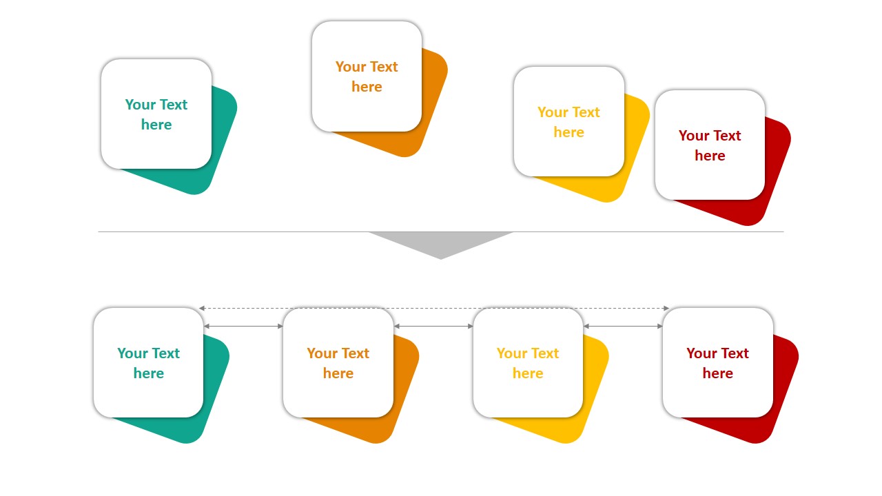
2. Inconsistent Fonts and Colors
Switching fonts or colors across slides creates visual clutter and looks unprofessional.
Fix: Stick to a consistent font pair and color palette. Use the Slide Master to apply changes uniformly.
powerpoint format painter
Check out our post on Typography in PowerPoint for tips. Consistency builds brand recognition. If your presentation is for a company, use the official brand guidelines for fonts and colors. This not only creates a professional look but also makes your deck feel like an extension of your brand identity.
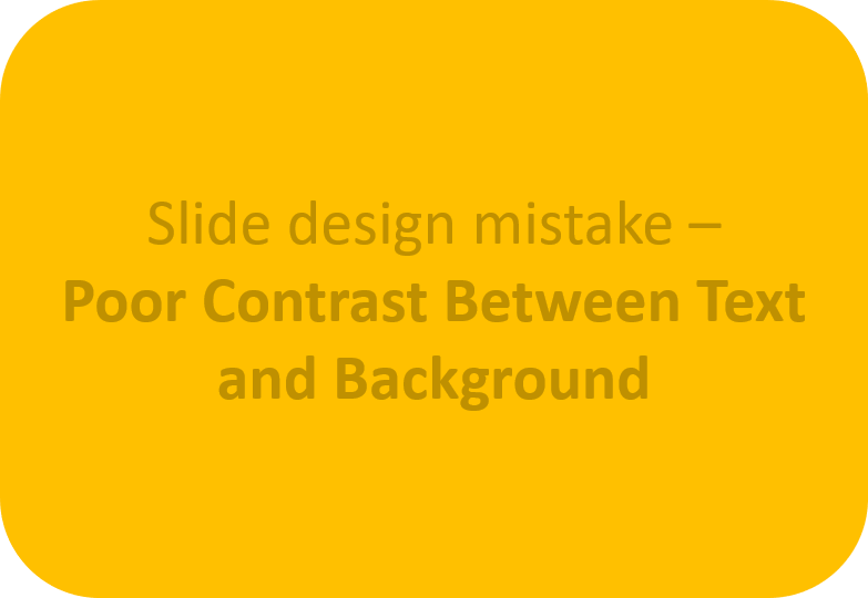
3. Poor Contrast Between Text and Background
If your audience can’t read your text, they won’t absorb your message.
Fix: Use high contrast combinations—dark text on light backgrounds or vice versa. Always test your slides on the actual screen or projector you’ll be using. What looks fine on a laptop might be unreadable on a dimly lit stage or large display. PowerPoint’s built-in Accessibility Checker can also help flag low-contrast issues.
design mistake
4. Low-Quality or Stretched Images
Pixelated or oddly scaled images ruin credibility.
 vs
vs 
Fix: Use high-resolution visuals and maintain aspect ratio when resizing. Stick to images that support your narrative. Avoid using generic stock photos that don’t connect with your content. Instead, choose visuals that feel authentic and relatable to your audience. You can also compress high-resolution images in PowerPoint to reduce file size without losing clarity.
5. Overuse of Transitions and Animations
Unnecessary animations can feel distracting or amateurish.
Fix: Use subtle effects like Fade or Morph only when they enhance the story.
Learn more in our blog on Animation Dos and Don’ts. Remember, animations should guide the audience’s focus—not become the focus themselves. When in doubt, keep it minimal. If every slide has motion, it loses its impact.
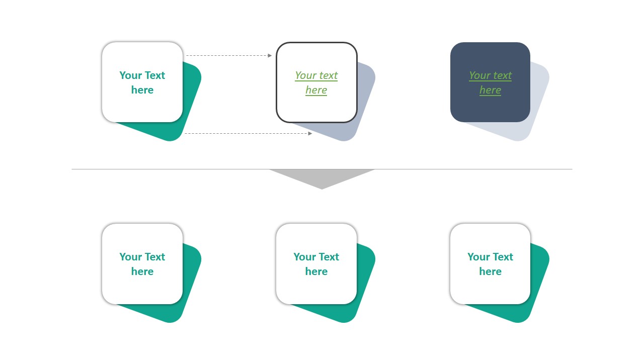
6. Unaligned Elements
Misaligned text boxes and shapes create a messy, unbalanced layout.
Fix: Use PowerPoint’s gridlines, guides, and align tools to keep everything structured. Even small misalignments can subconsciously signal a lack of attention to detail. Using consistent margins, padding, and spacing gives your slides a more professional and organized appearance.
powerpoint alignment
7. Ignoring Visual Hierarchy
All text isn’t equally important—but if it looks the same, nothing stands out.
Fix: Use size, boldness, and color contrast to highlight headings and key ideas. Visual hierarchy works hand-in-hand with storytelling. For example, your main headline should grab attention instantly, while supporting points should be visually secondary. This ensures your audience processes information in the order you intend.
Final Thoughts
Slide design isn’t just about style—it’s about clarity, credibility, and communication. By avoiding these 7 common mistakes, you’ll deliver a presentation that looks sharp and keeps your audience focused.
🎁 Ready to level up? Explore our Free Templates designed to eliminate these mistakes by default.
💡 Well-designed slides show your audience you mean business. Make the right impression. The difference between an average and outstanding presentation often comes down to design discipline. When your slides look clean, consistent, and intentional, your message has a better chance of landing—and being remembered.


