

Ever wondered why some presentations grab your attention while others put you to sleep?
It’s not just the content—it’s the psychology of design. Understanding how the human brain processes visuals. It can help you craft PowerPoint slides that engage, persuade, and leave a lasting impression.
In this blog, we’ll break down the psychological principles that make slides effective. Also show you how to apply them with free, professionally-designed PowerPoint templates. At SlideMasterz, we’ve seen first-hand how applying design psychology can double audience engagement. The way your slides are structured, colored, and delivered plays a huge role in whether your audience tunes in—or tunes out. By mastering these principles, you’re not just designing slides, you’re designing an experience.
1. Visual Hierarchy: Guide the Eye
Our brains are wired to scan. That means your slides must have a clear visual flow.
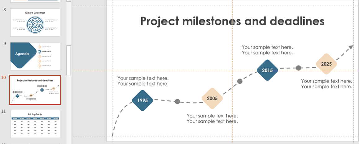
timeline
Fix: Use headings, font sizes, bold colors, and alignment to direct attention where it matters.
🔗 Try our Bold Title Templates designed with intentional hierarchy for maximum impact. You can also use spacing to control attention. Increasing whitespace around key elements makes them stand out more, helping the audience instantly know where to focus.
2. Color Psychology: Influence Mood & Behavior
Colors don’t just decorate—they communicate. Blue evokes trust. Red stimulates urgency. Yellow grabs attention.
Fix: Choose a color palette based on the tone of your presentation and your brand’s personality.
Explore our guide on How to Choose the Right Colors for PowerPoint.Keep cultural differences in mind—colors may carry different meanings across countries. For example, while white is associated with purity in Western cultures, it can represent mourning in some Asian traditions. Always consider your audience before finalizing your palette.
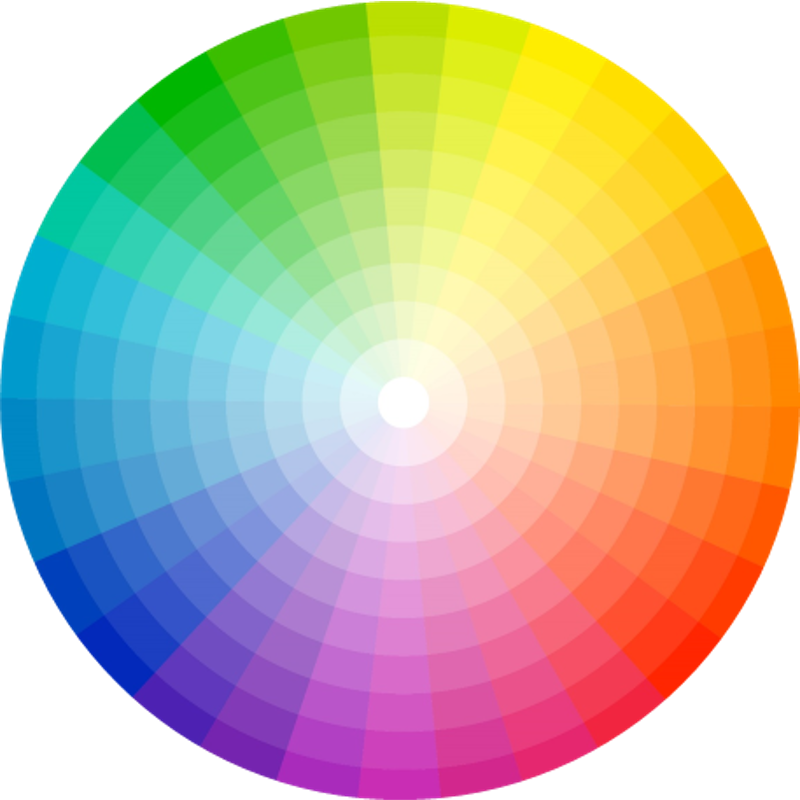
color palette
3. Cognitive Load: Less is More
The brain can only process so much at once. Overloading slides with text and visuals increases fatigue and reduces retention.
minimalist
Fix: Follow the 1-6-6 rule—1 idea per slide. 6 words per line, 6 lines max. Use visuals instead of paragraphs. Studies show that presentations with concise text and strong visuals improve audience recall by up to 65%. Tools like PowerPoint’s Designer can help you automatically restructure cluttered slides into cleaner layouts.
4. Emotional Triggers: Tell a Story, Not Just Data
Emotion drives memory. Slides that evoke feeling through imagery, language, or narrative are more likely to stick.
Fix: Use storytelling frameworks and real-world examples. Choose images that connect emotionally.
Learn more in our blog: The Art of Storytelling in PowerPoint. Even in business presentations, weaving in personal anecdotes, customer success stories, or relatable scenarios can make your message more memorable than data alone.
5. Pattern Recognition: Use Repetition and Contrast
The brain loves patterns—it finds them faster. Repeating layouts, colors, and styles across slides creates familiarity and flow.
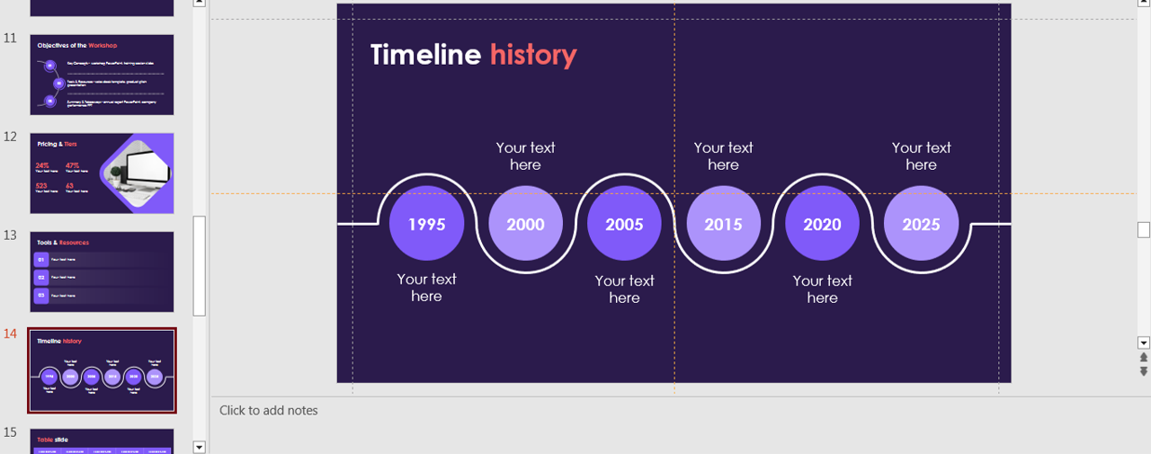
timeline
Fix: Use the Slide Master to maintain consistent design across the deck. Add contrast for emphasis. Strategic contrast—like a pop of accent color or a bold font weight—can highlight key takeaways without overwhelming the slide. This ensures important information gets noticed first.
Final Thoughts
Good design isn’t just about looking pretty—it’s about making your message memorable. Tap into visual psychology to design impactful slides.
Create presentations that look great and work hard for you.
🎁 Want a head start? Browse our Free Template Gallery and apply these psychological principles instantly.
💡 Great slides don’t just inform—they influence. Make yours count. Remember, every choice you make—color, font, layout—is a signal to your audience. By using psychology-backed design techniques, you ensure those signals lead them exactly where you want: understanding and remembering your message.


