
")
Still using the same PowerPoint styles from 2010?
If your slides feel flat, cluttered, or just plain boring—it’s time for a serious refresh. Outdated design not only hurts your message but also your credibility.
In this blog, we’ll help you spot the common signs of outdated slides and give you easy, modern fixes. Best of all, we’ll share free PowerPoint templates that instantly make your deck look current, and In addition professional. At SlideMasterz, we’ve worked with presenters from startups to Fortune 500 companies, and the biggest difference between “okay” and “wow” slides often comes down to avoiding outdated design habits. With a few smart tweaks, your presentation can look as if it was built by a professional designer—without the steep learning curve.
Sign #1: Overused Bullet Points
Fix: Replace bullet lists with icons, grids, or SmartArt graphics. Because, these alternatives are more engaging and help your audience remember key points better.
🔗 Check out our Modern Grid Layout Templates that use visual alternatives to bullet points. You can also use diagrams, timelines, and infographics to break down complex ideas. Visual storytelling helps audiences process information faster and keeps them interested throughout the presentation.
Sign #2: Old Fonts Like Times New Roman or Comic Sans
Fix: Upgrade to modern, clean fonts like Montserrat, Poppins, or Open Sans. In addition, Consistent typography with proper sizing adds instant professionalism.
Need help choosing fonts? Read our blog on Typography in PowerPoint for expert guidance. Always stick to 2–3 font styles maximum—one for headings, one for body text, and an optional accent font. This keeps your slides looking clean and avoids a “mismatched” feel.
Sign #3: Inconsistent Slide Designs
Fix: Use Slide Master to create a unified layout with consistent fonts, colors, and spacing across all slides. This not only saves you time but also ensures brand consistency. A cohesive deck makes your presentation feel more trustworthy and well-prepared.
Sign #4: Outdated Color Schemes (Think Beige and Navy)
Fix: Switch to vibrant or minimalist color palettes with modern tones. Additionally, use sites like Colors or Adobe Color to explore palettes—or start with a designer-crafted template.
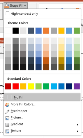
🔗 Explore our Minimalist Templates featuring modern color schemes and stylish layouts. Modern design often leans towards high-contrast combinations, subtle gradients, or soft pastel tones—depending on the mood you want to convey. Always test your color choices on both light and dark backgrounds to ensure readability.
Sign #5: Over-the-Top Animations
Fix: Stick with smooth transitions like Fade or Morph. Moreover, Avoid bouncing text or spinning images unless you’re designing for kids.
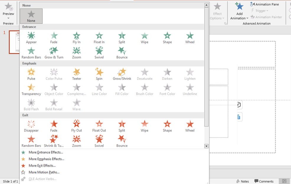
animations
Learn more in our post on The Do’s and Don’ts of PowerPoint Animations. Overusing flashy animations can distract from your message. Instead, use subtle movement to guide the viewer’s eye towards important information, keeping the focus on your story.
Fast Fixes You Can Apply Today:
- Replace default themes with custom templates
- Also, Reduce text, increase visuals
- Additionally, Use whitespace effectively
- Also maintain alignment with guides and grids
Even if you don’t have time for a full redesign, applying just one or two of these tips—such as updating fonts or removing excessive bullet points—can instantly modernize your slides.
Final Thoughts
Your content deserves a fresh, modern design. With just a few smart changes—and the right PowerPoint template—you can go from outdated to outstanding.
🎁 Ready to upgrade? Explore our Free Template Gallery and start transforming your slides today.
💡 Small updates can create a big impact. Don’t let outdated slides hold your message back. The good news is you don’t need to be a designer to make this transformation. With access to high-quality templates and a few best practices, you can create professional presentations that impress your audience and deliver results.


