

When you’re pitching to potential clients or investors, first impressions are everything. Your pitch deck needs to be clear, compelling, and visually persuasive. PowerPoint, when used strategically, can be the perfect tool to craft presentations that not only inform but convince.
In this blog, we’ll show you how to use PowerPoint to create pitch decks that stand out—and close deals.
1. Know Your Audience
Before designing your pitch deck, understand who you’re speaking to. Tailor your content to what matters most to them:
- Investors care about growth potential and ROI
- Clients want solutions to their problems
- Partners want synergy and shared values
Every slide should reflect the goals and concerns of your audience. When identifying your audience, consider creating audience personas. For instance, if you’re pitching to a corporate board, include market data and long-term projections. If you’re speaking to a startup founder, emphasize agility, innovation, and cost-effectiveness. By adapting tone, design, and even the color psychology of your slides, you increase the emotional connection and relevance. For more tips on tailoring your presentation style, explore our PowerPoint Presentation Blogs.

quote slide
2. Start with a Clear Structure
An effective pitch deck has a logical flow. Here’s a tried-and-true structure:
- Title Slide – Your name, logo, and tagline
- Problem – What issue are you solving?
- Solution – Your product/service in action
- Value Proposition – Why you’re different or better
- Market Opportunity – Size, demand, growth
- Business Model – How you make money
- Go-to-Market Strategy – How you’ll reach your audience
- Team – Key people and their strengths
- Case Studies or Testimonials – Social proof
- Call to Action – What you want from your audience
reading view
If you want to make this structure even more persuasive, incorporate storytelling elements. Start with a relatable anecdote or a quick scenario illustrating the problem before diving into the numbers. Research shows audiences remember stories far more than isolated facts. If possible, pair each section with one powerful visual to reinforce the message—this is especially impactful in the Problem and Solution slides.
3. Design with Purpose
Design isn’t just about looking good—it should guide attention and enhance clarity.
Key Design Tips:
- Use clean, minimal layouts to reduce distractions
- Stick to a consistent color palette and typography
- Highlight key messages using bold text, icons, or contrasting shapes
- Use visuals (images, graphs, mockups) instead of dense text
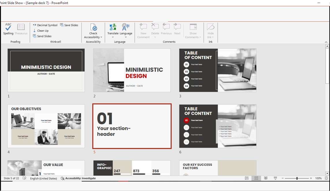
Avoid stock images that look generic or staged—they can make your deck feel impersonal. Instead, use custom graphics, brand-specific imagery, or screenshots from your product in action. A great way to keep designs consistent is to start with a professionally designed template. You can explore our free PowerPoint template downloads to find options that are both polished and customizable.
powerpoint free template downloads
4. Use Data Wisely
Numbers matter—but dump too many into one slide and you’ll lose your audience.
- Use infographics and data charts to visualize key metrics
- Highlight trends, growth, or savings clearly
- Add labels and takeaways so viewers immediately understand the impact
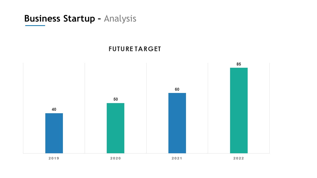 When presenting financials or market stats, limit yourself to one core data point per slide. This avoids overwhelming your audience. If you must include more details, consider adding an appendix slide at the end for reference. Also, color-code your charts—green for growth, red for risks, and blue for stability—so viewers can quickly interpret the message without reading every number.
5. Keep It Concise
Aim for 10-12 slides max. Each slide should support your narrative without overwhelming with details. Leave room for follow-up questions or deeper conversations.
Use animations sparingly to control flow and keep focus—but avoid overdoing it. A helpful trick is to use the 10/20/30 rule popularized by Guy Kawasaki: no more than 10 slides, 20 minutes of presentation, and 30-point font minimum. This forces brevity and ensures your message is digestible. Additionally, always rehearse with a timer so you don’t rush or drag sections.
6. Add a Personal Touch
- Include client logos if you’ve worked with known brands
- Add quotes or testimonials
- Feature your team’s photos for relatability
These human elements can boost trust and connection. If possible, tailor these personal touches to the specific audience. For example, if your potential client is in the healthcare industry, show testimonials from healthcare clients. Also, make sure any brand logos you display are high-resolution—blurry logos can make even the best decks look unprofessional.
7. Prepare for Delivery
A winning deck is only half the job—the rest is how you present it.
- Practice your pitch to ensure confidence and flow
- Use Presenter View in PowerPoint for seamless delivery
- Prepare a version in PDF for easy sharing

vector
Record yourself practicing to spot areas where your tone, pacing, or body language could improve. Also, prepare for technical issues—always have your deck saved in multiple formats (PPTX, PDF, and even a cloud link). This ensures you’re ready no matter what device or software your client uses.
Final Thoughts
A pitch deck is your business card, elevator pitch, and resume all in one. Using PowerPoint thoughtfully can help you communicate clearly, stand out from competitors, and most importantly—win clients. Remember, your pitch deck isn’t just about presenting information—it’s about creating a memorable impression that lingers after the meeting.
📈 Design with intention. Tell a compelling story. Close the deal.


