

When it comes to creating clean, organized, and visually compelling PowerPoint presentations, layout is everything. A well-structured layout not only makes your content easier to follow but also enhances the overall professionalism of your slides. One highly effective method for achieving this is using a grid-based design built entirely with PowerPoint shapes.
In this blog, we’ll walk you through how to use shapes to build structured, grid-aligned layouts that elevate your presentations from basic to brilliant.
What Is Grid-Based Design?
Grid-based design is a layout technique that uses a series of vertical and horizontal lines to arrange content in a clean and consistent manner. It helps in creating visual balance, alignment, and hierarchy.
gridlines
When applied in PowerPoint using shapes, it allows you to:
- Divide your slide into structured sections
- Align text, images, and elements precisely
- Maintain consistency across multiple slides
This technique is especially helpful for presenters who want to establish a rhythm and flow between slides—making your deck not just informative but also visually appealing.
Why Use Shapes to Build Layouts?
- Customizability: Create layouts that suit your unique content
- Visual Consistency: Shapes help you maintain proportional spacing
- Flexibility: Easily duplicate or adapt layouts across slides
- No Need for External Tools: PowerPoint has all you need built-in
By using PowerPoint shapes creatively, you reduce dependence on third-party tools or templates. You can even adapt your layout to different screen sizes or formats with ease. Don’t forget to check out our free downloadable PowerPoint templates that already follow grid-based principles.
How to Create Grid Layouts Using Shapes
Step 1: Plan Your Grid Structure
Decide how many columns and rows you need. Common layouts include:
- Two-column or three-column content
- Header, body, and footer rows
- Split-screen sections for comparisons
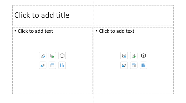
layout
You can sketch your layout idea first or even use PowerPoint’s built-in table tool as a temporary guide before drawing shapes. This planning step ensures that your structure supports your content, not the other way around.
Step 2: Insert Shapes as Layout Guides
Use rectangles or lines:
- Go to Insert > Shapes
- Choose Rectangle and draw your grid blocks
- Use Format > Align > Distribute Horizontally/Vertically for even spacing
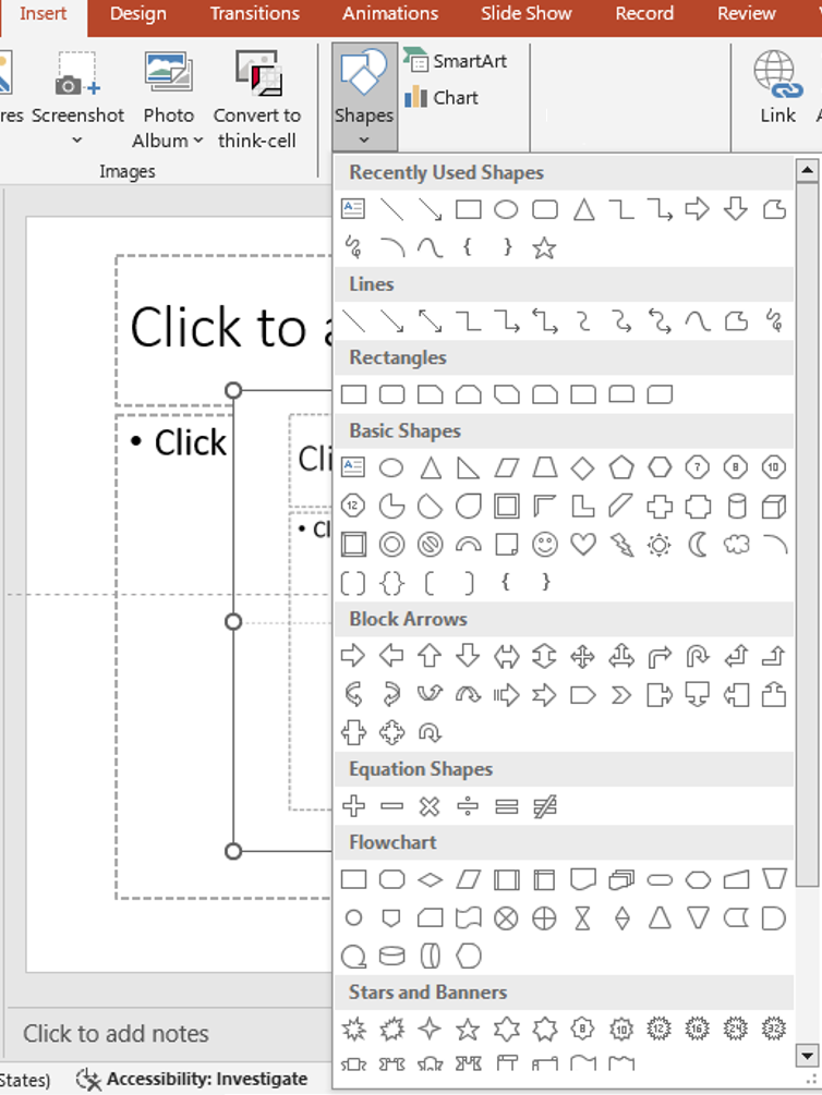
These shapes will act as layout placeholders. You can delete or hide them later. For precision, enable Snap to Grid under the View tab. You can also use transparent shapes with borders to help during alignment while keeping your slide clean.
Step 3: Add Content Inside the Shapes
Now place your actual content (text, images, icons) inside the shape blocks. This keeps everything aligned and easy to follow. Make sure your text boxes are margin-aligned within shapes. Use Format > Align > Align Center or Middle to balance the content visually. This small detail improves readability and aesthetics.
Step 4: Group or Lock the Layout (Optional)
To avoid accidentally moving your layout:
- Group the shapes (Right-click > Group)
- Lock elements using Selection Pane
Locking elements is particularly helpful when collaborating on a presentation with teammates. It preserves your layout while allowing others to focus only on content.
Step 5: Use the Slide Master for Reusability
If you’re using the layout across multiple slides, consider building it into your Slide Master.
- Go to View > Slide Master and build your shape grid there
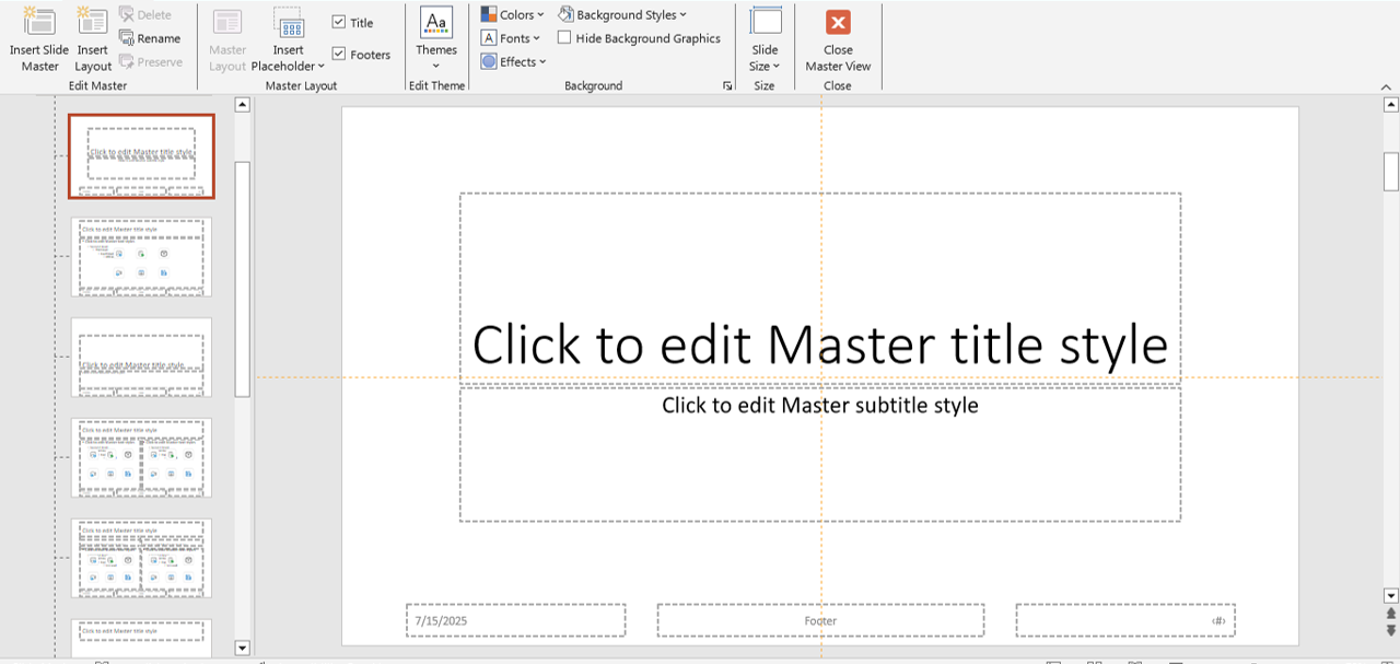
slidemaster
This method is perfect for branding consistency—especially in corporate presentations. You can even add placeholders for text or images inside your grid shapes to streamline content updates.
Pro Tips for Grid-Based Slide Design
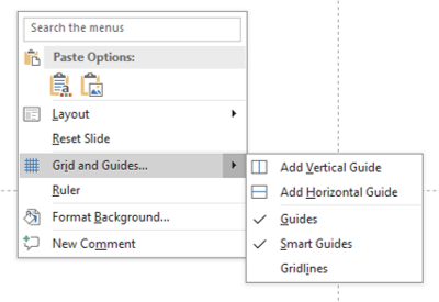
- Use the Grid and Guides feature under View to help align your shapes precisely
- Stick to a consistent margin around your shapes for balance
- Create visual hierarchy using different sizes or weights of text inside shapes
- Align shapes to the center or edges using the Align tools
Don’t forget to maintain sufficient white space between elements. A clean layout breathes better and avoids clutter—especially important when presenting on screens or projectors.
Use Cases for Grid-Based Shape Layouts
- Portfolio or case study presentations
- Comparison slides (before/after, pros/cons)
- Data-heavy slides for dashboards or reports
- Team member or testimonial slides
You can also create visual timelines, step-by-step processes, or client journey maps using grid layouts—enhancing storytelling without relying on infographics alone.
Final Thoughts
Building layouts with shapes in a grid-based design framework can dramatically improve the clarity and visual appeal of your PowerPoint presentations. It brings order to your slides and helps guide your audience’s attention to the most important elements.
🔄 Next time you’re creating a slide deck, try designing your layout with shapes and grids—you’ll be surprised how polished your presentation can look!


